
 Adam's Art weblog Adam's Art weblog Adam McLean is one of the few recognised experts on hermetic, emblematic and alchemical symbolism. Since 1978 he has published over 50 books on hermeticism, alchemy and related matters, edited the long running Hermetic Journal in the 1980's, and now organises the largest and most comprehensive web site on alchemy. He also offers study courses on the interpretation of alchemical symbolism. He also has one of the largest collections of modern tarot decks and is very interested in the artwork of modern tarot. As an artist he is not one given up to exploring in a free or indulgent way his own ideas, but instead he works essentially to restore and invigorate traditional emblematic and alchemical imagery. In March 2008 he decided to create this occasional weblog dealing with his artistic interests and research, his ongoing projects, his enthusiasms for traditional emblematic allegorical works and criticisms of some of the more risible aspects of modern art. View Adam's art prints. 9th February 2017 I have decided to re-awaken my art weblog after four years of silence. These past years have seen me working on many different projects, many involved with art and symbolism, especially through my audio visual presentations on Youtube. The main reason for reviving this art weblog is because I am currently purchasing a shop, some 200 yards from my home here in Kilbirnie, and I intend to open it as an art gallery. This will partly showcase my work with emblems, but will also give local artists a place to exhibit their work. If all goes well I should be able to open it in April or May this year. It will be called The Week-End gallery as I will only be able to open it on Saturdays and Sundays, due to my having to continue working on my books and other projects during the week. Here is an old photograph from 1904 showing the property. The gallery will occupy much of the ground floor. 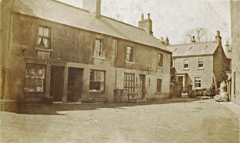
I will post up more news over the coming weeks. 5th February 2013 I have been very lucky recently as I have sold four of my 2001 paintings of alchemists to a single collector. I have been asked to sell these a few times over the last decade, but I liked these paintings so much, indeed I exhibited them in my Alchemy exhibition in 2007, that I was reluctant to part with them. It is good to know that they have gone to someone who values my work and that they have been kept together. 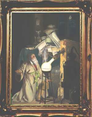
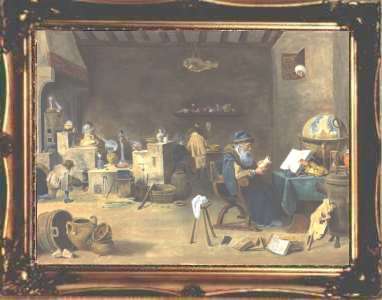
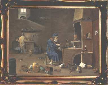
I made a group of paintings on canvas in 2000-2001. Last month I heard from a collector who had bought five of these works back in 2000 and he sent me a photograph of these on the wall of his home, so it is great to know that they are still together in his collection. I also sold a few of these paintings on canvas to individuals. So the last of my canvas paintings have gone. Around 2004-5 I decided to move away from canvas and work instead on board. This arose because I wanted to make copies of early paintings and I found it impossible to achieve the detail as the weave of the canvas limited what one could do, so I moved on to painting on a completely smooth surface. I doubt I will ever go back to canvas. My most recent painting, on which I an still working, is my recreation of the view from Chancellor Rolin's window as originally painted by Jan van Eyck. It needs at least 20 more hours of work, but all the forms are well established. It is all about detail, detail, detail. It will be difficult to part with this. 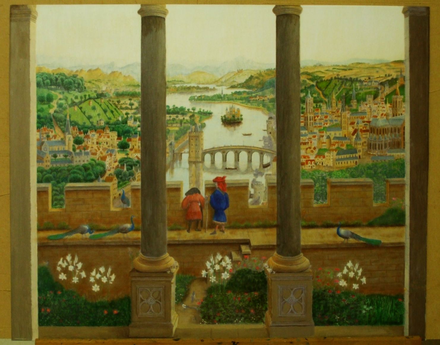
13 December 2012 After a long break I have returned to painting and have substantially finished a double portrait of Shakespeare and Jonson, using the Chandos portrait of Shakespeare and the van Blyenberch of Jonson. Melding the two has proven quite easy as they are in much the same style. There are still a number of adjustments to make, in particular I will have to push Jonson more into the background with some overglazing, but that should not take too long. I hope to work on a number of other paintings over the coming months. I rather enjoyed doing this and it did not take too long. 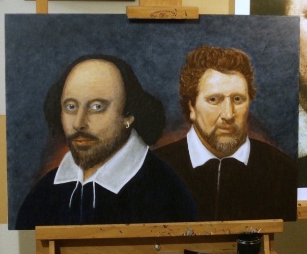 1 May 2012 I find myself now entirely left behind by the world. Today I discovered that Tracey Emin has been made Professor of Drawing at the Royal Academy. There now seems no point at all in any artist trying to develop a skill in a medium if a scribbler can become a professor. A professor of drawing surely must be a role model and someone to look up to, but the Royal Academy has chosen to lose its way in postmodern nonsense. Skill and ability are drowned in a morass of flies devouring meat and childish scribbling. There is obviously no future for my work. I will give up. What a terribly empty age we live in. 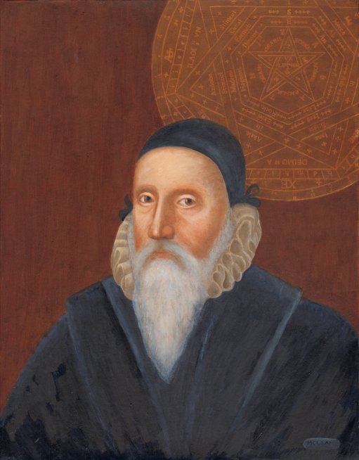 19 April 2012
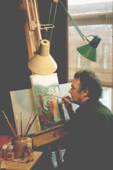
I have rather neglected this weblog of late. This is to a large extent due to the fact that I have rescheduled my time to allow me to make a study of mathematics. I used to spend at least some of most weekends painting or working on art related material, but now instead I am immersed in trying to grasp topology, abstract algebra, and the ideas underlying modern physics (tensors, lie algebras, the linear vector spaces of quantum mechanics). The only art piece I have worked on recently is a portrait of John Dee with the Aemeth sigil which was commissioned by a person in the USA some months ago. I sent this off yesterday. I would like to get back to more painting and I have a mass of half-completed projects waiting, but I find with my work on publishing that there is just not enough time. I am also very aware that I have so few years left in which to complete the things that I wish to. I do have a considerable intellectual curiosity about the major concepts in modern mathematics and this is at the moment displacing the time I have to devote to painting. My artwork suffers from the fact that it takes so many hours to produce a single painting, and only a handful of people have been willing to buy them. Few really value my art work and it just absorbs my time with no return. I have to make a living through my publications and this absorbs most of my time. I will have to keep going with this for a few more years in order to secure sufficient financial resources for the time when I am no longer able to continue with publishing books. I find I have little time to indulge myself in acivities which do not pay the bills, so at the moment my painting has lost out to my need to grasp the major ideas of our age. When I was younger I had little sense of the finite limits on my time, but now I find myself staring down the inevitable dead end. 14 December 2011 After many years searching I finally managed to find a reasonably high quality scan of the famous Temple of Music engraving from Robert Fludd's volumes on the Macrocosm and Microcosm, and set about colouring it. It did take a few days, as the colouring scheme was difficult. It is easy for people to merely colour various components of an engraving to suit their idiosyncratic feeling at the time, but this usually produces a total mess. One has to think long and hard about how the different parts of the image reflect each other and how colouring helps separate the various structures and parts of an image, and tie together related elements. This engraving has been quite a challenge. You can zoom in to see all the details by clicking on the image. 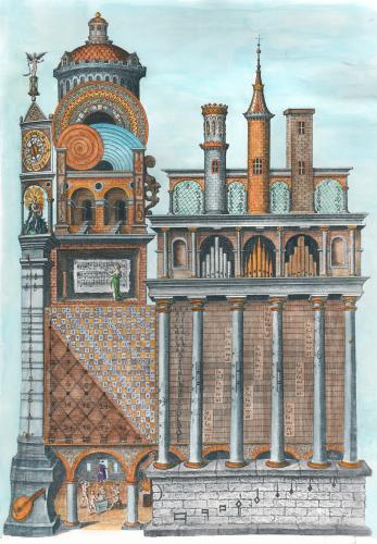 12 December 2011 I have managed to find some time recently to return to oil painting. I had received a commission to make a portrait of John Dee, and began working on this and also returned to try to complete some paintings from over a year ago which I had ceased working on. Hopefully, I will be able to find more time for oil painting. I have many things I would like to work on, but as I cannot raise much funds from selling these paintings, it is very difficult to justify spending 50 or 60 hours on a painting which will just sit on the wall of my study or library. I am sure they will be valued one day, probably when I am no longer able to paint in such a detailed way, but at the moment I seem to be painting for myself. You can see these on this page 24 October 2011 Six months ago I posted the coloured version I had made of an engraving I had then discovered. Today I have found a painting of the same emblem emanating from the circle of the mannerist painter Bartholomaeus Spranger (1546 – 1611) which was sold at Christies in 2002. This is a small oil painting on copper. The engraving was made by Hyeronymus Olgiatus in 1569 so must be the original image. 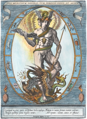 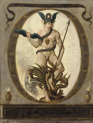
23 September 2011 I have now added two further items to my Art Book series. In these books I am extending my work with alchemical and astrological emblems to other more obscure series of emblematic images. There remains so much more to uncover in this neglected area. Sadly, I seem to be one of the few people excited and engaged by this emblematic material. It surprises me that almost no one appears to share my enthusiasm. Maybe people will catch up with me in ten years time, though I will by then have moved on to investigate other types of material. 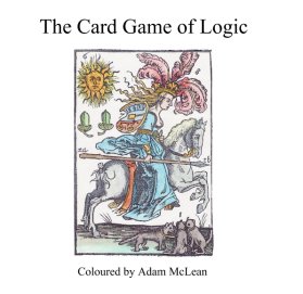 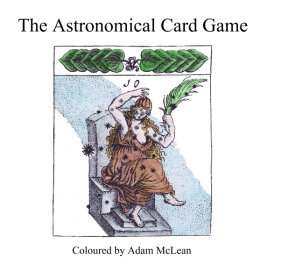 22 September 2011 I have made a little more progress with colouring the masonic tracing board engravings. At the weekend I completed the Mah-Ha-Bone frontispiece. This early exposé, Mahhabone, or the Grand Lodge Door Open'd, revealing the secrets of the Freemasons, was published in London in 1766. The title refers to the secret word used in some Freemasonic rituals. The frontispiece engraving is an elaborate structure presenting many of the key symbolic elements used in Freemasonry. Another exposé, Jachin and Boaz contains a similar complex gathering of symbols. The third image I show below is an 18th century engraving, the source of which I am not able at the moment to identify, depicting the layout of a lodge. The strange drops that cover much of the symbolic elements are the Masonic tears for the death of Hiram Abiff. It proved a reather difficult image to colour. There are many such fascinating emblematic images used in a Freemasonic context. These I will eventually publish as another item for the Art Book Series. I may also issue some of these as large format prints. 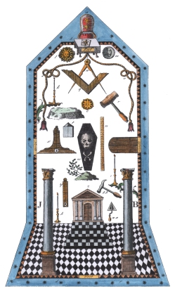 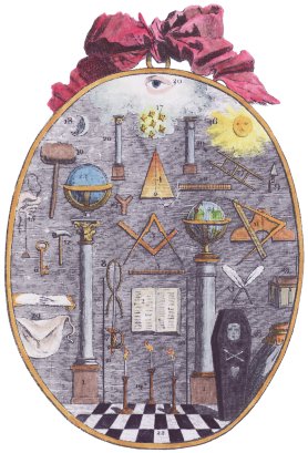 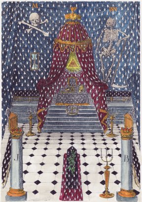
Today I decided to rework a coloured version of the well known Compass of the Wise engraving from the late 18th century. I originally coloured this back in 1998 some thirteen years ago. I needed to use this as an illustration in one of my forthcoming books so I thought I might rework it. I decided to leave the colouring scheme broadly the same, depicting the merging of the coloured influences from the heavenly planets and their reflection in the earth, however I have added more detail and delineated aspects of the imagery through sensitive colouring of adjacent components. So here is the original and the new version. 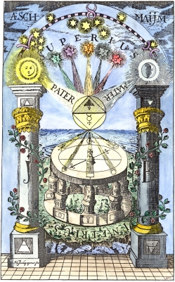 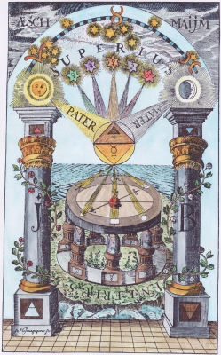 14 September 2011 I have always had an especial interest in emblematic imagery. Of course, I have almost exhaustively explored alchemical emblems (though there are still items to discover even after all these years of research). This year I am exploring some emblem systems that run parallel to alchemy, and have sourced material in woodcuts and engravings to colour for my Art Book series. For many years I have been fascinated by the tracing boards used in freemasonry. These are complex diagrams, often created on cloth or board which was laid on the floor of a lodge during the initiation rituals. I suppose the new initiate had to study the symbols and have these explained by the master of the lodge. Masonry is a strange spiritual/religious system which endowed the working tools, trowel, level, mallet, square and plumbline, and accoutrements such as pillars, cords, stone blocks , etc., of the craftsman mason with some spiritual significance. Often they draw on the supposed form of the Temple of Solomon. Anyway, I have managed to gather over twenty designs of these tracing boards (also known as trestle or tressel boards) which appear as engravings in 18th and 19th century masonic books and have begun colouring these for the next book in my Art Book series. The original engravings are, I suspect to the modern eye, rather dull and uninspiring, but I think that a sensitive colouring makes them more engaging. Here are two examples. 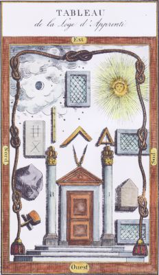 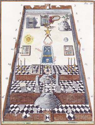
8 September 2011 Today I completed the layout for the Astronomical card game book. It looks rather good, and I will now get a proof copy made in order to correct any errors I have made in the layout. I was able to interest my colleague Paul Ferguson in the work to the extent that he has kindly translated the short descriptions from the original German. I should be able to make this available for sale in about two weeks. 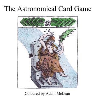 1 September 2011 I am almost half way through colouring the engravings of the Astronomical card game, which was published as illustrations in the book Das Astronomische Kartenspiel, Nurnberg, 1656. I was immediately taken by these engravings which are based on the Uranometria of Johann Bayer printed at Augsburg in 1603. The astronomical card game has the standard 52 cards with the four suits of hearts, acorns, bells and leaves which was usual for German playing cards of that period. Once I have completed the colouring I will make this into a book for my Art Books Series. 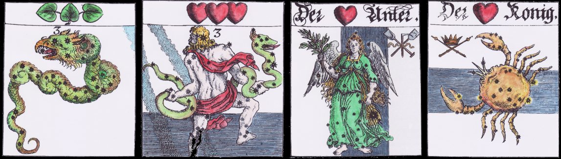
26 August 2011 A significant part of present day (indeed 20th century art) seems to be about undermining established images. Banksy, et alia, make a good living by taking established images, usually emblematic of some aspect of society, and invert, distort and satirically poke fun at them, undermining the original intention of the emblem. This art is reactive and essentially negative. Much of it is trite. One glance at it and you get the message. There is no need ever to see it again. The essence of the art work lies in the first few seconds of seeing it, and this is lost on any subsequent viewing of the piece. Thus Marcel Duchamp's L.H.O.O.Q. where he took a black and white reproduction of the Mona Lisa and inked on a moustache is not worth seeing more than once, and the same is true for Banksy's visual puns. I find myself entirely pointing 180 degrees from this position. I find value in long neglected emblematic imagery, and try and restore it and make it approachable to the modern eye. I don't wish to undermine this but to celebrate it. This is the intention of my new Art Book Series, which sadly seems not to have attracted any enthusiasm at all. I have only sold about four copies of each title. It seems I am totally out of touch with the modern mentality. I will push on with the series. One day, when the editions are sold out, I expect people will be emailing me to ask if I have any copies left. This is what happened with my Magnum Opus series. Back in the 1980s, I hardly sold any copies of these during the first few years, now they are out of print people email me continually for copies. I have tried to make alchemical texts more accessible through my publications, now I am attempting to do the same for obscure systems of emblematic imagery. 25 August 2011 Over the last three weeks I have used what scraps of free time I could manage to make coloured versions of the 51 woodcuts from the Card game of Logic, created by Thomas Murner in 1509. These are now completed and I will now move on to making these up into book form as the fifth item in my Art Book Series. This is an amazing work, fusing medieval logic, a Renaissance memory system, emblems and a card game. As always, I have adopted a subtle, naturalistic colouring scheme.  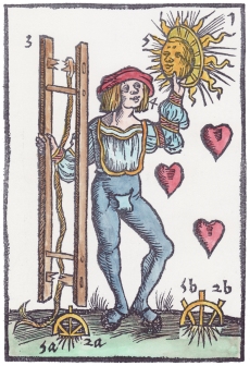
2 August 2011 I have now set up the initial four books in my Art Books Series. This is a new project I began to work on earlier this year when I discovered the high quality art printing system called Blurb. This enabled me to publish books with high quality illustrations at a reasonable price. It also took the work of printing, binding and posting copies out of my hands. This series of art books uses my coloured versions of series of emblematic engravings from the 15th to 18th centuries. I find that such artworks lie neglected and ignored in libraries, despite their invention, humour and virtuosic exploration of emblematic imagery. In general little text is included and the books are essentially books of artwork. As this material is only of interest to a few collectors, the books in this series will be limited to only 50 copies. This series of books will only engage a few people, who, like myself, take delight in this obscure emblematic material. I have researched and sourced these images then sensitively coloured these for issue in this series. The colouring makes them more approachable and readable by the modern eye. The edition is small and I will not reprint. I will hold back about twenty copies which I may sell in the years ahead when they may have appreciated in value. To see the full series go to the page I have set up for my Art Books Series.
29 July 2011 I am making a coloured version of the wonderful, though totally obscure and unknown, Card game of Logic, created by Thomas Murner in 1509. This is a set of cards intended to be played as a means for remembering the key elements and rules of the logic of that time. Each card bears various symbols which are part of an elaborate memory system. I will publish the complete series in my forthcoming Art Book series. Murner's mnemonic device is contemporary with the Hexastichon of Sebastian Brant, a visual memory aid for the events in the different chapters of the four Gospels. The Card game of Logic was used from the 16th century well into the 18th, but nothing seems to have been written down as to exactly how it was used, or how it helped one remember the rules of logic. I hope, when I am working through these and colouring the images, that I will gain some understanding of how these were intended to be used. There are so many obscure items such as this, that I intend to publish in the Art Book series. Here are the Three of Hearts and the Four of Bells. 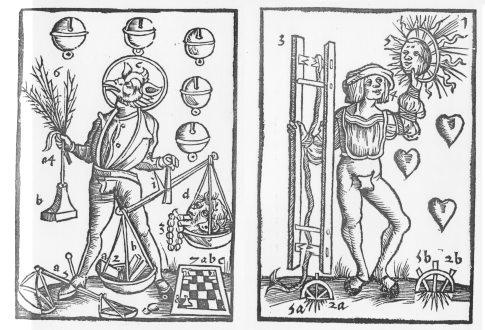
These will look amazing when coloured. I can hardly wait to get started. I do wish more people shared my enthusiasm for this material, but I suspect this will meet with deafening indifference as have most of my art projects. 13 July 2011 I have created a short (10 minute) excerpt of my Study Course on Bosch's Garden of Earthly Delights and posted it on the Photodex site. The full course is available on a CD_Rom and lasts for two hours and explores the imagery in an exhaustive way. 8 July 2011 I have, since the mid 1960s, been interested in emblematic symbolism. Initially this was in the amazing engravings, woodcuts and coloured drawings in alchemical books and manuscripts. I came to see that alchemical imagery was embedded in the wider emblematic tradition found in emblem books and artworks of the 15th through 18th centuries. In recent years I have researched and explored a number of these themes, the Planetenkinder, many series on the Apocalypse, strange alphabets, odd series of emblems on various themes, astrological and astronomical emblems, freemasonic imagery and so on. I began collecting high quality images of these woodcuts and have in some cases begun colouring these. Initially this was for my own interest, and with the hope that perhaps some people might share my enthusiasm and buy some of the prints I produced. This did not work as a project, as so few people seem interested in these old images. I sold so very few prints, despite their low cost. But I struggle on, and, despite a deafening indifference, I have now decided to issue many of these obscure, enigmatic emblems in the form of printed books, through an Art Book Series. I have recently issued some of my coloured imagery and study courses in printed form through the Blurb printing company. Their print quality is so good and their production time so short that I have decided to produce a number of art books of emblematic images through the Blurb system. These will be in editions of only 50 copies. I do this because I have no illusions about the number of people interested in this material. These will sell only a very few copies. By limiting the edition to only fifty copies, I give the purchaser the possibility of the book gaining in value once it sells out. I will hold back 10 or 20 copies which I can sell in five to ten years time. I will not gain any substantial money from this as Blurb gets the major part of the price paid, but it will be fun to do. One factor that has influenced my decision to publish material in this way, is my growing realisation that it is becoming increasingly difficult for me to do all the hand binding for the Magnum Opus titles. This year I have been hit by some skin problems on my hands which prevented me from working for long periods on the task of bookbinding. It would be wrong to shift the Magnum Opus production to the Blurb format as my customers want the hand bound leather books, so I will continue as long as I can, though slowing down a bit. The great thing about the Blurb printing is that once I have created the coloured images and set these out in book form, I have nothing more to do. Blurb then collects the payments, makes up the books to order, and posts them out to the customer. I am left to do the creative work rather than printing and making up books. These will be rather beautiful books, little text but wonderful coloured images. Over the next week or so I will set up a web page about the new Art Book Series. I do hope some of my customers will be interested in this material. What I will be publishing are obscure, enigmatic series of images, known to few. Perhaps in time people will catch up with me and come to share my enthusiasm for this material. 4 July 2011 A few months ago I found a source for high quality images of a series of rather delightful images of Hell created by Philipp Sadeler, a rather obscure artist engraver working in the early decades of the 17th century. I find his images, which appeared as illustrations in the Jesuit Jeremias Dexel's book on the horrors of Hell issued in 1631, have a rather playful sense of humour. I decided to colour these quite stark engravings. These will be made into a book for my upcoming series of art books which I will publish through Blurb in a few weeks time.  
25 June 2011 I have now completed colouring the incredibly detailed Nicolaus Haublin engraving. I have scanned it in and made a satisfactory test printing. Anyone sufficiently interested to buy a print can get one here. 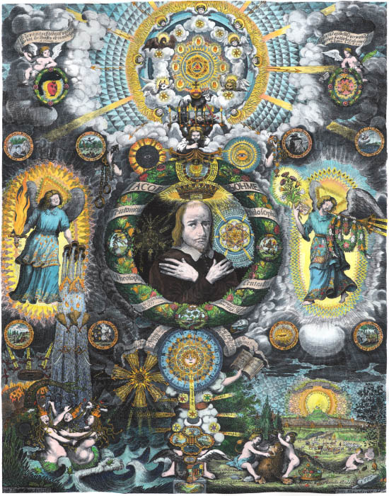
29 May 2011 I should be able to complete colouring the Haublin print during this coming week. There are still some areas to puzzle over, but it is already substantially finished. There is an interesting story behind this. A few weeks ago I was contacted by email by someone wanting to sell an original print of the Haublin engraving, which dates to 1677. He wanted my cooperation to help him sell the print, saying I was an authority on such matters and would have many contacts. Years ago, back in the days of the Hermetic Journal, I had found this engraving and managed to get a reasonable quality photograph from one of the German libraries holding a copy. I dug this out from my archives and immediately realised that it would be a great idea to make an audio visual presentation on this complex engraving. I also thought I might make a coloured version of the image. So I set to work on this. This correspondent then requested my help again. I wrote back asking what was the price he wanted for this. He replied $250,000 ! I was rather amused by this. 17th century engravings do not fetch astronomical prices like this. One can easily find engravings, even with incredibly detailed and skilled work, for $500-1500. One can even buy complete emblem books, each with many large detailed engravings for as little as $2000. There is currently, for example, a copy of the Raphael Sadeleer, Zodiacus Christianus locupletatus, 1634, on sale at the moment for just over $3000, bound with another work and containing 24 wonderful mystical engravings. What makes a print highly valued is usually the artist, thus Durer woodcuts, or Rembrandt etchings will attract many buyers and fetch high prices at auctions. Other factors that increase the desirability and thus the price at auction are if the work has some especial historical import, thus early Americana from their War of Independence, are highly prized. Sadly few people, even among specialists, have ever heard of Nicolaus Haublin. I knew him through my work on Freher, Gichtel and the other Boehmists. If you look for him on Google you will find my book on the Heart Emblems of Paul Kaym, with engravings by Haublin which I coloured, comes close to the top of the list. I wrote back to this correspondent saying that by valueing the engraving at a quarter of a million dollars I did not think he was living in the real world. Unfortunately, this was not what he wanted to hear and he rather took umbrage with my directness. He has the mistaken idea that because something is rare and esoteric it automatically fetches a high price. I wish that were true because I own a number of rare and esoteric items, and create more day by day ! Anyway, though I disappointed one individual and probably made him intensely dislike me for raining on his parade, I nevertheless was inspired by this interchange to work on the piece. 25 May 2011 This week I have scaled back on other work and set to colouring the large elaborate alchemical/mystical emblem I mentioned earlier. It is very exacting work. I find I can only do about four hours a day on it as I need the extra time to contemplate the colouring schema and to avoid losing concentration and spoiling the piece. I have made some progress but it will probably not get finished till next week. It is an astounding piece. I have enlarged it by about 150% to 28 by 22 inches (700 by 550 mm) and the detail is still amazing. I will reduce it back to about its original size when I make a print of it. Among the main problems is creating sufficient saturation of colour without burying the forms. It is essential to be using the correct size brush for different sized areas. My colouring schema draws on my experience of examining the D. A Freher mystical manuscripts. It is not a matter of chosing colour on aesthetic grounds, but these must echo the mystical ideas that the emblem is attempting to communicate and some colour correspondencies that should be respected. Thus there are subtle gradations of light and darkness, reflecting the spirit becoming more immeshed in matter. It is also important to apply many layers of colour on some areas to create a rich texture of tonalities. Mere flat areas of colour would let the piece down. So far I have coloured about 20% of the surface area. 
19 May 2011 I have today managed to obtain a fine copy of one of the most elaborate alchemical/mystical emblems. It will be an enormous challenge to hand colour, but the results should be spectacular. I hope to be able to devote most of next week to this task. Once it is complete I will use it as the basis for an audio visual study course. I will also produce a small edition of large format prints of this image. It will take at least a week or perhaps two to complete the painting. So watch this space ! 18 May 2011 I have had to divert much of my time lately to converting some of my study courses into the form of printed books. This has temporarily eroded the time I have for painting. Perhaps I will be able to find more time for this in the months ahead. I have recently sourced a copy of an amazing complex image reflecting the work of Basil Valentine. I hope to colour this as soon as I can. The little video that Pat Smith made about my work last year has now been viewed by over 1200 people. 20 April 2011 I have been working on a number of projects over the last few weeks which has temporarily meant I had no time for painting. I did manage to free some time at the weekend and completed coloring this interesting 16th century engraving. It shows the Italian explorer Amerigo Vespucci observing the South Cross, and there is a reference to a verse from Dante's Purgatorio Canto 1. This, in Longfellows translation, says: To the right hand I turned, and fixed my mind Upon the other pole, and saw four stars Ne’er seen before save by the primal people. Rejoicing in their flamelets seemed the heaven. O thou septentrional and widowed site, Because thou art deprived of seeing these! 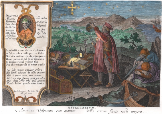
28 March 2011 I have spent about twelve hours colouring this large cosmological plate from Robert Fludd's Utriusque Cosmi Historia. I provided an extensive analysis of this in my study course on the Imagery of Robert Fludd but was always unhappy with the quality of the copies I had been able to obtain. Recently I found a high resolution scan of this large engraving that was suitable for colouring. The original plate is a large copperplate engraving spanning two pages and thus scans of photographs of this image often exhibit a problem down the central line. I have also cleaned up the background which had various scratches and pits in the copperplate so now we have a very good copy of the emblem. I will make it available in the book on Cosmological, Astrological and Astronomical emblems in the maximum page size, but I am now happy to supply it as a large A2 print. 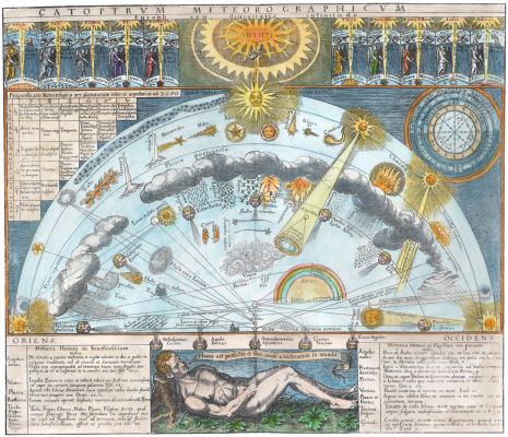 28 March 2011 Here is a wonderful image of the Astrological Man from Athanasius Kircher Ars Magna Lucis, 1646, which I coloured over the weekend. 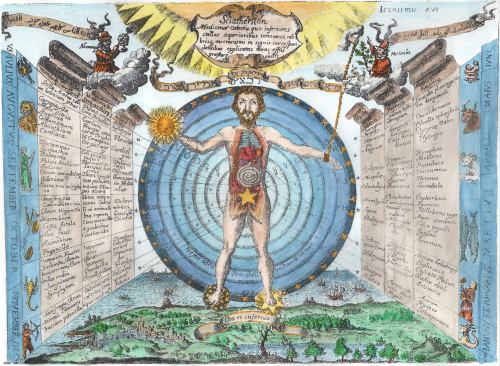 24 March 2011 Sales of my recent art book of coloured alchemical sequences have been a bit slow, but despite this I will push on with producing some further items under this format. Once the production work is done there is no further need for my input, binding, making up packets and so on, thus it is a good medium for me to use as I get older and become less able to do these things. Since late last year I have been inflicted with a number of health problems some of which are impacting on my ability to work long hours. It seems that now I am well into my sixties that I cannot merely continue as I had before, and am having to face making some changes in how I work. Among the next items for this series will be a books of Cosmological, Astrological and Astronomical emblems which I have coloured. I am still finding items for this collection. A few days ago I found a really wonderful image and spent most of yesterday colouring it. Some emblems are very complex and require many hours to complete. I would expect that the hundred plus images which I will include in this collection have taken at least 500 hours to create, and cost hundreds of pounds to source high quality scans or photographs. One of the interesting features of my work in colouring these emblems is that I have used a consistent colouring scheme, based on my experience of viewing original coloured illustrations in manuscripts and early printed books. I have avoided a mere personal aesthetic and striven to present a coherent colouring scheme. I have come across a number of other people's attempts at colouring alchemical emblems and often seen items coloured in a purely decorative manner, with the choice of colours being at the whim of the person colouring these. I hope people will come to see that my consistent scheme tries to reflect the meaning of the imagery, and attempts to use colour to reveal the enigma of the image and not merely obscure this further. There are some wonderful treasures of 15th-16th-17th century emblematic imagery awaiting discovery. Sadly, few people seem engaged by this imagery. Perhaps this will change in future. My own collection of this material is a considerable resource, but I have no idea how to preserve it for the future. Printing this material in book form is a start. 18 March 2011 Some years ago I found this interesting emblem from a book by Tobias Cohn, a Polish-Jewish physician of the late seventeenth and early eighteenth centuries. It was included in his Cohn's Ma'aseh Toviyyah, 1707. It is an allegorical emblem paralleling the organs of the body to the parts of a house. I only recently managed to obtain a sufficiently clear reasonable resolution image and have now made a coloured version. 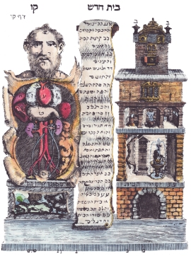 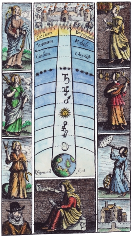 17 March 2011
I have decided to spend as much of my time this year working on emblematic imagery. I recently was able to issue an art book of my coloured versions of various alchemical sequences. I was very impressed by the print quality, the fine binding and the delivery service that the company provided, and want to produce more material in this form, so I have a number of projects in preparation. Among the first of these will be one of Astrological and Astronomical woodcuts and engravings. I already have a concsiderable amount of this material prepared but I have been gathering some more obscure and delightful items for this compilation. Opposite is a frontispiece by engraver Richard Gaywood from an unknown work of around 1660, showing the liberal arts and the planetary spheres. I have found many examples of such almost unknown items and by including these I hope to produce a good sourcebook on astrological and astronomical imagery. 4 March 2011 I recently managed to buy a copy of an old German book which had some illustrations of the amazing alphabet engravings created in 1466 by the unidentified artist only known by the title "Meister E. S.". Although these fascinate me, they are totally ignored by most people and only mentioned in the footnotes of articles by classic art historians. In order to make people look more closely at these and perhaps appreciate these beautiful engravings, I will over the next months try and produce coloured versions which help show the imagery. At the moment I only have some six or so quality reproductions of these engravings. There is an expensive book which apparently contains better quality prints, and I will have to decide whether or not to invest £300 ($500) in this book. Here is the letter 'A'.  28 February 2011 I have been very busy over the last few weeks on a number of projects. One I am very pleased with is that I have found a print on demand high quality art book publisher. I have now created a hardbound book which reproduces 546 of my coloured emblems from 34 alchemical sequences which is available now. This book represents many thousands of hours of my work, researching, locating and painting them. If there is a good response to this publication I intend to issue a number of other collections of my coloured emblems. Among these will be a volume of my coloured astrological and astronomical emblems. I have recently added some further emblem to the astrological/astronomical galleries on my website - particularly pages three and four. Here are just a few of the new items I have added 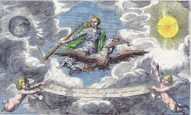 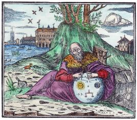 
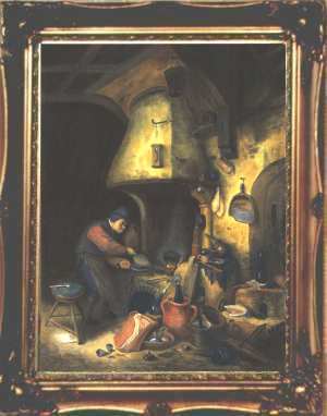
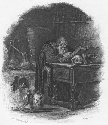
29 January 2011 Some years ago I first became aware of the visionary or fantastic art movement, particularly through the work of Christian De Boeck, who had gathered together some examples of this style of artwork and created websites. Artists, of course, are notorious for not easily fitting into categories, and this movement seems to have fragmented into a number of different labels, such as Fantastic Realism, Magic Realism, Visionary Art and so on. 28 January 2011 A colleage has pointed out to me regarding the painting and engraving, that the engraving must be later than the painting as it is a satire. It depicts the alchemist with a crooked nose, hand like a claw, frowning brow, and a bony face, an allegory of misery and anxiety and gives him ridiculous spectacles which make him look like a blind owl. The painting, on the other hand, is a sympathetic presentation of the alchemist as a sincere scholar, following in the style of David Teniers, who had in the mid 17th century established the genre of alchemical interior paintings. The satire, as is usual, must have followed the original, as it is almost unknown for an artist to take a satirical depiction and rework it in a positive way. My colleague also noted that in the painting there was a crucifix hanging on the bookcase, indicating that the alchemist was a conventional Christian and thus would acceptable to the 19th century viewer, whereas the engraving chooses to leave this out of the image. 26 January 2011 A few year ago I was lucky to find two alchemical paintings for sale by a bookdealer and was able to buy them. There was no information on the paintings, no signatures or labels, but it was obvious from the stretchers and frames that these were made at least in the late 19th century. These paintings are somewhat in the style of those by David Teniers, and visually quote from his works. A week or so ago I found on Ebay a 19th century engraving of one of these images. I immediately bought it. When it arrived yesterday I discovered that the engraving was made by Alfred Johannot, a painter and engraver working in the first quarter or so of the 19th century. This may give some pointer towards a date and possible origin of these paintings. The painting and engraving are obviously related though it is difficult to decide whether the engraving was made from the painting or vice versa, though is it more common for an engraving to be made from a painting. However this is, it may establish an early 19th century date for the paintings. It is rather good to own these almost unique items. There are few early paintings on alchemical themes available for sale nowadays, except those from the 17th century which occasionally appear at art auctions, but fetch prices over $100,000. 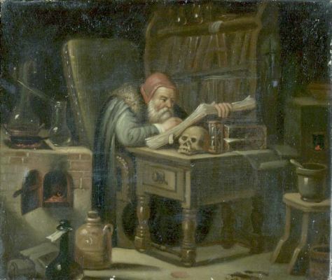
12 January 2011 There is something deeply flawed in the modern mind. During the last half of the 20th Century continuing up to the present, people seem to have become obsessed with finding hidden meaning in old paintings. The old standards of academic art history have been superseded by speculative nonsense. I have documented this in the case of Hieronymus Bosch on my website dedicated to his work, where I show the flaws in the growing number of interpretations of his work. Many of these interpretation are absurd and future generations will laugh at the stupidity of intelligent people who get lost in a tangle of contrived explanations of Bosch's imagery. It is not only Bosch who gets this treatment. Leonardo da Vinci is a well used target for such stupidity. The latest was reported a few days ago in the Daily Telegraph. An Italian art historian claims to have been able to see the numbers 7 and 2 artfully concealed in the span of the stone bridge in the background of the Mona Lisa. Carla Glori sets out the theory in a new book, The Leonardo Enigma believing the numerals are a reference to 1472, the year in which a devastating flood destroyed the Ponto Bobbio, a bridge in a village which lies in rugged hill country south of Piacenza, in northern Italy. Why on earth should Leonardo hide such an open secret in a painting. The reality is that the Mona Lisa in the Louvre suffers deep and extensive craquelure and much surface damage due to over vigorous cleaning in the past. You could probably find any symbol you wanted in the web of fine lines that make up the craquelure. It is like finding pyramids on Mars or the face of Jesus in a bagel. How such people can call themselves art historians amazes me. 31 December 2010 I recently found this painting by metaphysical artist Wolfgang Grasse (1930-2008) which reminded me of the Jacques Callot Temptation of St Anthony. 
30 December 2010 I have now completed my version of the painting by the Italian Jacopo de'Barbari entitled A Portrait of Luca Pacioli. I just realised, from this weblog, that I began that exactly a year ago on 31 December 2009. Anyway, it is now framed and on the wall of my library. It has not photographed particularly well as I did thus using quartz floodlights, but I will try again in a few days if I can get some good natural light. 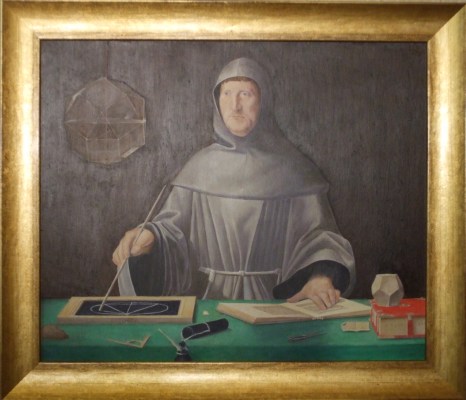 29 December 2010 I recently managed to get reasonably good quality images of some of Jacob Isaacsz Swanenburgh (1571 - 1638) paintings. He was a Dutch painter active in Leiden. The main focus of his paintings were scenes of Hell. In this he followed the imagery established by Bosch and his followers.  This reminded me of another member of the family in Leiden, Willem Van Swanenburgh (1581 - 1612), made a number of engravings from paintings. One which particularly appealed to me is from his allegories of the misuse of worldly property series. This one of a Beardless Youth Standing to Right of Devil at an Easel is after a painting by Heemskerck.  28 December 2010 Readers of this weblog will know I have little engagement with conceptual art. Today I received an email trying to sell me the catalogue for an art exhibition in Beijing entitled Stray Alchemists. Of course, I immediately searched online for information about the exhibition, only to be disappointed to discover it had nothing at all to do with alchemy and instead displayed ridiculous examples of conceptual arts. One of the main art pieces was the release of 100 spiders (species lycosa sinensis) into the gallery space. Another involved the artist spending days rolling 27,000 metres of aluminum foil into a large ball - what a waste of time. Admission to the exhibition was free. It would have to be! 21 December 2010 I have now added a number of new pages of material to my website devoted to making sense of the work of Hieronymus Bosch www.boschwebsite.com in particular some analysis and reviews of some of the interpretations that rely on seeing Bosch's work through some external textual material. The website will continue to grow, as time permits, in order that it can provide a comprehrensive survey of Bosch's work. I am particularly concerned that we return the paintings back to Bosch the artist and not steal them from him in order to advance some intellectually derived theory. I do get annoyed that people present Bosch as something he just could not have been. It is so unfair just to use this artist, steal his reputation, to articulate some half-baked theory. None of these theoretical interpretations will survive, but Bosch's paintings will. It is really unfair to present this great artist as a Rosicrucian, Cathar, Adamite, or whatever, or indeed see him working out his imagery from literary sources only available to scholars. He was an artist. Let us celebrate his art, not try and appropriate it in order to write some stupid theory. 15 December 2010 I finally managed to get some of the paintings framed that I made early this year. I had intended these for an exhibition in October that had to be abandoned, but it it good to see these in suitable frames. The first two are from the Zoroaster Clavis Artis manuscript, and the third from a version of the Buch der heiligen Dreifaltigkeit . I will put them on the wall of my work room and perhaps someone eventually might like to buy these unique items. 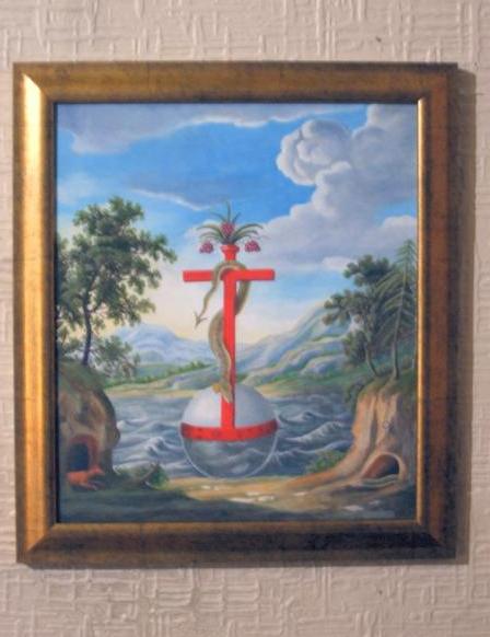
 29 November 2010
Today, I completed developing my latest study course. This is an exhaustive study of Hieronymous Bosch's Garden of Earthly Delights. This painting does not have an alchemical significance, and I do not attempt to impose such an interpretation onto it, but instead I look at each component of the work and explain it within the structure of the painting itself. This is the only significant attempt ever made to explain the painting from within itself, without imposing some external interpretation. The course consists of a high resolution exploration of the entire work. It is in the form of a video (structured into a Windows exe file) lasting 2 hours, and is provided on a CD-Rom. You can see details about the course on this page. It took six weeks of constant work to develop the course. It provides the first ever coherent reading of the entire painting. During my research I decided to set up a Hieronymous Bosch website www.boschwebsite.com dedicated to Bosch and to returning his work to the painter, as so many modern commentators have projected so much nonsense onto poor old Bosch. The reason for the study course and the website is to try and show Bosch's work as Bosch would have seen it, and strip away all the modern nonsense that has been, sadly, projected onto him. 9 November 2010 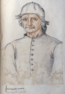 A great deal has been made by some commentators on Bosch about his "self-portrait". Indeed, some even go so far as to identify the tree man figure on
the Hell panel of the Garden of Earthly Delights as Bosch himself. I do not see such a likeness between these two images. However, it did lead me to look a little more at this "self-portrait". It turns out that this drawing in charcoal and red chalk, is one of the folios in a manuscript Recueil d'Arras, Ms 166 in the Bibliotheque Municipale d'Arras in Northern France. This is dated to around 1550 and thus not by Bosch himself. The manuscript has been attributed to a Jacques Le Boucq (ca.1520-1573) and contains many portrait drawings of historical characters - John of Luxembourg (1296-1346), Henry VII (1457-1509), Marguerite de France (1310-82) - whom Jacques Le Boucq could never have seen. Consequently, this image of Bosch is at best a reconstructed one and probably not an accurate likeness.
A great deal has been made by some commentators on Bosch about his "self-portrait". Indeed, some even go so far as to identify the tree man figure on
the Hell panel of the Garden of Earthly Delights as Bosch himself. I do not see such a likeness between these two images. However, it did lead me to look a little more at this "self-portrait". It turns out that this drawing in charcoal and red chalk, is one of the folios in a manuscript Recueil d'Arras, Ms 166 in the Bibliotheque Municipale d'Arras in Northern France. This is dated to around 1550 and thus not by Bosch himself. The manuscript has been attributed to a Jacques Le Boucq (ca.1520-1573) and contains many portrait drawings of historical characters - John of Luxembourg (1296-1346), Henry VII (1457-1509), Marguerite de France (1310-82) - whom Jacques Le Boucq could never have seen. Consequently, this image of Bosch is at best a reconstructed one and probably not an accurate likeness.
8 November 2010 I have made some further progress with my study course on The Garden of Earthly Delights. I have almost completed my descriptive analysis of the central panel. My approach is to look at the painting from within itself, rather than imposing an external interpretation onto the work. When one looks at the painting in this way it becomes more and more clear. I have explored all the small details of the work and present them in a way which makes their significance obvious. This will be the first ever reading of the painting which explains every detail and its overall message. Naturally those with their agenda driven views will criticise my approach and rubbish my study course, but it is based on the facts of the painting, the actual images depicted and the structure of the work itself, so I am sure my perspective will endure. Those interpretations driven by ideas external to the painting are merely fashions that quickly fade, whereas my perceptions rooted in a structural analysis of the work itself will continue to be relevant. Sadly, I fully expect people will just lift my ideas and perceptions, without credit, and rework them into their own. Some thirty years ago I cut up two copies of the full sized facsimile printed by Phaidon, pasted it all together and placed it on the wall of my study in Edinburgh. I lived with it for many years without penetrating though to a clear idea of what was presented there. Now, at last, having worked through masses of emblematic material, and having learnt the individual structure of similar paintings by creating exact facsimilies, I have been able to make an in-depth study of this work and reveal its structure. Bosch was not merely randomly piling image upon image in his work, everything was well thought out, and each scene placed in relationship to each other, so that a narrative emerges from the very structure of the painting. I have read most of the books interpreting Bosch and no one has explored it in this way and read the narrative. 5 November 2010 I now have collected 35 modern books on Bosch which I need in order to create my study course on the Garden of Earthly Delights. Many of these are just simple studies of the work, but a significant number are agenda driven interpretations of Bosch's paintings, attempting to explain his works within the mindset of the modern writer. I find these a flawed unacceptable approach and I would prefer that the paintings were returned to Hieronymus Bosch and not merely raided by people with some agenda. Over the next few weeks, time permitting, I will be continuing to critique the major offenders. It is the conceit of some modern writers, to push views and attitudes onto artists such as Bosch, which are just not visible in his work. In my my study course I am trying to let Bosch speak for himself, through his painting, not by my forcing meaning into it. 4 November 2010 As my study course on Bosch progresses with me currently working on the foreground section of the centre panel, I feel impelled to make a facsimile copy of the painting. I will try and do the central panel next year. It will take many months and I will work it about half size around 4 ft by 4 ft. I might be willing to sell it for around £10,000 ($16,000) so if anyone is interested in advance let me know. This will be a very fine musaeum quality piece as I have now mastered the task of painting such facsimilies. Sadly, no one seems interested in buying my paintings at the moment, but like my limited edition books, in time they will considerably increase in value. As I am unlikely to be producing books or undertaking the exacting task of painting in, say, ten years time, when I will be well into my 70s, now is a good time to buy my work. 4 November 2010 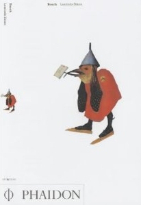 In the early 1980s I came across Laurinda Dixon's Ph.D. thesis Alchemical Imagery in Bosch's Garden of Delights. In those days I had a full size reproduction of the Bosch painting on the wall of my study in Edinburgh. I had puzzled long over its imagery, so I was open to an alchemical interpretation. I found her thesis suggestive rather than completely convincing but I kept an open mind. Later, once I had more deeply studied alchemical manuscript imagery I became less and less convinced that any of this could be the source for Bosch's painting. In 2001 I attended the Art and Alchemy Conference at the University of Aarhus, in Denmark. Laurinda Dixon presented a paper on Bosch. I was totally unconvinced by her finding alchemical apparatus and alchemical emblems in Bosch's paintings. A few years later her book on Bosch published by Phaidon appeared and she sent me a copy. I still remain totally sceptical of her approach. Nothing would give me greater delight than to bring Hieronymous Bosch into the alchemical tradition. To unite these two major interests of mine would be wonderful, but I have to remain honest to what I see and I just cannot find any alchemy in Bosch's paintings. In the early 1980s I came across Laurinda Dixon's Ph.D. thesis Alchemical Imagery in Bosch's Garden of Delights. In those days I had a full size reproduction of the Bosch painting on the wall of my study in Edinburgh. I had puzzled long over its imagery, so I was open to an alchemical interpretation. I found her thesis suggestive rather than completely convincing but I kept an open mind. Later, once I had more deeply studied alchemical manuscript imagery I became less and less convinced that any of this could be the source for Bosch's painting. In 2001 I attended the Art and Alchemy Conference at the University of Aarhus, in Denmark. Laurinda Dixon presented a paper on Bosch. I was totally unconvinced by her finding alchemical apparatus and alchemical emblems in Bosch's paintings. A few years later her book on Bosch published by Phaidon appeared and she sent me a copy. I still remain totally sceptical of her approach. Nothing would give me greater delight than to bring Hieronymous Bosch into the alchemical tradition. To unite these two major interests of mine would be wonderful, but I have to remain honest to what I see and I just cannot find any alchemy in Bosch's paintings.
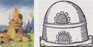 One has to retain historical context otherwise ones view becomes totally subjective and worthless. Bosch lived before the phase of alchemical printing, so he could only have been exposed to a few alchemical manuscripts which had emblematic imagery. Linking his depictions to images from engravings and woodcuts from a century later seems worthless to me. An example of this can be seen on p246 of Laurinda Dixon's book where she parallels one of the towers from left panel of the painting with a woodcut from Libavius from 1606 (a century later). Her commentary illustrates her way of thinking about these matters, indicating that in the image shown "...Bosch illustrates the cleansing of impure gases and the circular rise and fall of condensed vapours into liquid, as described in many alchemical texts. Furthermore, the hut-shaped hillock through which the white birds enter at the bottom left corresponds in shape to a type of rounded furnace ... that appeared in manuals throughout the seventeenth century." This appears to me as a kind of muddled thinking, looking for alchemical parallels where none exist, seeing the painting through an alchemical telescope. To me it is an entirely unconvincing book, and hopefully will eventually be reduced to a mere footnote in Bosch studies.
3 November 2010  Poor old Bosch ! This book by Kurt Falk The Unknown Hieronymus Bosch, issued in 2008, disgraces this great painter. How can an intelligent person like Kurt Falk be so unsympathetic to Bosch as a real living person. Falk is a believer in the turn of the century Austrian "clairvoyant" cultist Rudolf Steiner. Steiner claimed to have a spiritual perception way above all other people, so he could not be criticised. He presented his opinions as spiritual perception with which one could not quibble, after all we mere mortals could not see into the inner workings of the spiritual world as he could. Steiner's nonsense has survived him and there is still a flourishing group of people who totally and unquestionably believe in his pronouncements. This is all very well when these anthroposophists stay in their own limited world, who cares if some people need to believe in some system of ideas, that is their existential problem, but it is annoying when they push their nonsense onto real people such as Hieronymus Bosch. Falk throws his barrage of esoteric theories at Bosch's paintings, presenting our painter as some kind of initiate, with some task to enlighten humanity. He draws on earlier Bosch commentators, Fraenger and Wertheim-Aymes and wheels out a mass of esoteric ideas of which Bosch knew nothing, 'Kamaloca', the planetary periods invented by Steiner in his book Occult Science, 'Rosicrucians' in 1505 over a hundred years before the first appearance of the idea in the early 1610s, Ichthus worlds (whatever they are), three streams of mankind, planetary incarnations of the earth, a formation of a new earth karma. All these things and many more have nothing to do with Bosch. He never heard of them. They are inventions of 20th century esotericism and Steiner's imagination. Falk read this back into Bosch's work. Poor old Bosch is buried in esoteric gobbledegook. I feel sorry for Bosch. But I feel angry that an intelligent person is so obsessed with such esoteric nonsense that he needs to vent this on one of the greatest of early Netherlandish painters. Nice pictures though. One could always cut them out and throw the useless text away. Poor old Bosch ! This book by Kurt Falk The Unknown Hieronymus Bosch, issued in 2008, disgraces this great painter. How can an intelligent person like Kurt Falk be so unsympathetic to Bosch as a real living person. Falk is a believer in the turn of the century Austrian "clairvoyant" cultist Rudolf Steiner. Steiner claimed to have a spiritual perception way above all other people, so he could not be criticised. He presented his opinions as spiritual perception with which one could not quibble, after all we mere mortals could not see into the inner workings of the spiritual world as he could. Steiner's nonsense has survived him and there is still a flourishing group of people who totally and unquestionably believe in his pronouncements. This is all very well when these anthroposophists stay in their own limited world, who cares if some people need to believe in some system of ideas, that is their existential problem, but it is annoying when they push their nonsense onto real people such as Hieronymus Bosch. Falk throws his barrage of esoteric theories at Bosch's paintings, presenting our painter as some kind of initiate, with some task to enlighten humanity. He draws on earlier Bosch commentators, Fraenger and Wertheim-Aymes and wheels out a mass of esoteric ideas of which Bosch knew nothing, 'Kamaloca', the planetary periods invented by Steiner in his book Occult Science, 'Rosicrucians' in 1505 over a hundred years before the first appearance of the idea in the early 1610s, Ichthus worlds (whatever they are), three streams of mankind, planetary incarnations of the earth, a formation of a new earth karma. All these things and many more have nothing to do with Bosch. He never heard of them. They are inventions of 20th century esotericism and Steiner's imagination. Falk read this back into Bosch's work. Poor old Bosch is buried in esoteric gobbledegook. I feel sorry for Bosch. But I feel angry that an intelligent person is so obsessed with such esoteric nonsense that he needs to vent this on one of the greatest of early Netherlandish painters. Nice pictures though. One could always cut them out and throw the useless text away.
2 November 2010 I am making good progress with my audio-visual study course on Bosch's Garden of Earthly Delights. As of today it has amounted to 40 minutes and I am about half way through. I expect the complete production will be at least 90 minutes. It will fit on a CD-Rom. This is my purely descriptive account of the painting - no theories, no speculation, no ascribing to Bosch ideas that he would have had no access to. Instead of pointless theorising and speculation, I show all the structural components, which many people just do not see when they look at the work. In a sense I am applying the methods I used in my analysis of emblems in some of my other study courses. While creating this course I have bought all the books by art historians and other commentators. My impulse to create this course, arose from my reading yet another empty, pointless speculation on the meaning of the painting, so I would like to begin a survey and critique of these various "interpretations" amd will enter these into this weblog over the next month or so. As luck would have it only a few days ago, BBC 2 televsion, here in the UK, had a program devoted to this one painting. This was presented by Matthew Collings, a British art critic and broadcaster. His account was rooted in the material in the painting, with some diversions to look at Bosch's background, patrons and later owners of the painting, so he was not peddling a pointless theory, however, I do find Matthew Collings at his weakest when he tries to pad out his account, as he then waffles and it is obvious he does not really have any insight to share. This is, sadly, a failing of the television documentary format, in that the presenter is supposed to have a deep understanding of the material. I saw the next in the series, again by Collings, this time on the Baptism of Christ by Piero della Francesca, a relatively simple painting and the poor presenter was struggling so hard to rise above repeating empty platitudes. Padding out 60 minutes proved more difficult than with the Bosch. 27 October 2010 Over the last few weeks my hands have become afflicted with a skin problem which unfortunately opens up raw areas. This means it is impossible for me to consider painting at present, as the oils would probably irritate the condition even more. I have ordered a special UV lamp which apparently can help in some cases. In the meantime I am immersing myself in creating the audio-visual study course on the Bosch painting. So far I have created just under 12 minutes. I expect the course will run for about an hour. It is exacting but extremely interesting work. 21 October 2010 A few days ago I was in the University library looking at a manuscript and early book, and I decided to take a glance at any recent art historical studies of Bosch's Garden of Earthly Delights. I borrowed a couple of large volumes and a few nights ago I began to read these to see what insights they had brought to bear on this magnificent painting. As I read I became increasing dismayed, as I realised that, once again, I was being asked to step into someones agenda, the writer's pathetic little theory. Poor old Bosch was pushed to the side as they proceeded to press their own interpretation onto his painting. Later I beacame quite annoyed. To Fraenger, Bosch was an Adamite, while Lynda Harris had him as a crypto-Cathar. Laurinda Dixon could only see alchemy in the painting, though Erica Fromm gave us a Freudian psychoanalytic interpretation. Numerous less sophisticated interpreters see Bosch as depicting psychedelic hallucinations due to him ingesting ergot or magic mushrooms. There are a whole slew of other interpretation struggling to fill our bookcases. It is really very sad. Where is Bosch in all this? These commentators are so taken up with their theories that they merely look at the painting to find confirmation of their own ideas. Bosch is marginalised. His painting fair game. So I decided to do something about this. A small something that will be quickly ignored no doubt, but it will at least make me feel I have done something to hopefully give the painting back to Bosch. I am creating an audio visual exploration of the painting. No interpretation. No McLean's pet theory. Instead I will just explore the imagery and structure of the painting from within the work itself. This is not a particularly difficult thing for me. This is the way I look at paintings. I have realised that it is a pointless exercise to merely project ones own ideas onto a painting. Rather one must read the painting from within itself. Such an attitude, of course, is far adrift from the way people today look at art, but I can live more comfortably with myself with this approach as I feel it leaves the artist in place, still owning his work. This audio visual course will take some time to create but I have at least made a beginning. It is unlikely with my present workload that I will be able to complete it within the next few months, but I will try and devote a day or so a week to it till it is complete. 10 October 2010 I seem to have almost abandoned this art weblog. This resulted from my having to shift my work away from painting towards book production during the later summer. I had been hoping to have an exhibition of my paintings in October, but this fell through. Now that I have more time for art again, I find myself impelled to work on a massive project, my Tarot Art Database. Over the last five years I have become aware of an explosion of modern tarot artwork, and the production of much wonderfully creative envisaging of the familiar tarot imagery. As there were no library resources or public collections, I began collecting tarot deck, and now have possibly the largest and most comprehensive in the world, with over 2100 decks at this time. I tried to interest art historians in this material but they marginalise tarot art and affect indifference. There are many tarot enthusiasts, but for the most part thay are only interested in tarot reading and divination and have little appreciation of tarot as artwork. So I set myself the task to try and generate some interest in the artwork of modern tarot decks. It has become clear to me in the last few weeks that what is essential for tarot art to become more appreciated is a comprehensive online database where people can see a listing and analytical description of all the modern tarot decks. So I have begun this task which will take possibly a year of concerted work to complete. A beginning has been made, with over four hundred items entered so far. I have begun by focussing on some of the lesser known decks, those from Japan, Taiwan, Korea and China, and will gradually work through the different countries over the next months. This can only be achieved by having the decks in hand, so my collection is key to developing the database. So although I might seem to have abandoned art, I am in fact working long hours creating an important resource for developing interest in the neglected artwork of modern tarot. 11 June 2010 Today I received the latest painting I have commissioned for my Splendor Solis art Project. This is very beautiful miniature painting by Chilean artist Alicia Thayer Morel. You can see more of Alicia's work on Flickr, a slideshow about an exhibition in 2009. Alicia Thayer has also created a wonderful tarot deck. I know many people think this to be rather pointless project and a waste of my money and time. I am collecting a number of envisagings of this classic alchemical image by modern artists in order to demonstrate ways in which the power of an alchemical image can still inspire modern artworks. One day I will have an exhibition on this theme. It will probably receive no support from the world of art galleries and I will have to pay for this myself, but I hope one day, long after I am gone, that this little collection will survive somewhere and will delight someone as much as it does me.  4 June 2010 Last year a local filmaker, Pat Smith, made a video of my exhibition at the Glasgow School of Art on the Artwork of Japanese Tarot . I was very pleased with this record of the event, that I decided to ask Pat to make a short video to help promote my artwork. We finished this a few weeks ago and we have now made it available on YouTube. I am also distributing it free on disc in higher resolution to some of the people who buy my books, prints and study courses. Hopefully it gives some insight into my motivation and the sources of my enthusiasm for emblematic imagery. 14 May 2010 Yesterday was primarily spent on filming a short video about my artwork. This is primarily intended to help promote my artwork, as I would like to be able to devote more of my time to painting over the next years. This does mean, I have to be able to sell more of my work, as I cannot afford merely to put many hundreds of hours into creating paintings for my own interest. I have to be able to generate some income from painting. Of course, this is difficult, as my paintings are so very detailed and require such a large input of time, that I have to price them quite high. These are not mere smeary messes that people can knock off in an afternoon - each painting takes between 30 and 60 hours of work over about a month. The video, hopefully, will show something of this, and I will give away copies to people who buy my books CD-Roms and prints. Shortly I hope to be able to announce another interesting project involving my art. 11 May 2010 My latest painting is nearing completion. This is taken from a manuscript of the Buch der heiligen Dreifaltigkeit, one of the earliest alchemical works with emblematic imagery.  21 April 2010 A few days ago I watched an interesting yet amusing two part documentary on Goldmsmith's College. This is the world famous art school component of the University of London. It is at the leading edge of contemporary British art. The documentary focussed upon a number of students, showing them working on their final year projects and then following them up for the year after they had graduated. I found many of their attitudes and work very amusing, but one really stood out, and she actually received a first class degree and the highest grades of her year. Her main piece of art was created by her going into shops and stealing small items of jewelry by swallowing them. Then, they having passed through her body, she retrieved them somehow, and mounted these as her art piece, documenting the theft as an essential part of her art work. She stole a plant from a botanical exhibition by Turner prize-winning artist Simon Starling, and again this, together with the documentation of the theft, was another of her major pieces of work. I feel so far removed from this ridiculous posturing. Contemporary art is now merely a part of the entertainment industry, the comedy section. Sadly, the joke once made fades and dies rapidly, like the conceptual grafitti of Banksy, the message of which one gets in the first glance, so there is no need ever to look at it again. No doubt the artist in that documentary will struggle on for a few years with her theme of stealing other peoples art, but the point is made and there will be little to be gained from further repetition and thefts - like the slashed canvases of Lucio Fontana in the 1960s, he made his point with the first, why go on to make hundreds of them ? 21 April 2010 I have now almost completed the other image from Zoroaster des Rabbi und Juden Clavis artis. 
7 April 2010 I have been working on one of the images from a late 17th or early 18th century manuscript Zoroaster des Rabbi und Juden Clavis artis. This has a number of rather beautiful coloured illustrations, among which are two full page images that are placed at the opening of two of the sections of the manuscript. I have made some progress on painting one of these, the snake crucified on the orb. It still needs a lot of work on the details. I hope to work on the other one in a few months time. 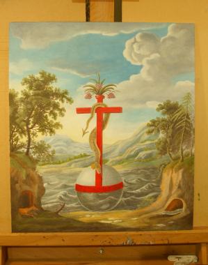
29 March 2010 This weekend I finished colouring the Baldung Grien series of planets woodcuts. I have now made this up into the form of a print, which will be available on my astronomical/astrological prints series. 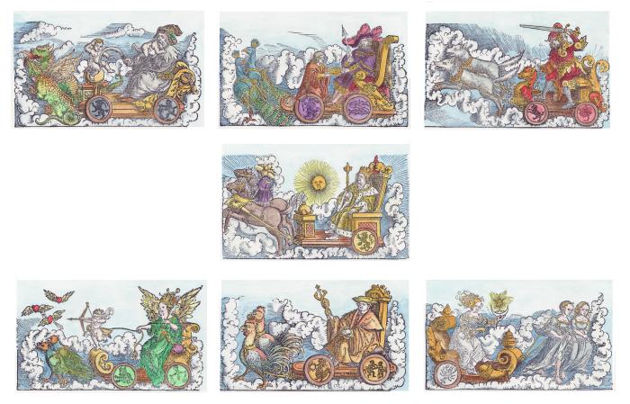
26 March 2010 In the last few days I have been making some progress on an oil painting that an american gentleman commissioned me to make for him. Undertaking a commission is a good way to work as one is not painting on spec, investing ones time hoping that one can sell it one day, but one has a definite sale. I have had a few commissions for works in the past, but not recently. My paintings are quite expensive as they are very detailed and can take fifty hours (or even more) to complete. I work in a small size - say up to 20 by 15 inches as I see my work as being domestic pieces rather than for exhibition in galleries. I also like to work smaller as I enjoy the challenge of creating the detail. I charge about £600 ($900) though this will vary according to how difficult the work is to copy. I have now put up a page with some details on the methods and materials I now use. 16 March 2010 A year or so ago I found a fine image of the Chariot of Luna, a woodcut from John Indagine Introductiones Apotelesmaticae, 1522. A few days ago I discovered that this woodcut was created by Hans Baldung Grien (c. 1480–1545) and that he has made one for each of the planets. So I have obtained copies of these and will, whenever I have the time among all the projects I am trying to work on at the moment, make coloured versions of these, and perhaps print them out on one of my large format prints. 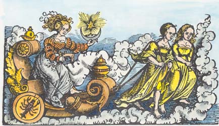
3 March 2010 I have been commissioned to produce a painting of one of the Masonic tracing boards which have always intrigued me. 2 March 2010 In the last week or so I have begun making facsimiles of an almost unknown series of 13 emblematic images from an alchemical manuscript by Gualdi. I have been able to make a little progress though there remains a lot to do. I will use these as the illustrations for an edition I am proposing for the Magnum Opus series, together with the text, which a colleague is currently translating for me from the Italian. 
9 February 2010 Over the weekend I completed colouring a late 15th Century German engraving of the Temptation by Master LCz (active ca.1480-1505). This is the temptation of Christ in the wilderness rather than a Temptation of St Anthony, however, I was rather drawn to the image of the devil, which so reflects the images of the demons in the Temptation of St Anthony engraving by Martin Schongauer made about three decades earlier. The wilderness here would appear to be situated in somewhere like the Rhine valley.  27 January 2010 For a bit of a break from the task of making up my latest tarot deck, I decided to have a go at colouring Durer's Melencolia engraving of 1514. It proved to be a more challenging task than I originally thought, and I spend much more time thinking about how to colour the various components in the image than actually on the task of painting. The problems of colouring lie in trying to keep to some naturalistic style and resist the temptation to colour a component in some artificial way, but at the same time separate the forms which can get muddled up by the saturation of the engraved lines. In a week or so I will return to it and make some adjustments, then I will put it up on my art prints site. 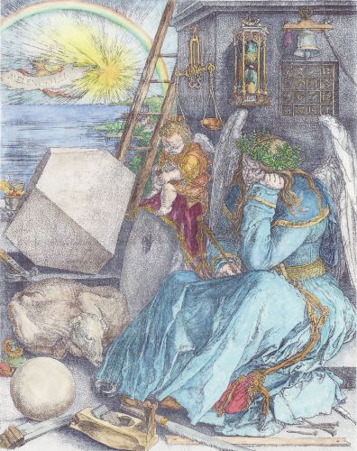 25 January 2010 A few years ago I came across a painting by the unidentified Master of Cassoni Campana. This painting now at the Musee du Petit-Palais in Avignon presents the story of Theseus and the Minotaur. I was very attracted by the image of the Labyrinth as a kind of walled garden. This painting was made between 1510 and 1520. 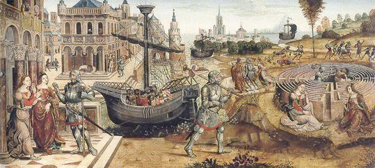 A week or so ago while looking through a book of 15th Century Italian engravings I discovered a Florentine engraving on the same theme from half a century earlier - 1460-70. I suspect the later painter had seen this engraving or a work copying it, as his imagery for the Cretan Labyrinth is so similar. A few days ago I finished making a coloured version of the Italian engraving. At one time I had considered making a facsimile painting of the version by the Master of Cassoni Campana, but I am happy for now with colouring the earlier engraving. It will make quite a nice large format print, so I will add it to my prints site next time I update it. 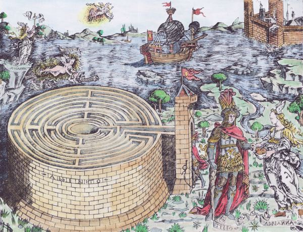 31 December 2009 As a bit of a break from the Temptation of St Anthony paintings, on which I am working at present, I have in the last few days began work on a painting I have admired for years because of its amazing depiction of a complex three dimensional polyhedron. This painting by the Italian Jacopo de'Barbari (ca.1440-1515), now in the Palace of Capodimonte in Naples, entitled A Portrait of Luca Pacioli, was made in 1495. The painting of the polyhedron always fascinated me. It is a rhombicuboctahedron, an Archimedean solid with eight triangular and eighteen square faces, here it appears to be made of glass and also half filled with water. The figure in this painting is the Franciscan friar Luca Pacioli (1445 - 1514) who had a great interest in geometry and wrote some books on the subject. I am amazed at the painting of the polyhedron which needed a deep understanding of perspective as well as reflection in the transparent medium. Some historians suppose that Barbari enlisted the help of Leonardo da Vinci. Certainly Leonardo had mastered the drawing of polyhedra. Some others even suggest that Barbari had access to a glass model of the rhombicuboctahedron to use as a model when making his painting. I cannot quite believe this. It would challenge a craftsman today with modern materials (epoxy resin glues especially) and equipment to make such a model. I have only just roughed in the forms, though I spent a lot of time on the rhombicuboctahedron. Apart from the problem of the colouring of the different layers of glass, Barbari also includes the reflection of a window, which is internally reflected three times. My copy is now about a third finished as there is much detail needed to the objects on the table, and in modelling the forms, and making them integrate with their backgrounds. Those who know this painting will immediately realise that I have chosen not to include the figure of a young man in court dress who stands on the right watching rather superciliously or disdainfully (to my mind at least) over the shoulder of our friar. This figure troubles me. He stands a bit back behind the friar yet overlooks him. The lighting of his hands and arm is strange as this should be within the shadow of the friar. I find him an intrusive figure and much prefer to paint the scene without including him. 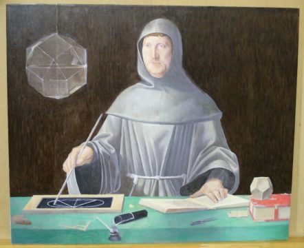
28 December 2009 I just discovered that one of the Temptation of St Anthony paintings by Jan Wellens de Cock (ca.1480-1527) has been through a bit of an adventure. It had been stolen together with numerous other works of art from the National Museum in Warsaw by the Nazi authorities in November 1939. In January 2007 the Wawel Royal Castle in Cracow came into possession of a bequest from a private person, which included, among other objects, the looted Temptation of St. Anthony painting by Jan Wellens de Cock. Happily the painting, though looted, appears to have been well cared for, and is now returned from the shadows to be seen openly again. 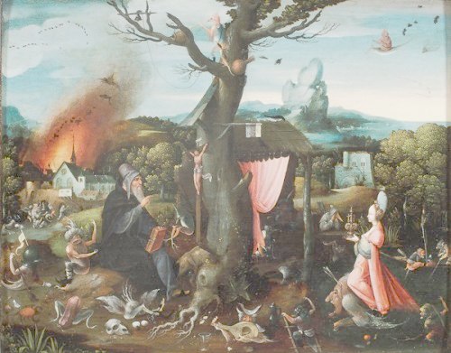
This is, obviously, related to the painting in the Fine Arts Museums of San Francisco. 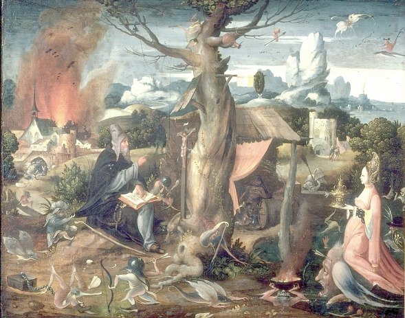
27 December 2009 Over the last few years I have often felt a bit insulted when someone compared the kind of facsimile painting that I undertake to the rubbish churned out from China often described as 'Museum quality hand painted oil painting reproductions'. These people usually show scans of the original paintings rather than their painted copies, as these would be of such low quality that few people would be stupid enough to buy them, however, some of their customers, obviously unhappy with the painting they received, try to sell them on Ebay and then they have to show a photograph of the painting they received from China. I was rather amused today to find that some of these suppliers of 'Museum quality hand painted oil painting reproductions' are now offering to give their wonderful creations a craquelure (that is, give them the fine network of cracks seen on old paintings). Who on earth would want this? I recently finished painting the wonderful Mary Magdelene by Rogier van der Weyden. This painting was much damaged by craquelure, especially in the white pigment, and the face. It was a delight to be able to paint a copy close to how the original would have looked when Rogier van der Weyden painted it and not some centuries later when the paint layers had shrunk and produced craquelure. What would be the point of then artificially adding craquelure? I can only suppose it is to cover up the poor quality of the painting. 21 December 2009 I finally finished my coloured version of the Jacques Callot second version of the Temptation of St Anthony. I scanned it at high resolution and printed out a copy. It printed quite well so I will make it available for sale on my Emblematic Art site. 
15 December 2009 I recently found this artistic statement by the surrealist artist Manfred von Pentz. It is well worth looking at his work on his web site www.manfredvonpentz.com At a time when the Fine Arts have been debased and nearly destroyed by clever barbarians who invented a faeces culture that proclaims mindless splashes of colour, soiled bedsteads or vagina-plastered Madonnas as art, this painter has joined the small band of artists who quietly fan the brightest of all flames: our marvellous, never surpassed Christian-European inheritance. In other words, he tries to produce figurative and metaphoric canvasses that would have effected a nod, no matter how faint, from his forebears, the incomparable Great Masters. 15 December 2009 Somehow I managed to find some rather attractive antiqued gold frames for the series of oil painted facsimile paintings I made of the Bonacina series of ten alchemical images. The paintings are quite small, 7 by 5 inches (177 by 127mm), but they look rather fine when individually framed in this way. I would only consider selling them as a complete set. When hung together in a close array they occupy 38 by 20 inches (950 by 510 mm) of wall space. I will now have to think about setting a price. The ten detailed paintings each took quite a number of hours to complete. 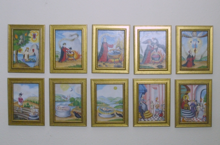
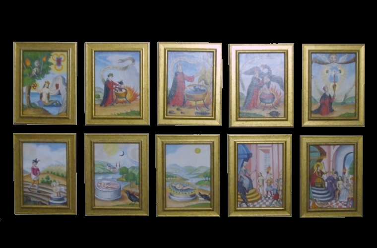
13 December 2009 Tonight I found that an 18th century oil painted facsimile of the Jacques Callot engraving of the Temptation of St Anthony had been sold in June this year at an art auction at Christies. It is quite a large painting on canvas and the greater intensity of the oil pigments create wonderfully atmospheric effects - one can almost smell the smoke. It sold for 49000 Euros ($68,000). 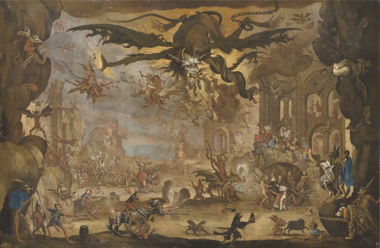
13 December 2009 Over the last year I have become increasing engaged by the depiction by artists of the Temptation of St Anthony. The ways in which the treatment of this theme changed over the centuries, reflects changes in the nature of cultural and religious ideas in European society. It is a fascinating study, at least to me, though I do not seem to have enthused many others with the importance of this theme. I have begun creating a graphical database of all the known artworks on this theme. At the moment I have information about 200 items but am now trying to gather these together systematically. I spent a few days on this already and have been able to enter about forty items. It will take many months before I have anything approaching an exhaustive database. A few days ago, while searching through a pile of my papers, I came across the well known Martin Schongauer engraving, which I had begun colouring about two years ago but must have put to one side. So I set to work this weekend and finished the colouring. It is a remarkable piece. This image created between 1470 and 1475 predates the imagery of Hieronymous Bosch by a decade or so. 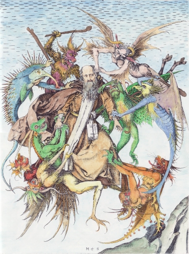 7 December 2009 The last few days I have been working on colouring a single engraving. This is the amazing second version of the Temptation of St Anthony by the seventeenth century engraver Jacques Callot. It has absorbed about twenty hours of my time so far, and I estimate I must devote about another twenty hours to bring it to completion. I have coloured most of the forms, but now must work on some of the small details and merge the colours in adjacent areas where they contrast too much against each other. Also I have to darken some of the colouring. One has to be tentative with watercolours as there is no way to correct errors, so it is best always to make the colouring less saturated and revisit it later to darken it a trifle. I always aim for a naturalistic and subtle colouring that respects the original artwork. This has been quite a challenge. The image is large, about 360 by 460mm, and already looks quite striking. I will temporarily mount it on my wall so I can just look at it occasionally to see how to solve some of the remaining problems with the colouring. I will let it rest a few days and hopefully return to it later in this week. Anyway here is the rough version which will be improved upon later. This image was taken with a digital camera, and it is consequently difficult to get the colours right with the low colour temperature of indoor lighting. When it is finished I will scan it in sections on my A3 scanner and patch the image together. Of course, many people think me quite mad to do such things, but I aim to make these amazing neglected artworks more approachable to the modern eye. I have so very often tried to enthuse people with the wonders of an old engraving, only to be met with a blank look. How exhausted the modern eye has become, not to be able to see the value in these old engravings. 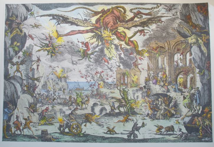
2 December 2009 Further on the drolatiques, I remembered that Salvador Dali had created a set of drawings based on these images. This was one of Dali's later productions, dated to 1973, and his drawings were issued as lithographs (in two sets, one of which was rather crudely coloured). Dali, of course, elaborates on the image, often almost burying it in accretions of his ideosyncratic imagery, often revealing his sexual obsessions. In this example, he takes up the funnel like image and works it into an elephant form, which seems to me a bit trite. Although it is interesting that Dali chose to rework wthese images, I much prefer the spare simplicity of the originals 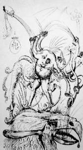 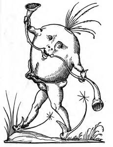
2 December 2009 I recently managed to get access to some high quality images of the complete set of one hundred and twenty drolatiques, the wonderful parade of grotesque comic characters associated with the Pantagruel of Rabelais. These woodcuts were printed in a book of 1565 Les Songes Drolatiques de Pantagruel, and are considered to be by a Parisian engraver named François Desprez. The imagery echoes Bosch and Brueghel and also draws on the tradition of incorporating such grotesques or drolleries as decoration in medieval manuscripts. I had great fun this morning colouring a few of the items. I hope to colour the complete series over the next few months. 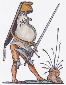 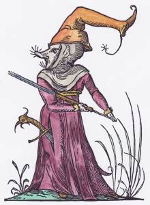 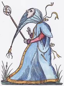 
1 December 2009 I have now framed up some of my coloured images of the Temptation of St Anthony and related themes. Eventually I hope to be able to have an exhibition on this topic, perhaps in a year or so. 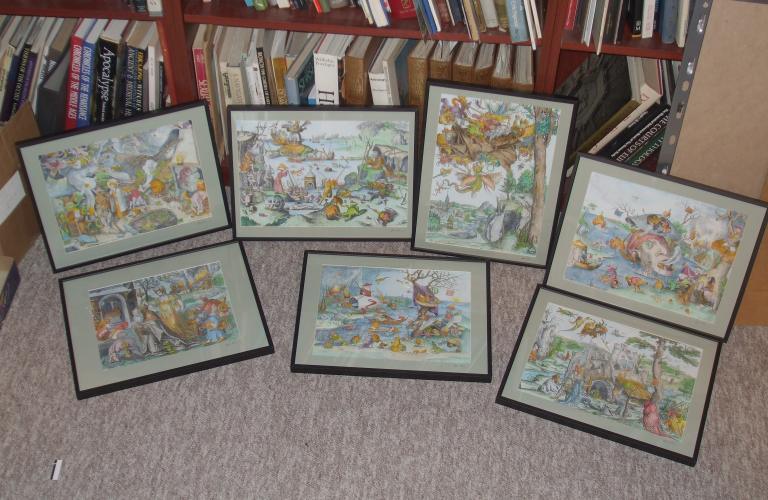
30 November 2009 I continue to push on with the Temptation of St Anthony series. I have now completed colouring another engraving, this one being engraved after a painting by Marten de Vos, the late sixteenth century Antwerp painter. I have not been able to see the original painting. There is another better known painting on the same theme by Marten de Vos. This one includes the temptation or teasing of the demon musicians. 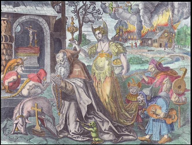
26 November 2009 This morning I finished mounting and framing up the Brueghel Seven Deadly Sins series which I had handcoloured during the course of this year. They look rather fine in their frames. I hope to incorporate these into an exhibition over the next year or so, then I would be willing to sell these. 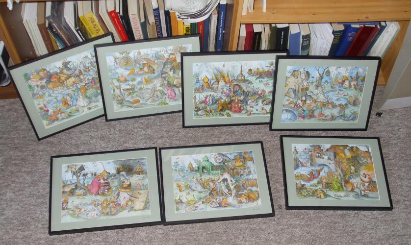
22 November 2009 Over the last month I have had to devote much of my time to other publishing projects so have not been able to do any painting. I managed to find time this weekend to finish off my coloured versuion of the Brueghel Patience engraving. I have now bought a set of frames for the Brueghel Sins series which I hope to exhibit next year. These should arrive next week. 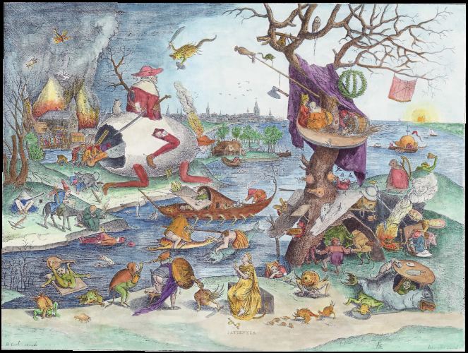
14 October 2009 The Turbine Hall at the Tate Modern Gallery in London has just installed a conceptual art piece at the considerable expense of Unilever PLC. It consists of a large light free container which the art enthusiast can step into. They immediately cannot see anything. The idea of this art piece is to provide the absence of any visual material. Art is nothingness, art is a black hole, dark energy, so many ideas seem quickly to come to mind. It is one step up (or is it down) from the Turner prize winning piece from a few years ago which presented an empty gallery in darkness and a light switch. Well, I have a confession to make. I actually have one of these black hole pieces in my apartment. I call it "My Hall". It has no windows and if all the doors opening into it are closed, then I find myself entering into a similar dark space. This saves me the expense of time and money of traveling to the South bank of the Thames to see this wonder of modern art. Amusingly, for me but not for those keen to see this piece, it had only been open a few hours when it claimed its first casualty. A visitor was injured in the pitch-black art installation when he walked into a wall he could not see. Now I sympathise with this art enthusiast, as I once stubbed my toe on a heavy box, when stupidly crossing "My Hall" in darkness. Now I always put on the light. At least I learnt something from my art installation. 7 October 2009 A few days ago I received an email from someone I didn't already know which began: "I was just looking through an art web site and came across your Gallery. Hope you are good today ? I am presently converting my Home to a guest house for Commercial purpose and would like to have some of your Renown works in the rooms of the Guest House. I tried to search for your detailed website so I can select some art works but could not get any web page that would assist me. Kindly make a selection of some of your works for 10 rooms in the Apartment so We can discuss and make payment."It seemed as if I was going to get a nice order. The next email from him seemed equally positive: "Granting you the liberty to make the choice and selection for me will me my wish. Kindly make the selection of the works bearing in mind my budget is $3,000 - $4,500 for the total amount of the works. I am going to make payment via credit card."At this point I put his name into Google and found a website for a entrepreneur and property developer with this name. So I felt quite confident that I would get a substantial order for my prints. Today I received a rather strange email from him confirming the order which alerted me to the fact that something strange was going on. "The works would be shipped to Seattle, WA. I booked the services of a wood agent and he is unable to process a credit card payment for $4,000.00. So when you get the card details you charge and deduct the amount of $6,000 from the card details."This time I put his email address into Google and this led me to a number of artists and bulletin boards on Internet fraud. Apparently this is a regular scam that this person has been using for a few years. He exploits artists using the hook of placing a large order, then asking you to charge his card for $4,000 extra dollars, and as a favour pay this to a tradesman involved in developing the "guest house" (who does not appear to have a credit card) that he owes money to. Of course, the credit card you charge will belong to some innocent person, who will not know about the transaction for a month or so until they get their statement. Then they will inform their credit card company about the fruadulent charge and they will cancel the payment. This will take up to six weeks, and by then you could well have paid the $4,000 extra and sent off your artwork. I doubt whether this individual has any interest in the artwork, and you are probably sending it to a non-existent address. Happily, being an older person and no longer easily flattered, I was able to see through the scam, but sadly some younger artists may be more gullible. This parasite obviously preys on artists.  23 September 2009 Here is the Lucas Cranach woodcut of the Temptation of St Anthony, 1506, which I almost finished colouring last weekend. It still need a little bit more work on some details in the foreground. 
21 September 2009 A couple of people have asked me about the strange bright red backgrounds to the Aurora consurgens illustrations. These, I believe, were the grounds for diaper work that was not actually undertaken. It was usual that medieval manuscripts were created by a number of different artisans, limners, scribes, painters, and often a final stage when it was passed to a specialist to create the diaper patterns, small decorative elements set in a square or diagonal grid of lozenges. Often these had applied gold leaf. Here is an example of such diaper work in a manuscript of some works of Bartholomaeus Anglicus. 
There is a rather fine article on diaper patterns in medieval manuscripts at www.jehannesjewels.com/3.6Diaper_Patterns.pdf 10 September 2009 I have almost completed creating a corrected copy of another image from the Aurora consurgens manuscript. It still requires a little more tweaking and cleaning up. One of the interesting aspects of this well known image is that it has been described as a battle between the Light Sun and the Black Sun. The Black Sun does appear in a very few alchemical works - the Ripley Scroll, the Kelly 'Theatre of Terrestrial Astronomy' and in an image in Mylius' Philosophia reformata - but is not mentioned in the Aurora consurgens. Instead the black headed 'Sun' is an artefact, well known to anyone familiar with medieval manuscripts. Illuminated manuscripts often had gold and silver leaf applied to parts of images. This was laid onto a cushion of gum and then burnished to a high gloss. Now gold does not tarnish as it is chemically inert, but silver on the other hand is attacked by sulphur oxides or hydrogen sulphide in the air and develops a black patina. This blackening has been interpreted by some people, unaware of this aspect of silver leaf in manuscripts, as an intention of the artist and writer. Sadly, I have on a few occasions had to disillusion people about this 'Black Sun'. They are usually unhappy about this and in a few cases even thought me to be foolishly mistaken. The 'Black Sun' image is one that Jungians and other esotericists are strongly drawn to and thus invest their belief in. They are often not very amenable to having their 'Black Sun' taken away from them - but truth remains truth, however much one wishes to believe in a contrary viewpoint. This image instead is about the opposition of Sun and Moon as is seen in the section of text in the Aurora consurgens which this image serves to illustrate.  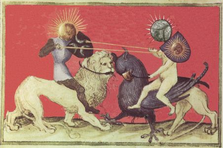
6 September 2009 I have spent about a day and a half correcting two images from the Aurora consurgens. Working on very high resolution images I pasted small patches of colour onto areas of the image from which the pigment had been lost, and using some other methods of redrawing the imagery. Rather painstaking work. Some images from the original manuscript suffered at the hands of a vandal who was so offended by sexual imagery that he felt impelled to scratch out and damage areas of images that offended him. The hermaphrodite image, the first in the manuscript, was damaged in this way but I have been able to see to some extent through the scratchings out and restore it a bit closer to the artist's original intention. These restored images will be printed in my forthcoming edition of the work. 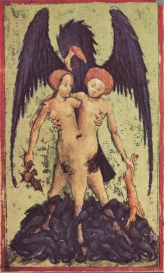 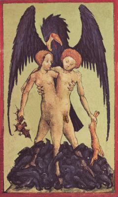
4 September 2009 Over the last few weeks I have had to divert all my creative energy and time away from painting in order to work on an edition of the Aurora consurgens an early alchemcial manuscript, which is thought to date from the late 14th century or early 15th at the latest. It is an important alchemical work and contains a series of twenty six emblematic images, which are among the earliest alchemical emblems created. The manuscript was created in the same way as a illuminated manuscript of that period. The Aurora consurgens is much misunderstood due to an incomplete and agenda driven publication made in the 1960's which has overshadowed it ever since. It is my intention to issue the work (in translation) in its original form so that people can appreciate fully what its author intended. 23 August 2009 I have had to divert much of my time over the last few weeks away from painting in order to work on other projects, especially a new book in the Magnum Opus series. However, I did manage to complete the colouring of an engraving by Hieronymous Cock made in the mid-16th century after a drawing by Bosch. I am now working on colouring the wonderful woodcut by Cranach. 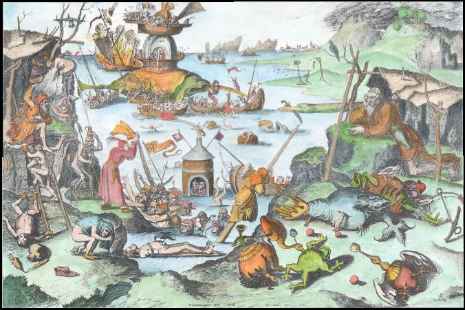
30 July 2009 I have made some progress on the next painting for the Temptation of St Anthony project. This is by Joos van Craesbeeck (born around 1605 – died between 1654–1662) a Flemish Baroque painter who specialized in tavern interiors and rustic peasant scenes, somewhat in the style of David Teniers. He also took to painting 'tronies' or paintings focussing on human heads often with outlandish garb or fantastic situations. They were not portraits as such, but rather the artist was using the head to make some particular statement. One of the best known nowadays is Vermeer’s Girl with a Pearl Earring. Craesbeeck's work is full of fun, and when he turned to painting a Temptation of St Anthony, he certainly provided us with a riot of humour. That is what drew me especially to this work. The head washed up on the shore of a lake or ocean, with people living inside its mouth and in its skull, is directly taken from one of Bosch's images engraved by Hieronymus Cock in 1556 which I posted on here a few weeks ago. St Anthony is marginalised by Craesbeeck by being seated under a tree and seems only a little discomforted by the close presence of a peasant woman temptress, while around him a chaotic cavalcade of strange creatures takes an interest in the still living head washed up on the shore. I am really enjoying painting this one. Over the last week I have established the forms and now have to work on the detail and modelling. I have painted this quite light, so it might appear a bit gaudy at this stage, however, this is intentional as I will gradually darken the forms with layers of earth colours. There will now be much use of umbers and the transparent siennas and the wonderful Vandyke brown, to give modelling and to blend the colours. This I can easily do as I use alkyd oils which dry very quickly, even becoming touch dry within the day, and can be overpainted the next day without lifting or smearing the underlying layer. 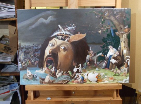
20 July 2009 I have recently embarked on a major painting project. I intend to create a series of facsimile paintings of key early paintings on the theme of the 'Temptation of St Anthony'. This will be the basis for an exhibition, in a year or two, documenting the evolution of the imagery in this important though entirely neglected backwater of European art. This group of paintings to some extent shows the struggles within Christianity as it moved from a medieval view to a more modern one, as well as the upheaveal of the Protestant revolution. I hope to make about twenty oil paintings and another twenty or more coloured engravings and woodcuts, together with some material which helps contextualise the theme. I would welcome some financial assistance with this exhibition, either direct funding, or through purchasing paintings in advance. I have already invested £1000 ($1700) in research and obtaining high quality photographs of paintings from which to work. There will be considerable costs in framing and preparing a catalogue for the exhibition. I have now almost completed the first painting. It still needs a little bit of work on some details, or areas that could be improved by darkening or lightening a little. This is by the almost unknown Flemish painter Pieter Huys (c. 1519 – c. 1581). I find this work most engaging. He draws on some of Hieronymous Bosch's imagery but reworks it into a more gentle and delightful conception. 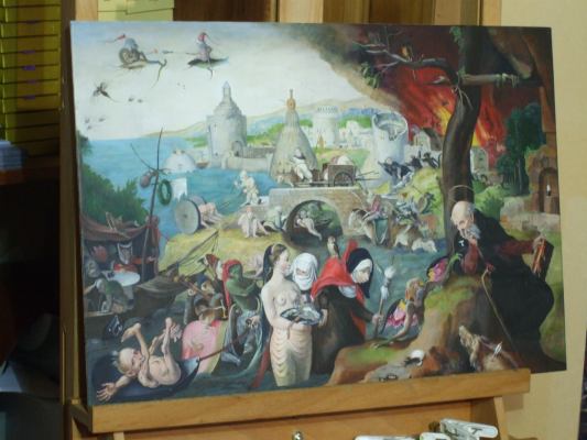 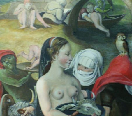
19 July 2009 Over the weekend I finished colouring an engraving by Brueghel entitled St. James and the Magician Hermogenes which dates to 1556. This is one of those artworks from the 16th century that I am interested in as part of the context of the Temptations of St Anthony. The theme of this engraving is the legend of the meeting of St James and the magician Hermogenes. St James stands just left of the centre while Hermogenes is seated on the far left reading his magical book and surrounded by demons, while in the air above witches fly around on broomsticks. In the legend St James converted and baptised the magician, after each had tested his shown his powers to the other. It is a Christian allegory of the triumph of the spiritual power of Christianity over pagan magic. The witch imagery is to a great extent taken from woodcuts and paintings by Hans Baldung Grien (c. 1480 - 1545) one of Durer's most gifted students. 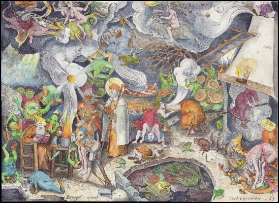
Hieronymus Bosch also apparently created a panel on the theme of St. James and the Magician Hermogenes. Compared with the riot and energy of Brueghel work, his piece is somewhat more spare and simple. 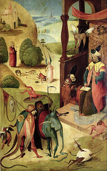
13 July 2009 Another interesting image related to the Temptation of St Anthony is an engraving by Daniel Hopfer (1500-1550) with the theme of three old women attarcking a demon. 
13 July 2009 Over the weekend I managed to finish colouring the engraving of the Temptation of St Anthony issued by Hieronymus Cock in 1556.  7 July 2009 I have now embarked on a major painting project. I have now collected images of about thirty 15th, 16th and 17th century paintings on the theme of the Temptation of St Anthony. I intend now to make facsimile paintings of twelve to fifteen of these over the next year or so. Hopefully this will lead to a exhibition on this theme. I have now made a start on a painting by Pieter Huys from 1547.  25 June 2009 Today, while researching the Temptation of St Anthony theme in painting, I came across a painting based on the well known woodcut of Martin Schoengauer (c. 1448–1491) which has recently been purchased by the Kimbell Gallery in Fort Worth and provisionally assigned as a youthful work of Michelangelo (even possibly his earliest surviving painting). The painting is on a wooden panel some 18 inches tall. Some scholars are now convinced that Michelangelo Buonarotti completed it in 1487-88 — when he was 12 or 13 years old. It is shortly to go on display in the Metropolitan Museum of Art in New York where it has been cleaned and restored. It will no doubt take some years before a consensus arises between the scholars as to the veracity of the ascription. 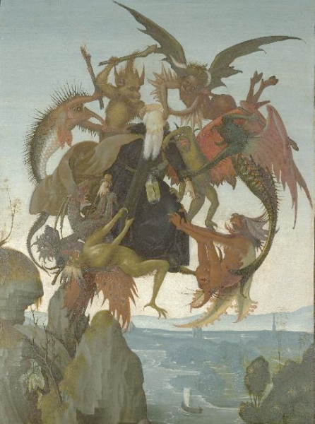 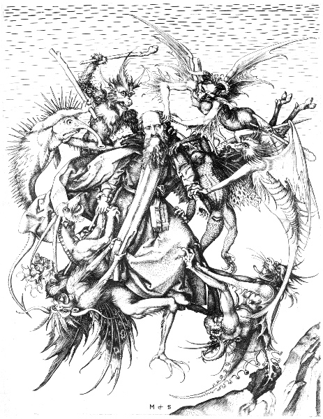
22 June 2009 A few days ago I discovered a painting, the Donna Nuda, in the Hermitage Museum in St Petersburg. On its website it is described as by an unknown late 16th century painter. After a bit of research found that it is more than likely a painting by Andrea Salai (c.1480-c.1524) who also went under the name of Gian Giacomo Capprotti. Obviously what intrigued me is that it is a version of the Mona Lisa, by one of his pupils Salai. Some people have titled this the Monna Vanna. It depicts the Giaconda with her hair in ringlets and naked to the waist. The cartoon for this painting is still preserved in the Musee Conde in Chantilly, France and is dated to 1515. I am not entirely sure what to make of it. It was included in an exhibition in Milan in 2001, when the curator said “I am convinced that the portrait was painted by Salai from an idea by Leonardo, who was having fun with the famous image he had created ten years before.” By happenstance, a few days ago The Telegraph reported that a new exhibition on Leonardo has opened at the Museo Ideale in the Tuscan town of Vinci, near Florence, where Leonardo was born in 1452. Part of this exhibition includes another naked Mona Lisa, which was only recently discovered hidden for nearly a century inside the walls of the private library of Cardinal Joseph Fesch, Napoleon's ambassador to the Vatican. Apparently there are a number of naked Mona Lisa paintings emerging from the circles of pupils and assistants of Leonardo. 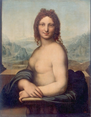 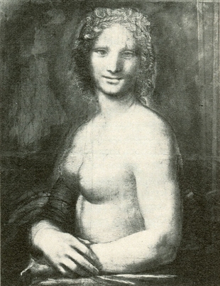 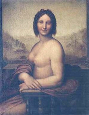
19 June 2009 As an artist at age 61 I can get a bit paranoid about my eyesight. I was totally astounded and yet rather amused by an email publicity leaflet I received today promoting some weird project and the author's latest book. Thus, the novel and provocative main thesis of this project is: eye floaters are the first appearances of a shining structure of consciousness within which we cover a distance to our spiritual origin. We can see and experience this way. As an object of concentration and meditation, these dots and strands are therefore a significant key to our consciousness development.The publicity seems to be making out that floaters in the eye are a positive thing for us, as they open us up to some expansion of consciousness. He even shows images of artworks which he seems to be claiming as inspired or influenced by floaters. This is just so much nonsense! What a sad person to believe this. A friend of mine last year experienced for a few weeks the frightening appearance of floaters which formed a bar across her central vision in her dominant eye. There was no positive development in her consciousness, merely a fear of failing sight. She found it difficult to read music. She had to go to hospital to have the situation investigated. Floaters can be the consequence of a tear or detachment of the retina which can lead to blindness - hardly contributing towards a positive development of consciousness. What a buffoon this person is to try and make out that this is a positive phenomenon. If I had significant floaters in my visual field I would be immediately making an apppointment with the eye hospital. How people can deceive themselves so greatly nowadays. A "provocative thesis" indeed, but also a stupid and risible one. How exactly this person hopes to exploit people suffering this condition I do not know, but if he delays people from seeking proper medical attention and diagnosis he may be responsible for them losing their sight. How can anyone be so self-deceptive and stupid ? The world often seems full of weird people. 18 June 2009 I have just had to spend over £600 ($1000) on some art reference books. These are on a number of themes, early Flemish paintings, and some source material on the Temptation of St Anthony paintings. I recently found a painting on this theme by Jan Mandyn (or Mandijn), a rather obscure 16th century Dutch painter. Mandyn painted at least two Temptations of St Anthony. One is well known but the other was only brought out before the public when it was sold at Christies in London four years ago. Sadly I can find very little about this artist. No one appears to have written a book about his life and works. 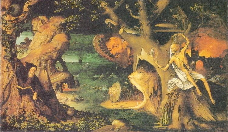
I also needed some reference material on Freemasonic imagery and symbolism, as I am at the moment working on a series of paintings of the strange masonic tracing boards. I have decided to try and mount an exhibition on Freemasonry as Art. The earliest this could be done would be next year as there would be a great deal of material to prepare for this. It is an area that few have explored, so I am quite at home ! 17 June 2009 My ultrasonic cleaning system has been a considerable success, both cutting down the brush cleaning time and also extending the life of the brushes, as only 10 seconds or so in the ultrasonic bath removes pigment and medium from deep down in the fibres and from the ferule. One has to hunt around a bit in the bath for the best point where the ultrasonic energy is focussed. This moves around but when the brush is in the correct place, you can see all the pigment flowing away from the brush, and this without grounding the point or damaging it by vigorous shaking and hitting the side of the vessel. It is so easy to use. I must say I do hate the sun. Most artists love working in natural light, but I find it changes so much that every time I come back to work on a painting, the colours as perceived have changed. Instead, I work in a darkened room with the curtains closed, and use powerful floodlights. I now use metal halide floodlights. These are relatively efficient. I used to use some quartz halide floodlight (two 500 watt lamps) and the heat given off by these was fierce. It is impossible to work under these in the summer. These were also of a low colour temperature - not as low as tungsten filaments of course, but around about 2500 degrees Kelvin. I now use two metal halide floodlight, one with very high colour temp 4500º K which is quite blue and another warm daylight rated at about 3600º K, so the two produce a good even and not too harsh illumination. This means that, at any time of the day, whatever the weather, or cloud cover, I can work on a painting under the same light as I had left it. 16 June 2009 I have almost finished the Altdorfer painting. It just needs some tightening up of some background details here and there, which I will do gradually over the next few weeks. It has taken just over three weeks work. Now I am going to move on to making some paintings of Masonic tracing boards - a rather different type of painting! I realised that I first mentioned these in the weblog on 30th March 2008. I was, at that time, hoping to start work on these, but it has taken over a year for me to find the time to work on the project. Although the tracing boards do not have the modelling and detail of 15th century panel paintings, I have decided to paint these quite small (about 15 by 10 inches), thus the individual symbols become quite detailed and require fine brushes. These should be quite stunning when finished. 14 June 2009 In my entry for 25th May I mentioned that one of Altdorfer's green pigments has proven fugitive and shifted towards brown and that this also was the case with the Flemish Love spell painting. I have discovered that this could well be the copper resinate problem. This arose when green copper salts, such as verdigris, were mixed with tree resins. The chemical formula is Cu(C19H29COO)2 This was used during the late 15th century and throughout the 16th century and but after a century or so artists began to notice the instability of the colour as the green transformed into a muddy brown. There is an informative web site on pigments through the ages. This pigment, or something chemically close to it, seems to have been, because of its transparency, used as glaze layers when painting leaves and foliage. One of the best examples of this fading must be Pollaiuolo's Apollo and Daphne (late 15th century) where the greens on the tree hands of Daphne and the background vegetation have entirely turned brown. Some art historians were misled by these colours and saw such paintings as being intended to be brown. Thus they ascribed a brooding autumnal melancholy to the artwork which is not what the artist originally intended. One day I may try my hand at painting a facsimile of the Apollo and Daphne with bright green foliage. 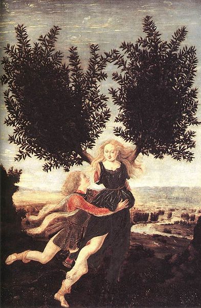
11 June 2009 I just discovered this rather interesting painting by Bernardo Parentino (1434 - 1531). Most of his output seems rather conventional but his Temptation of St. Anthony is quite wonderful. The Temptation of St Anthony is a fascinating theme in 15th and 16th century art. When I have time I will try to systematically collect images of paintings on this theme. I have over 90 so far, early and modern. It is remarkable that this theme still engages artists today. 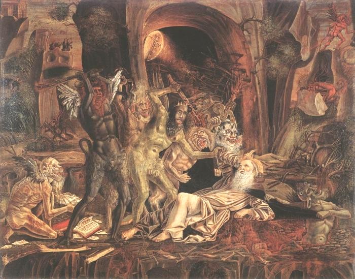
9 June 2009 I received a rather amusing email today. Not that the author intended to amuse. He was pointing out to me that it was pointless my making facsimiles of these old paintings that I love, as you can easily buy them from China for less than $200 and that if I wanted facsimile paintings I should just buy them from there as other people do. Indeed he even saw a copy of the Altdorfer on one website, which was what occasioned him to write to me. There are large companies in China who will have people paint you a copy of a painting in a day or so on an unstretched canvas then send it to you rolled in a tube within a week or two. These cannot be done in oils as you could not roll this up after a few days. So they are probably made in acrylic, or using some mechanical printing process, such as giclee. The quality of these is very poor. At best they are impressions of a painting. I saw an interesting documentary last year which showed a Chinese "artist" making copies of the Van Gogh Sunflowers. He had about fifty bits of canvas pinned on a long wall and went from one to another, painting the same colour and section. An assistant kept handing him brushes filled with colour, so he did not even have to dip and charge his brush as he went from one painting to another. It was hilarious - a human photocopier in action. And people actually pay $200 for these ! The words "China" and "quality" do not sit easily together. Often their products seem merely made to look like an established item without the quality or functionality. I have long since given up buying Chinese light bulbs and spotlamps, as these merely last a few days. Yesterday, I got rather frustrated when cutting up some thick cardboard boxes. The knife kept sticking and tearing rather than cutting, despite me inserting a new blade. I took a look at the packet, and there was the terrible phrase "made in China". They cannot even make Stanley Blades (box-cutter blades for US readers). They must use rubbish steel that quickly blunts. So this correspondent who was trying to get me to give up my painting may have been well-intentioned but sadly too trusting in the quality of Chinese craftsmanship. It just takes hours and hours to work the detail, and access to a large sized image from which to make the copy. One cannot make anything except a poor impression by copying from a postcard-sized image. If one looks carefully at the images shown on these Chinese art production sites, one immediately notices that they do not show their paintings but instead photographs of the original paintings. This should warn the unwary. They also use the term "museum quality". Now I wonder which museums would hang one of these. My paintings are not impressions, but facsimilies. They look like the originals, indeed the naive eye would not be able to tell the difference, though, of course, anyone who has experience of looking at paintings, would immediately see that these were painted recently using modern materials and a simple imitative technique. In any case you cannot really paint detailed paintings on canvas, as the weave causes problems with small brushes. That is why, some years ago, I switched to painting on board. It gives a flat surface for the paint. I was amused by this correspondents remarks, but it is sad that he thinks to lump me alongside Chinese fast art production. I think I can do a little bit better than that human photocopier. 7 June 2009 I often find the ways in which artists and critics try and explain their work today rather amusing. I just received a classic of this style. [The theme of this art exhibition] is the idea of externally perceptible behavioral patterns of a particular system, of a complex transitional space, or a non-space. In everyday language, the simplest model has advanced towards being a paradigm: through the reproducibility of sense perceptions, analogous to the black box of an airplane, an archive of memories and associations is constructed. It is a transistor, able to absorb and transform information... The three artists approach the subject as experimenters, thereby creating a system of tests in which events can be followed, but which also lends itself to substantiating different modus operandi. Oscillating between possible and impossible implementations, they transform notions of reality and illusion into a dimension of functional describability, while revealing the character of the exhibition space as an in-between place. The artists’ approach is closer to an unveiling than a usage of the space, marking less an attempt at organization than the activation of forms of behavior and conditions. The artistic media used in this range from photographs and drawings to installation and sound. Not least of all, the exhibition is marked by a moment of ignorance, in which none of the artists are aware of each other’s intentions and strategies.Oh well ! Back to creating the fine detail in the Altdorfer. I will leave "the activation of forms of behavior and conditions" and "transforming notions of reality and illusion into a dimension of functional describability" to these three artists. 28 May 2009 I have made considerable progress with the Altdorfer painting. After two full weeks of work (four or so hours a day) I have established all the forms quite well. Now all that remains is the detail. This painting is all about detail, detail, detail. So probably another two weeks work with the smallest brushes before I can call it complete. 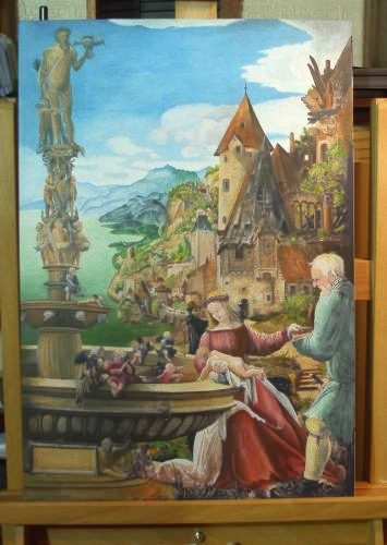
27 May 2009 I just bought an ultrasonic cleaner which I intend using for my brushes. One of the great problems with detailed oil painting is that you damage the brushes a little every time you clean them, either by shaking them in white spirit and inadvertently striking the point against the sides or bottom of the container, or by wiping them in a rag or household paper towel, which seems also to shorten their life considerably. It is annoying when some dark pigment stubbornly stays close to the ferule and emerges when one is later painting a thin light area. So I am now trying out this ultrasonic cleaner, which is actually intended for cleaning jewelry. It consists of a tank, which I fill deeply with white spirit. When one switches the device on, ultrasonic waves shake the liquid and all one need do is to hold the brush still in the liquid for about 10 to 20 seconds. I will see, over the next weeks, if it helps or is just another waste of money. 25 May 2009 Having succeeded with the love spell painting, I decided to work on an even more challenging item. I seem always curious to see what can be achieved through painting. So I have begun work on a wonderful painting by Albrecht Altdorfer (c.1480-1538), an important early German painter. This is a religious painting The Rest on the Flight from Egypt created in 1510 and now in the Staatliche Museum in Berlin. What attracted me to this work was not its religious content, but rather the amazing romantic landscape on the right and the ornamental fountain on the left. This painting is enormously detailed, and this detail is essential to the work, so it will take some time to complete. However, not as long as Albrecht Altdorfer took ! In his day, painters in oils had to wait long periods between applications of paint until the layer dried sufficiently for another to be painted on top. This still applies to those today who paint using conventional oil pigments and linseed or some other slow drying oil medium. Some years ago I switched to using alkyd based oils. These dry very quickly, so that the paint is dry by the next day and often even in a few hours. This means one can work on top of a layer the next day without stirring up the pigment in the layer below. Early paintings like this were created by using glazes or thin layers of paint, built one upon another. It must have taken early artists some months to work four or five layers, but I find it easy to do this now within a mere few days. Some of the Windor and Newton alkyd colours are transparent which makes the glazing of layers very easy. This applies to some of the earth colours, especially their Burnt Sienna, and Vandyke Brown, which I use a great deal in the modelling of forms. One of Altdorfer's green pigments has proven fugitive and shifted towards brown, so I will of course restore these areas. This also was the case with the Flemish Love spell painting. I must try and find out which green pigment from that period it is that does not survive the centuries. 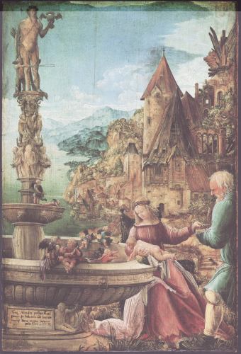
15 May 2009 A few years ago I began working on a facsimile of a 15th century Flemish painting of a young woman casting a love spell. This so challenged my technical abilities that I became increasingly frustrated and after a few months I abandoned this. I really love this painting so a few weeks ago I returned to this and decided to start work on a new version. This time it progressed well and I have now almost completed it. It now only requires a little bit more work on some of the small details. I will eventually put it up for sale, but for a year or so I would like just to have it on the wall of my apartment. 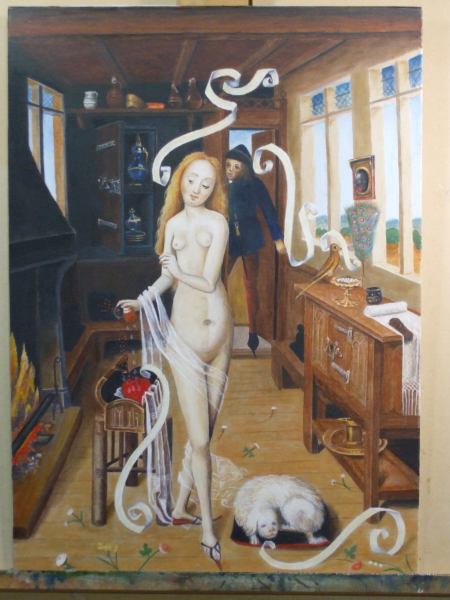
5 May 2009 Some years ago I found an interesting engraving by the German artist Daniel Hopfer (1470-1536) entitled Christ triumphant. 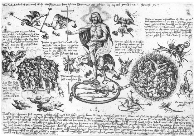
I only recently managed to obtain a high resolution image of this. I removed the German text and made a coloured version of this interesting emblem which is dated to 1530. 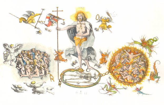
2 May 2009 I reecently managed to finish my copy of the Mona Lisa. This was based on a later copy of Da Vinci's painting, which shows more detail in the background and her costume, than the original does now. I decided, in fact, to define these areas even more. I reinstated the veil, which has become invisible in the original, as it seems to have become lost in the surface dirt or possibly partly removed during earlier cleaning and revarnishing. When working on this I found that the enigmatic smile was not really created by her mouth and lips, but rather by the shading of her facial muscles. It proved frustrating to me to find that a minor adjustment, blending or smoothing this shading could so easily change her expression. Now I will have to find a suitable frame and give it a space on my wall. 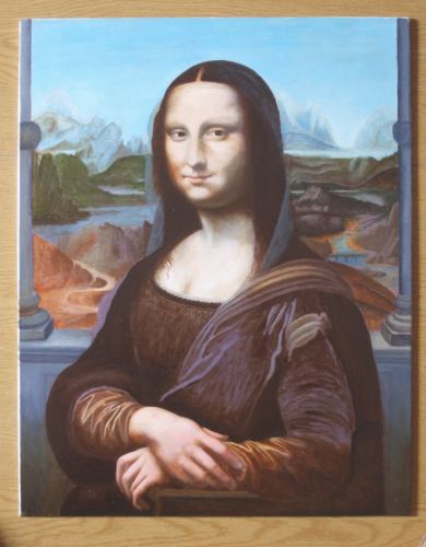
27 April 2009 Now that my exhibition on the Art of Japanese Tarot is out of the way, I have decided to try to find the time to return to a number of paintings I began last year but had to abandon due to other projects coming to the fore. The first one I want to finish is my copy of the Rogier van der Weyden Mary Magdalene. I had almost completed it, except for her elaborate hat and veil. So today I got out the whites and the various earth colours and began work again to complete it. This is a painting I do not expect I will ever sell, as it has taken up so many hours of my time that the price would be too high. Also, people just will not buy paintings based on viewing small jpgs on the internet. One really has to see the detail in my paintings up close in order to be prepared to pay a high sum to own them. Of course, I really like to have these paintings on the walls of my apartment. Over the next few years I hope to make a number of paintings based on 15th and early 16th century works. I feel very close to this period of art. It so delights the eye. 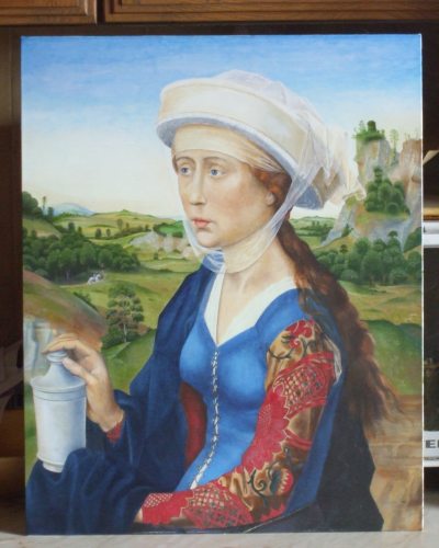
21 April 2009 I recently discovered this rather wonderful emblem engraved by Zacharias Dolendo after Jacques de Gheyn. It is the final engraving in a series of nine produced in 1596/97, entitled Allen Dingen ist der Wechsel eigen (omnium rerum vicissitudo est) which I suppose roughly means "All things inherently change". 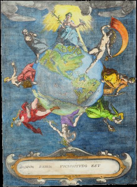 15 April 2009 I have now finished colouring Brueghel's Pride. I have some plans now to use this series of images in various ways.  7 April 2009 While researching images of the various Children of the Planets series I came across an interesting engraving. This is on the theme of the Battle of Ratio and Libido, and was made by the French engraver Nicolas Beatrizet (1515-1565) in 1545. It is, however, based on a drawing or painting by Baccio Bandinelli (ca. 1493-1560), best known as a sculptor, but also an accomplished draughtsman and painter. I would like to find a larger and higher quality image of this engraving.  5 April 2009 Last week I managed to get high quality images of the Hausbuch Meister's drawings of the Planetenkinder, and have managed to colour one of these, Luna. Over the next few months I will try to find time to work on the others, together with the Baldini. I may eventually put these into a book on the Children of the Planets.  31 March 2009 Last night I undertook a little research into the Children of the Planets emblems. A few days ago I had coloured one of the Baldini engravings of this series, so I wanted to gather together a little bit of information about the various versions of this emblem that appeared in the 15th and was still popular into the 16th century. I have set up a page on my new website devoted to emblematic art. This is still under development, but I thought I might give you a little preview of what I have been working on. 30 March 2009 Sunday (yesterday) was a painting day. The day before I had damaged my back and could not walk about much, so I decided to do some painting, which does not stress my lumbar vertebrae. So I looked onto the pile of images I had recently collected and found there a rather fine Adam and Eve woodcut from 1572 by Hans Weigel the Elder, based on an earlier work by the more famous Hans Sebald Beham. To me it looks even better when coloured.  29 March 2009 I managed to finish painting the Baldini image of Venus. This did not take as long as I had estimated, though this is the least complex of Baldini's planets series. It still needs a little bit of adjusting and reworking of some of the figures.  28 March 2009 Last night I spent a few hours scanning and correcting some images I recently managed to obtain of an amazing series of 15th century Italian engravings of the Children of the Planets series by Baccio Baldini (c. 1436 - 1487). I have known about these for some years but was never until recently been able to get access to high quality photographs of the imagery. The images needed a bit of correction as the backgrounds had some ink stains in white areas, which can happen with engravings. I now intend to colour these complex images. It will take quite a time as I estimate about twelve hours work on each of the seven images, so it will take a few months to complete the series, but they will look wonderful when completed. 27 March 2009 Today I began adding some further large format prints to my bookshop pages. I have been producing these giclee prints for over a year but the sales are extremely slow, which is rather disappointing, both because I would like to gain some sales and because people are missing out on having some of these wonderful images to contemplate. I, of course, am immersed in that material and so enthused by alchemical, astrological, and emblematic imagery that I find it difficult to understand why others would not also not wish to have such imagery. I do also produce standard format print at A4 size, but many images really become striking when available in the large format. Not all are suitable to be printed in the larger size but I have now added about 15 further images. It takes quite a time as the original paintings have to be rescanned at 1200 dpi in order to provide the best quality for printing. Anyway you can browse the items by clicking here. I have also reduced the prices to USA and Worldwide customers to reflect the recent currency fluctuations. 23 March 2009 Brueghel's Sloth. 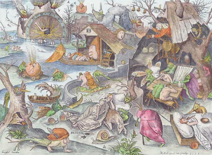 19 March 2009 Here is Anger from Brueghel's Seven Deadly Sins series. I still have two left to colour. I take great delight in Brueghel's humour as well as his amazing technique and composition in his creation of little scenarios within the larger work. 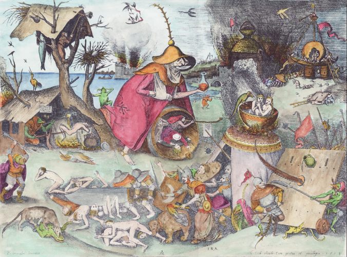 19 March 2009 Yesterday I managed to find copies of the original drawings that Brueghel had made for the series of engravings on the Seven Deadly Sins which were issued by Hieronymous Cock. It is amazing that these drawings have survived, though they are distributed throughout European galleries, one being in The British Library, two in Paris, one in the King's Library in Brussels, another in the Uffizi gallery in Florence, with one in Basle and the final one in the Albertina in Vienna. Brueghel, being a total professional, had created his drawings in reverse, as the process of engraving, mirrors the image. Thus his figures were drawn as left-handed in order that they would appear correctly right-handed in the final prints. Here are some sections from the original drawing for Sloth with the final print. We can see how the engraver Pieter van der Heyden has faithfully reproduced the elements of Brueghel's drawing.   Here Brueghel remembered to reverse the clock! The figures in the lake below also in the final print are seen raising their right hands. Being able to visualise this mirroring in the creation of all the details in his drawings marks him out as a consummate professional. 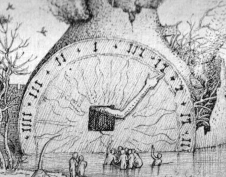 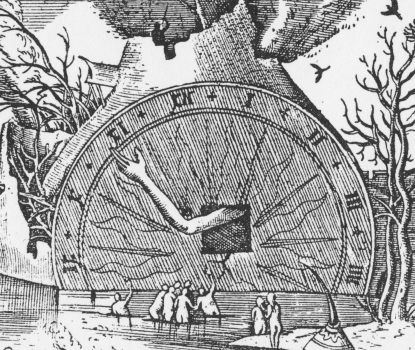 18 March 2009 We are all familiar with work of the mid 20th century Dutch graphic artist M.C. Escher, especially his use of interlocking figures in black and white, figure and ground often being the same image inverted. We might be excused for seeing such images as a moderm invention. Today I found a woodcut by Hans Burgkmair the Elder (1473-1531) which he designed in 1516 as his coat of arms. The interlocking bears on the shield are a wonderful device.  18 March 2009 Today I found a rather fine woodcut created within the school of Durer around about 1504. It is entitled Urania the muse of astronomy and astrology. As it was quite small and relatively simple, I spent some time this evening colouring the image. 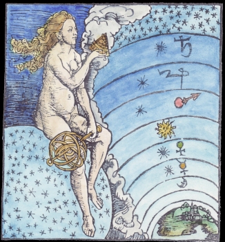 15 March 2009 After a gap of a month, while I worked on my forthcoming exhibition on the Art of Japanese Tarot and also on some paintings for the Bonacina book, I managed to complete another of Brueghel's deadly sins. This is Invidia or envy. These are wonderful engravings full of humour and delightful images. When I complete the series I will probably issue them as a series of large format prints. 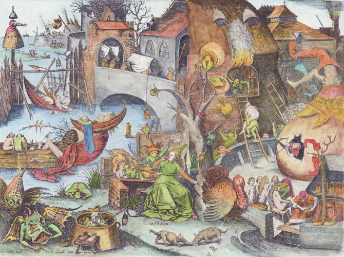 15 February 2009 At weekends I indulge in the seven deadly sins - well, perhaps only by proxy, as I try to find time to paint one of the amazing series of engravings by Brueghel. This weekend it was "avarice". 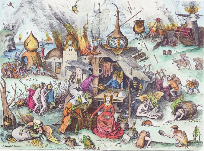 9 February 2009 A couple of weeks ago I coloured one of the large engravings from Brueghel's famous series of Seven Deadly Sins, which were engraved by Hieronymous Cock in 1558. I have now managed to do another, the amazing 'Luxuria' or lust, with its many quotations of images from Bosch. 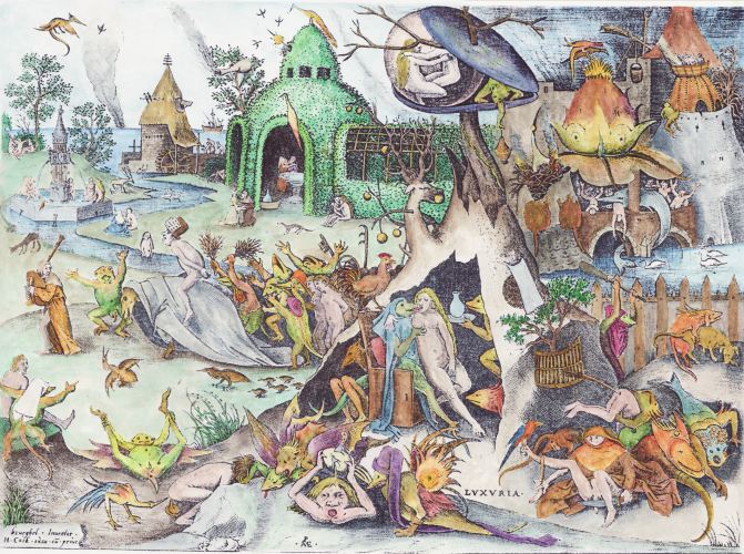 1 Febuary 2009 I found this interesting woodcut version of Melancholia, best known as the engraving by Durer (1514). I am not sure of the exact date of the woodcut nor the engraver, but it is apparently made after a woodcut of Sebald Beham (1539) based on the Durer. We can see how Beham in copying from the Durer mirror reverses the image and then the later artist does this again, thus restoring the handedness of the Durer. I have coloured the laeter version. 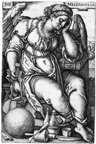 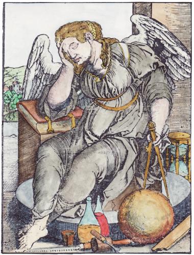 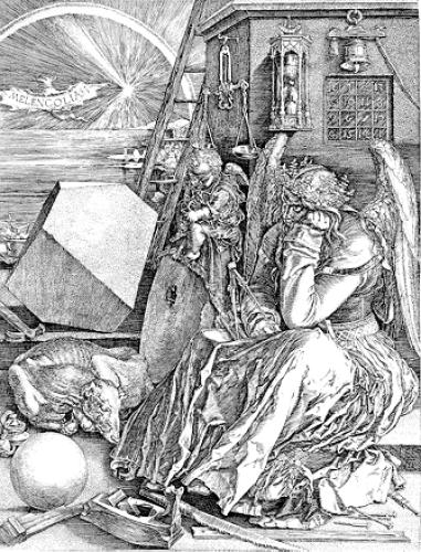 25 January 2009 By serendipity, which in reality meant spending three hours looking through a series of catalogues of German woodcuts from the last half of the 16th Century, I recently came upon a rather engaging series of seven woodcuts of the classical planets. This weekend I worked on colouring these. The woodcuts were apparently made by an unidentifed artist, cryptically named as 'The Master 4+' He was active in Wittenberg between 1554 and 1580. His line is delicate and subtly formed, giving a detailed image. His series of planets uses the conventions and emblematic ideas about the associations of the planets current at that time, but this has been realised in beautifully crafted images. I have never seen these wonderful woodcuts before and I hope that others might share my enthusiasm for them. It was a great delight to colour them, and hopefully this might make them more easy for the modern eye to appreciate their forms.   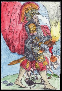 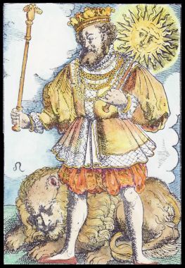 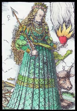 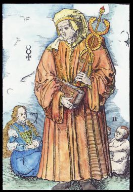 
Over the last two weekends I worked on colouring one of the large engravings from Brueghel's famous series of Seven Deadly Sins, which were engraved by Hieronymous Cock in 1558. The fine lines of the engravings are not easy for people to appreciate today, so, as I have done with other emblematic material, I have added colour to help bring out the forms. If I ever find the time, I would like to complete the series.  5 January 2009 Some years ago I came across an 18th century mystical cosmological diagram. I wanted to make a coloured version that would bring out the different components, which were primarily geometrical. I puzzled over this for a long time, but last weekend I decided just to press on and try and see what I could acheive by colouring it. The idea being explored in this engraving is that of the emanation of aspects of the Cosmos through light emerging out of darkness. The light from the Divine flows through a series of spheres, and densifies as it gets further from the Divine. I used various yellows to suggest the densification of the light, adding more earthy reds to the yellow light as I moved down the structure. The larger spheres emblematically represent different worlds, so I coloured these in such a way as to suggest their significance in the hierarchy. Thus the highest sphere is divided into a dark and light half, with the sphere below that in blue as it is the heavenly world, while the large sphere below, the outer world of appearances, is given a more earthly tonality. Choosing the correct colours for such an emblem is quite a difficult task. It requires being able to think through the meaning of the emblem and avoiding any external or personal choice of colour. One must also avoid any clashing of colours and must blend and integrate these. The colours must complement and work with the emblematic imagery. The end result here gives the impression of the Divine light flowing through the various vessels and densifying. 
30 December 2008 Back in April I was wondering about the strange rainbow coloured wings of angels depicted in early European art. I showed a few examples. Yesterday a correspondent, Tanya, wrote to tell me of a rather fine example in The Annunciation by Fra Angelico (Florentine painter c. 1400-1455). Fra Anglelico was also an early exponent of geometric perspective, and I found this image on Google with the perspective construction lines added. The vanishing point appears here to be on the upper left corner of the door lying between the heads of Mary and the Angel. Leonardo, in his Annunciation (1472-75) also places the vanishing point on a line between the heads of these two main figures. I wonder how much this device was used by other artists of the period. 
Here in Glasgow is Botticelli's Annunciation of around 1500, in which he locates the vanishing point close to the forehead of the angel, thus creating a heightened dramatic scene, as the angel seems almost to fall into the space of the picture. 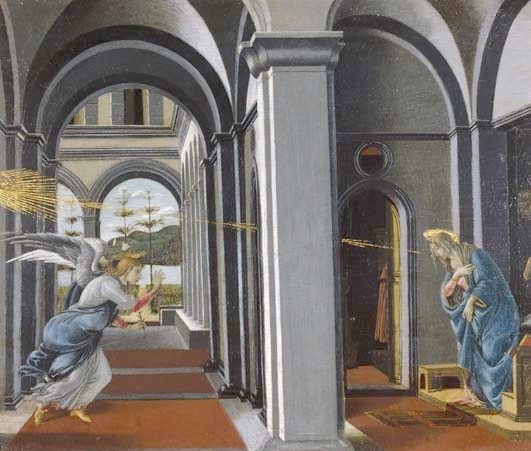
16 December 2008 Last night I found some rather beautiful images from a manuscript in the National Library of Spain, created by the 16th century Portuguese artist Francisco de Holanda (Hollanda) (1517-1585). This manuscript provided a series of over a hundred illustrations of familiar Biblical scenes. Some of these drawings have been completed by colouring, but the bulk are in penciil and light wash and presumably incomplete. I found the opening series on the Creation a great delight, and also the images from the Apocalypse at the end of the manuscript very fine. Here are two from the opening section on Genesis which for the most part was fully coloured.  
13 December 2008 This weekend I decided to colour two emblems which have been lying on my pile for a year or so. I have for some years wanted to make a coloured version of an engraving from a book by David Joris, but only last year managed to find a good quality image to work from. Joris was a mid 16th century Dutch Anabaptist, who, although initially a conventional Protestant, later became influenced by visions, and apocalyptic enthusiasms and came to see himself as a kind of prophet. His main book 't Wonderboeck was first printed in 1542, but this engraving comes from a later edition. The other engraving I wanted to colour was the titlepage of Abraham Ortelius, Speculum orbis terrarum, Antwerp, 1593, a book on cartography. Again, this is a wonderful piece of emblematics, which sadly almost no one today has any interest in. I often get rather depressed that some of the items that I find of great value, both aesthetically and as emblems, are of almost no interest to others. I try and enthuse people about this material but get no response. I find it strange that people do not immediately engage with this lost art.  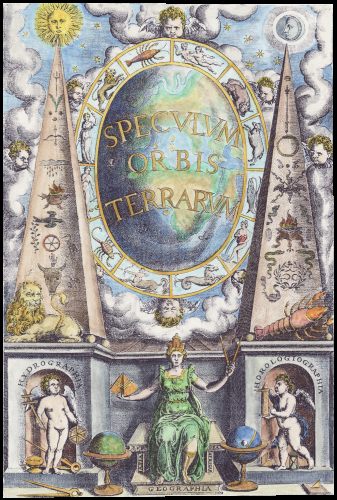
3 December 2008 The Behaim Codex incorporates a series of illuminated paintings on parchment depicting everyday life, particularly the work of tradesmen and women. The manuscript was created by an unknown artist in 1505, and it incorporates the guild rules then current in Cracow in Poland, where it still resides in the Jagiellonian University Library. I was rather taken by the depiction of a painter working on a mural. It reminded me that artists/painters were at that time members of a guild of craftsmen. We all have such a modern view of the artist as an independent creator, that we lose sight of the fact that most of the amazing artwork of the 14th and 15th centuries was created by artists who had an entirely different role in society than they do nowadays. They were seen alongside bakers, shopkeepers, shoemakers, saddle-makers, and so on. 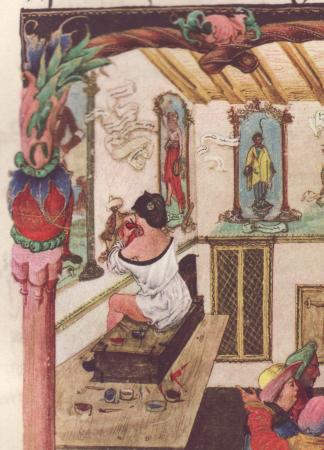
3 December 2008 One of my correspondents, Carl Lavoie, told me that the Trithemius image was later reused in Sebastian Munster's Cosmographia universalis , Basle, 1544, but in this context, used as a fiend summoned before Marcomir, King of the Franks. 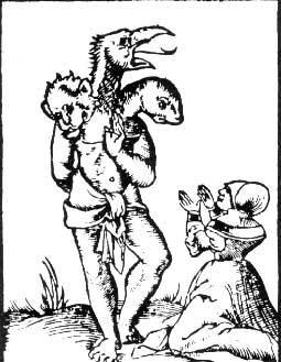
2 December 2008 Johannes Trithemius (1462-1516) collected magic texts and other strange manuscripts for his library in the Abbey of Sponheim. Eventually he was moved from Sponheim because of accusations of necromancy. Stabius (f 1522), a teacher of mathematics in Vienna from 1497, astrologer and poet, got into a dispute with Trithemius and accused him of being the "fabulator omnium fabulosissimus" and to have manufactured monsters and chimeras. In this manuscript of 1515 (now in the National Library of Austria) he caricatures Abbot Trithemius, depicting him with three monstrous heads, a probable allusion to his reputation of being involved in magic. I found this image rather amusing. 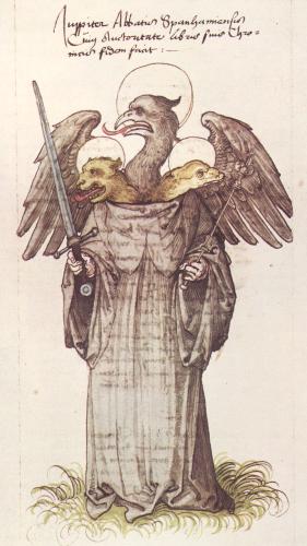
29 November 2008 What initially attracted me to the Albumasar painting was the observation that it was done in the style of early 15th century Flemish paintings which I admire so greatly, even though Herman Tom Ring was painting in the late 16th century. My colleague, Paul Ferguson, has come up with some further information that adds greatly to the context of the painting. It turns out that a set of fifteen pictures representing the Sibyls and the pagan Prophets announcing Christ's arrival, that decorated the choir of the cathedral of Münster were painted by the Flemish painter Robert Campin in 1435 and were damaged at the time of the Anabaptist rebellion in Munster in 1534. It seems likely that these pictures were copied by Ludger tom Ring, and later by his son Herman Tom Ring. It is amazing what one finds lying behind a seemingly simple piece of art. The series itself, part of which survives in the Landesmuseum fur Kunst und Kulturgeschichte in Munster, is a great delight. 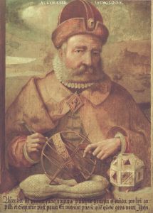 28 November 2008
A month ago I discovered a portrait of the astrologer Albumasar made by Herman Tom Ring in the late 16th century. Today I obtained (at some expense) a detailed print of the painting and I asked my colleague Paul Ferguson to translate the Latin text at the bottom of the painting. He read this as: "In the first decan of Virgo there arises a beautiful, pure and refined woman with loosened hair", and later on he follows on by saying: "And she nursed a boy whom a certain people call Jesus." and he revealed its context, finding that this is a reference to Book IV of Albumasar's Introductorium maius, which was used in the Middle Ages to defend astrology against attacks from the church, as according to Albumasar astrology seemed to predict the birth of Christ. 24 November 2008 Carl Lavoie has alerted me to the use of emblematic imagery in printer's typographical marks, which they often used on the title page (or the final page of a book) as a kind of branding sign. Professor Joachim Telle has in 2004 published a study of alchemical imagery in these printers' marks. There is well known mid 19th century catalogue by Silvestre. I took a quick glance through this and immediately found an interesting mark used by the Lyon printer Jean Lertout (working between 1575-1594). He uses an image derived from the Rosarium Philosophorum whose woodcuts were printed in 1550. Lertout was aware of alchemy as he printed a work of Paracelsus and another by Duchesne. 
23 November 2008 I have just finished colouring some of the emblems from George Withers A Collection of Emblems, Ancient and Modern printed in 1635. Some of these use emblematic imagery related formally to similar imagery in alchemical and hermetic illustrations of the period - just as an example, the ouroborus. Of course, the fact that A was influenced by B does not mean that B was influenced by A, a mistake many people today seem to make. Alchemical imagery was clearly influenced by the more general emblematic tradition, but rarely has the influence worked in the other direction. It is important to view the emblem book material as part of the cultural context of alchemical imagery, but entirely false to see emblem books as being significantly influenced by alchemy or secretly hiding some alchemical ideas. There are a few cases where there is a clear link, usually through the engraver working on both emblem books and alchemical illustrations. Withers does not seem to have been much influenced by alchemy, even though the imagery strangely seems paralleled in some alchemical engravings. 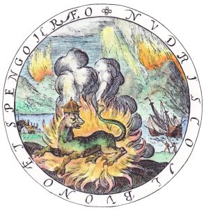 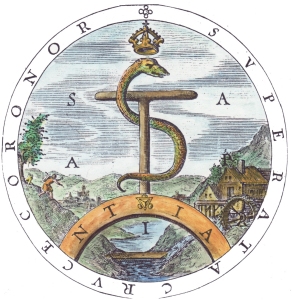 
20 November 2008 Carl Lavoie kindly pointed out some examples of Zitirons from the second volume of Louis-Catherine Silvestre's Marques typographiques, second volume. 1853-67.  
13 November 2008 A few days ago, during some email correspondence with a fellow researcher, he alerted me to a rather interesting series of four engravings. These are of the four seasons, and are bound into a book in Duke University. I must try and get access to better quality copies. Here is the engraving for Spring and Autumn.  
20 October 2008 I recently found this interesting portrait by a late 16th century German painter Hermann Tom Ring (1520-1597). He did a number of portraits of people of his time and also a series on ancient sybils and sages. The one that caught my attention was Hermes Trismegistus ca 1570 (oil on wood panel). On the right is another from this series, of the astrologer Albumasar. I will take a look at a book on this painter in the University Library.  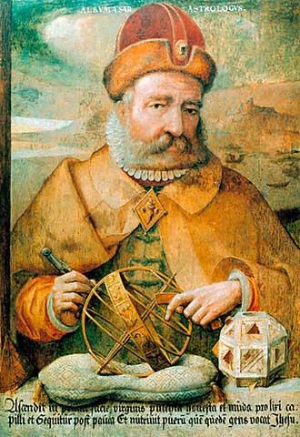
13 October 2008 Last week I had a visit from an interesting writer who wanted to buy one of my paintings, but he ended up buying two ! So that was a rather fine day for me. It seems that it is almost impossible to sell paintings through the internet as people do not know what exactly they are buying and understandably are unable to assess the quality of the art work though a computer image. Only when they see these items up close, are they able to make an assessment. Unfortunately I can see no way of increasing the traffic of people able to actually view my paintings. I found this rather fine painting by Jan Mandyn, one of the Antwerp-based followers of Hieronymus Bosch. This is one of his paintings on the theme of the Temptation of St Anthony. Here I show just a small section from the right hand side, which I find rather engaging. 
 25 September 2008
The long delay in posting an entry on this page, indicates just how little time I have to devote to art. If only I could sell some paintings I would be able to allocate more time to this, but instead I have to turn my time and energies my other publications. However, today I found a rather fine image from an early 15th century manuscript of Augustine's La Cité de Dieu (Paris, c. 1400-1410.) by the illuminator, Orosius Master. It shows a philosopher being instructed by Philosophia, while demons attempt to distract him. 8 July 2008 It is strange how one can go through life misunderstanding a word or term. I just discovered the true meaning of the work "pink". To me this was always merely a rosey colour. Now I have just discovered that is instead refers to a class of art pigments first recognised in the 17th century. These are similar to the so called "lake" pigments, in which a dye stuff is bound to alumina to produce a more permanent pigment - Carmine lake was made in the Medieval period from kermes insect dye fixed with alum. The dye becomes fixed onto the particles of aluminium hydroxide in an alkaline solution. Many such lake colours were developed over the centuries and are still used by artists today. Pinks were similar, but here the dye was attached to some white substance such as finely divided chalk, or even ground eggshell. The first pink was invented in the 17th century. This was yellow pink, then a green pink was made, and a brown pink, as well a a rose pink. The others gradually fell into disuse, and by the 19th century the term "pink" was used to refer only to the rosey colour. 1 July 2008 Sadly I have not been able to find time to undertake much painting recently. The good news in the last week is that I now have a commission to make a facsimile of a section from Bosch's Garden of Earthly Delights. This might take a few months as I have so many other commitments. I have managed to find an hour here and there over the last months, to make some coloured versions of the woodcuts in the Prognostications of Paracelsus. These are a series of 32 woodcuts and are really improved by being coloured. I will make this up into a small book and if I have the time will publish it later this year.  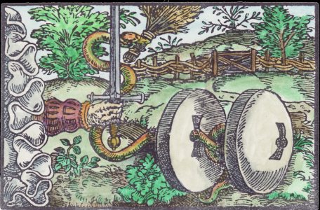
11 June 2008 Most of the last few weeks I have been working on my new publications, and binding up copies for customers, so I have rather neglected my art. I have, nevertheless, managed to obtain some interesting books on Flemish illuminated manuscripts in the last few days. In one of these I was delighted to find a reasonably sharp reproduction of Simon Bening's self portrait. I have seen this before, but the image was so small that I could barely make out the details. For those who have never heard of him, Simon Bening (1483-1561) was one of the greatest illuminators of the 16th century. His technique and detail is exquisite. Some people see his hand or at least the influence of his work in some of the illuminated alchemical manuscripts of the Splendor Solis. I was lucky enough to have beeen able to see many magnificent examples of his work at the exhibition Illuminating the Renaissance, some years ago in London. The small illustrations in books do not do his work justice at all. I feel drawn to make a facsimile copy of this portrait for my own private collection. People probably will think this a bit silly, but I would like to have a constant reminder in my studio of this amazing artist, who so few people have even heard of. This portrait is in the Victoria and Albert Museum so I will probably write to them and try and obtain a high resolution scan. 
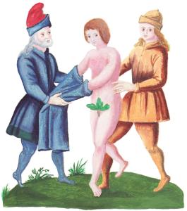 28 May 2008
Over the last week or so I have been finalising work on an edition of the Solidonius series of alchemical emblems, for which I made 18 facsimile paintings. I was very much amused today when I came across a reference to the Solidonius in the notable Italian art historian Maurizio Calvesi's interpretation of Marcel Duchamp's Large Glass or The Bride Stripped bare by her bachelors. Calvesi links this idea to the sixth emblem in the Solidonius series. He further suggests that stripping of the bride is a metaphor for the philosophers' stone in the writings of the 17th century alchemist Solidonius. This is rather risible as the figure in the Solidonius is not a woman but a man. It clearly states this in the text. Also the idea that the emblem is illustrating, is the purification of Sol or gold (the young man) through having its impurities stripped away. The text says this can be done through heating it with antimony metal, shown as the figure in brown on the right, or by using aqua fortis (nitric acid), shown as the figure on the left. So nothing to do with brides or the philosophers' stone. Art historians can read far too much into an image ! 19 May 2008 I have decided that I am going to define myself from now on as a 'facsimile painter'. I am getting a bit fed up with people making, what I consider, fatuous and ill-informed remarks about my paintings, saying I should, with all my knowledge of symbolism, do something original and creative, instead of copying the work of others. I fear people are missing the point of my work entirely. Everyone else is doing "something original and creative", so much so that most of these new creations are totally tedious and vapid. My work is to try to uncover and restore the powerful emblematic material from the past that has been neglected, often almost entirely lost and buried in libraries or the basement stores of museums. Just as in my work over the last decades with alchemical texts I have tried to recover obscure material and make it accessible to people, so with my painting I try to make this lost emblematic material also become visible again. My abilities lie in being able to create facsimile paintings, in which the faded colours of the originals can be refreshed and damaged areas repaired, so that the original work itself is able to speak again. Most artists just want to express their own vision, but I am rather tired of this. Instead I want, through my work, to enable the artists of many centuries ago, particularly those involved in alchemical and related allegorical and emblematic material, to have their work appreciated again. In a strange way, in this modern age when every artist is pursuing their own vision, I find myself out on a limb, in a minority of one. Recently, an artist colleague of mine, on seeing my copy of the Rogier van der Weyden, rather hurtfully said it was a complete waste of my time. Well I take delight in the technical details of making a copy of an original work. It satisfies me. At the moment I am working on the Solidonius series of alchemical emblems, and later I will make a start on the Bonacina series. There are also some wonderful paintings that I want to make facsimiles of in the coming years, despite it being a "complete waste of my time". I abdicate from being an "artist" in the modern sense and instead embrace the lable of "maker of facsimilies". 18 May 2008 I have been rather busy with my book publications and unable to finish the many paintings I began this year, however, my editing of books and my painting have at least come together in one project, the making of facsimile paintings of the Solidonius series. As I am beginning to work on publishing this illustrated text, over the passed few days I have been working on the finishing the eighteen small paintings (9 by 7 inches) that are found in this manuscript. I began working on these earlier this year and hopefully should complete them in the coming week. These are based on illustrations in a French manuscript, but I have corrected the faded colours and some small points where the descriptions in the text are at variance with the emblems. I have also made these facsimiles in oils rather than watercoloured drawings. 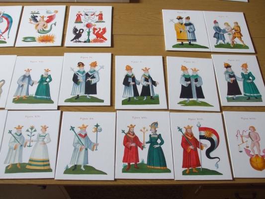 8 May 2008 Sadly I have not had any time to devote to my painting for a number of weeks. I have just had so much to do binding up books and dealing with various routine chores. I did manage a few hours to frame up the Paracelsus portrait which I have now put up for sale. I also have a pile of books of illuminated manuscripts to look through and study. I also now have to rework the Solidonius alchemical manuscript images, which I made facsimile paintings of earlier this year. These have to be amended in light of the descriptions of the colouring in the text, which I now have had translated. 21 April 2008 Over the last few days I have been pondering over angels' wings. Angels, of course, were a well used emblematic element in illuminated manuscripts and panel paintings. One especial feature that has always intrigued me is a convention that grew up to depict angels with multi-coloured or rainbow wings. This so intrigued me a few years ago, that I made a facsimile painting from a manuscript in the Fitzwilliam Musaeum in Cambridge. What attracted me to that piece was the angel's rainbow wings. Recently I have found many examples of this emblematic convention. Someone recently told me that this arose from the idea of God's Covenant with Noah when God had said that he would show the sign of the rainbow. I was not enirely convinced by that explanation. It seems to rather conflate two separate ideas. No angels were mentioned in the Noatic covenant. So I will keep looking for the source of the rainbow coloured angels' wings, however, like the pot of gold, it may not be easy to find.  
Fitzwilliam Museum. Northern French, before 1468. Angel from the Crucifixion. Fresco by Taddeo Gaddi, before 1366.  18 April 2008
Many illuminated manuscripts are religious in nature, being Books of Hours or other devotional tracts. There must be tens of thousands of Books of Hours preserved in libraries and private collections, and they regularly appear in fine art auctions. During the 14th and 15th centuries there arose a class of people who became relatively wealthy, and one way they could display their status and wealth was to have scribes and illuminators prepare a lavish personal book of devotion. Apart from a few notable examples, I find the content of most of these, though often having amazingly beautiful paintings within them, does not truly engage me. However, there was arising in that time other more secular works, which often allowed the artist a freer expression outside the straightjacket of the formulaic Book of Hours. Thus we find a number of manuscripts with illuminations of Dante, Boccaccio, and even stories such as the Roman de la Rose, Tristan and Isolde. Ovid's Metamorphoses provided a opportunities for the artist/illuminators to explore emblematic material. Here is a beautiful example of Hermaphoditus and the nymph Salmacis from a manuscript of the Metamorphoses in the Bibliotheque Nationale. Astronomical/astrological works began to appear with many wonderful illustrations, even a particular format depicting the Children of the Planets. The Apocalyse provided a source of powerful emblematic imagery and many manuscripts appeared exploring this theme. We also find manuscripts depicting the Triumphs of Petrarch, processions in which a triumphal chariot is being pulled by various people or animals, and this was so popular a format that the imagery was extended beyond that expressed in Petrarch's poems. Indeed, by the 15th century, manuscript illumination had expanded far outside the formula of religious devotional works. This is what makes the artwork of this period so exciting. There is so much to uncover and explore here. 17 April 2008 Last evening I noticed the film of Umberto Eco's novel In the Name of the Rose was being broadcast on television. I took a short glance (for a few minutes) at the film, as I have seen it a few times before, and happened upon the scene when the medieval detective and his sidekick (really Holmes and Watson) first entered the labyrinthine library. The novel is set in 1327 and constantly alludes to manuscripts being copied in the scriptorium by monks. This led me to wish to point out that this is a bit of an anachronism. Many people believe that illuminated manuscripts were all made by monks, indeed some of my correspondents think that alchemical manuscripts emerged out of monastic scriptoria. This is a fanciful idea but not really true. During the 12th century there developed craftworkers, scribes, limners, and illuminators who quickly became much more skilled at their work than monks, so much so that by the beginning of the 13th century they were usually employed to undertake the copying of manuscripts, and by 1250 monks were no longer devoting time to this task, as it was so much more convenient for the religious house to pay these craftsmen for the work. This was happening long before alchemical manuscripts had appeared in any numbers. 15 April 2008 People have been asking me why I seem to be diverting so much of my time to researching 14th and 15th century illuminated manuscripts and panel paintings and they wonder what relevance this can have to alchemy. Well it seems to me that the earliest alchemical manuscript paintings, which only appear early in the 15th century Buch der heiligen Dreifaltigkeit (1412), Aurora consurgens (around 1420), are influenced by the art of the illuminated manuscripts of their period. One thus cannot truly contextualise and understand these images unless one has some grasp of the illuminated manuscript tradition. Let us just consider the images from the Aurora consurgens. We should look at the famous monkey violinist figure. The particular representation of rocks seen below the figures is found in a number of Italian and French manuscripts of the late 14th and early 15th centuries. In the middle is an 14th century example of the stylised rock formations. This stylised representation gives way through the 15th century to a more realistic depiction of rocks and cliffs. The intense red background on this and other images from the Zurich Aurora consurgens is puzzling, until one realises that these were probably prepared as grounds for what is known as diaper work on manuscripts (from the French diapré 'variegated' a repetitive geometric pattern). This was apparently often left for a specialist to do after the paintings had been completed, so it may be with the Aurora consurgens (Zurich manuscript) that this was left unfinished. On the right I show another example of such diaper works from a French manuscript of the mid-14th Century. This use of elaborate patterned backgrounds to images in manuscripts gradually passes from favour through the 15th century and was replaced with naturalistic scenes.  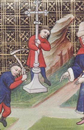 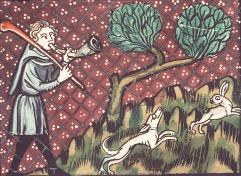
14 April 2008 For a while I have been looking for a portrait painting of Edward Kelley. There is a famous painting of his colleague and travelling companion Dr John Dee in the Ashmolean Museum in Oxford, but on Kelley I seem to have drawn a blank. There is a portrait engraving apparently made close to the time of Kelley's life, but not a painting. While undertaking research I was led to some later portraits of these two made at the end of the 19th century for a Polish book. These were made by a book illustrator called Michal Elwiro Andriolli. Through the good offices of my Polish colleague, the writer and academic, Rafal Prinke, I have been able to obtain some scans of these later portrait engravings. I found these rather amusing. Andriolli has chosen to represent these two as rather dissolute. Rather than the imposing view of Dee, confidently engaging the viewer in the Ashmolean portrait, we see here someone rather broken down and suffused with melancholy. Kelley is also shown as rather old and world weary ! It is quite fascinating to see how different ages choose to depict those figures. I wonder how an artist nowadays would chose to show them. 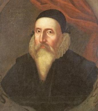 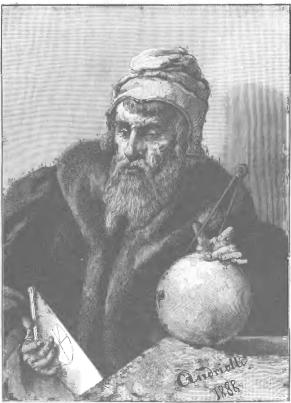
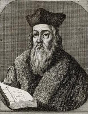 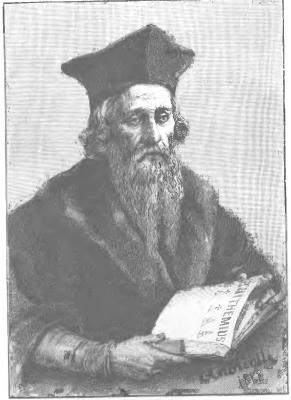 13 April 2008 I have spent a great deal of money this weekend, some hundreds of pounds, buying books, primarily on 15th century manuscripts and paintings with an emblematic and allegorical content. This is a subject that cannot be easily researched on the Internet as much of the material online is not well described and the illustrations are very low res so one cannot truly appeciate the artwork. The University library here in Glasgow has an excellent collection of art books, but there are still many gaps and I find I have to buy some books if I want to have easy access to them. The area of 15th century art is quite obscure, being primarily the province of the more academic type of art historian, so there are many manuscripts and painting which have not been well exposed in the public domain but kept within the sphere of a small group of specialists. I find myself really engaged by some of this material, particularly the artwork that moves away from the conventionally religious. Of course, a major part of the artwork of this period are Books of Hours and similar devotional pieces. Artists of that time were primarily commissioned by religious institutions, or wealthy patrons wanting to possess an illumined book to impress their friends of their piety, but there are some wonderful emblematic works alongside these. It is this that I am currently drawn to investigate, thus the large hole in my budget and a pressing need for some more bookshelves ! My own research library is at the moment a complete mess, piled up with books, articles, various prints and images and I will have to sort out some storage shortly or I will not be able to locate things quickly.  12 April 2008
A couple of years ago I undertook some research into the Voynich manuscript. This is a strange manuscript on vellum written in a weird unreadable script which some people suggest is a code though it has never been broken. It seems to date to the late 15th or early 16th centuries. It contains many drawings, a section which is obviously a herbal with pictures of unidentifiable plants, an astronomical section with circular diagrams, a balnealogical section with picture of bathing women, and some other graphical material. About two years ago I presented some new information to the Voynich discussion group that the balnealogical section could well be representations of the thermal and sulphurous healing baths at Pozzuoli in the area called the Phlegrean Fields, West of Naples. This is a volcanic region where hot springs bubble up, and it has been used since Roman times, but was still actively being used in the Medieval and early modern periods. The Voynich discussion group rejected my research as they were taken up with grand theories and most of the contributors did not have their feet firmly planted on the earth and consequently their heads were rather in the clouds. So I had just pushed this to the back of my mind, when today looking at a book on Italian Renaissance book illumination what should I see but a manuscript showing yet another image of the Baths of Pozzuoli, written in the third quarter of the 15th century and thus contemporary with or slightly predating the Voynich manuscript. It seems to me so obvious that the creator of the Voynich manuscript had seen a manuscript depicting the Baths at Pozzuoli, either this one or some other (there are a number which have survived), however, the Voynich speculators are not interested in something so prosaic and obvious. The text of the Voynich cannot be read, but the images can be contextualised and thus the subject matter of the manuscript can be revealed. Art and images so draw on earlier examples, that one can see how images emerge from an earlier context. Just as Bosch drew on the depictions of zitirons and other strange beasts in Flemish manuscripts available in his time, so the author of the Voynich drew on depictions in earlier manuscripts of the baths at Pozzuoli when drawing his figures. Click here to see my 2006 research into the Voynich manuscript. 12 April 2008 Following up on the zitirons (also known as Zeeridders) a correspondent pointed out to me another example in a manuscript in the Koninklijke Bibliotheek in the Hague of Jacob van Maerlant's poem Der Naturen Bloeme. Jacob van Maerlant lived in the 13th century but this particular Flemish manuscript with many illuminations was made around 1350. 
11 April 2008 One of the features I especially like about 15th century art, both in manuscript illuminatons and in paintings, particularly Flemish, are the wonderful stylised landscape forms, usually as appearing as a background to a portrait and often glimpsed through windows. So I was delighted today to find an illustration from the Savoyard Apocalypse which sets the powerful and horrific events of the Apocalypse in this rather charming, gentle and safe landscape. It is this delicious contradiction which especially delights me. Here we see the Whore of Babylon seated on the beast with seven heads, but somehow one does not feel the world is about to end ! I must try and find more images from this manuscript.  10 April 2008 Last night I came across a word I had not heard before - "zitiron". This is a strange beast found depicted in some medieval manuscripts. A zitiron is man-knight riding on or fused with a fish body. Here are two examples, the first from from Queen Mary's Psalter, made in England around 1310-1320, and the second from the Book of Hours of William Lord Hastings, around 1480.  
Hieronymous Bosch must have seen examples of zitirons in manuscripts as he closely mimics these in his Garden of Earthly Delights (created around 1504), and other paintings. It is obvious that Bosch was not entirely driven by imagination or fantasy, but had made a deep study of such imagery in the manuscripts of his time.   9 April 2008 I came across an interesting fact recently when reading Paul Binski's little book Medieval Craftsmen Painters. One is used to the term "miniature" being applied to the paintings in illuminated manuscripts such as the Tres Riches Heures. I had always presumed that this was derived from some Latin word for "small" but it turns out it is instead from the Latin "miniatulus" meaning "coloured with red-lead or cinnabar", through the Italian word "miniatura" which was early on applied to the art of illumining a manuscript. In the ealiest period the creators of manuscripts often embellished pages with delicate illuminations and bordered them with the red lead pigment "minium". It is strange that I have read and studied illuminated manuscripts without picking this up. How many other little blind-spots do I have in my knowledge, I now wonder? 8 April 2008 A few days ago I was looking at a book I have with high quality illustrations of the early 15th century illuminated manuscript Tres Riches Heures, the work of the Limbourg brothers. This Book of Hours was made for the Duc de Berry between 1410 and 1416, and has many wonderful full page miniatures painted on vellum. I was paticularly interested to see some extreme close up illustrations of these illuminations, as one could clearly see that areas of the painting were made with little short strokes of the brush, applied one beside another on top of a ground colour, to give the modelling. Such detail of the way in which the artwork was painted is not easily seen in most illustrations which are very small, and the half-tone screen of the colour lithographic printing obscures this further, but the detailed illustrations in this book revealed this key aspect of the way in which the paintings were created. I show one example here, though the scans I made from the book, in fact, only just show these little stab strokes. You can see these in the sky and the dragon's wing. It reminded me somewhat of the way in which Hieronymous Bosch painted. Bosch's large paintings look, in book sized modern reproductions, to be smoothly modelled, as in the work of Jan van Eyck, Rogier van der Weyden, or Hugo van der Goes, but on close examination the paint surface is in fact thin and seemingly applied in small strokes.  
 7 April 2008
Today I have put up for sale the Dee portrait, which I finished in March and have now had framed. This is the first time I have attempted to sell one of my paintings for about three years. Click here to see a larger photograph and details of price. 4 April 2008 I always seem to find it difficult to finish a painting. Once all the forms are well established and the bulk of the painting achieved, there remains a time when one tinkers about with the details, strengthening a shadow here and there, altering the modelling, or smoothing out and blending some transitional tones. Nothing much changes as far as the viewer is concerned, but somehow I feel a bit happier with the result. Unfortunately this process can just go on an on and one must eventually call a halt. Usually I then apply a layer of glaze to smooth and blend the different surface paint textures together. One can still overpaint on top of this thin glaze layer of course, but I rarely do this as it can look like a correction, especially when trying to lighten a dark area. So I fiddle about with the little details for weeks until at last I apply the glaze. 3 April 2008 I have almost completed my facsimile copy of the Splendor solis image in oils. I just have to tighten up and rework some of the details - say another 6 to 10 hours. You can see this on my page showing what I am working on at present. 30 March 2008 I have now obtained good quality photographs of a number of those fascinating tracing boards used in Freemasonry. Most of these date to the late 18th and early 19th centuries. A few years ago I made a painting of a masonic tracing board which I subsequently sold. I find these gatherings of symbolism into a stylised painting rather interesting. As far as I understand, these tracing boards were originally made as line drawings on cloth, which were laid out on the floor of a Masonic Lodge during one of their rituals. Later some of these were made into coloured paintings, and it is these that especially interest me. So, when I find the time I will make paintings of these boards, probably in a relatively small format, say 16 by 12 inch in size. As some of these are rather old and have become damaged I will be able to restore them to their original form when making the facsimile paintings. They are a strange form of symbolic artwork but well worth recreating and making them available to people again. 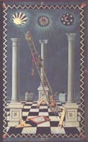 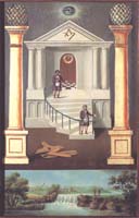 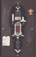 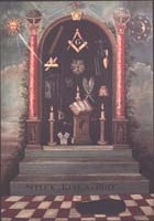  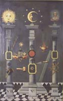 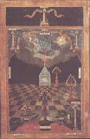 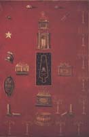
26 March 2008 It rather saddened me recently to hear that the bulk of the Robert Lenkiewicz paintings are to be sold off next month at an auction house in Exeter. The Lenkiewicz estate have had no choice because of the debts (reportedly around two million pounds) that this wonderful artist left behind when he died in 2002. Some of his paintings were sold a few years ago and also much of his library. Robert was deeply interested in occultism and religious philosophies, not that he was a believer but rather that these aspects of the human condition fascinated him. I got to know him in the 1990's when he would sometimes phone me up to ask my advice about whether he should buy some rare book he had noted in some sale. Eventually I managed to meet up with him at his studio in Plymouth, where he showed me his amazing library, and talked about his project to establish this as a permanent collection open to the public as a research resource. He also wanted to keep his major paintings in Plymouth by setting up a museum/galley for his work. Sadly, his ambitious project is now not to be. He died too young, only 60 years old. Had he had another ten or fifteen years to further his reputation, and establish higher prices for his paintings, I feel sure he would have been able to raise the funds to set up this project. The Lenkiewicz Foundation, no doubt, struggled to rescue Robert's vision, even a part of it. They can probably take comfort in knowing that with the paintings being widely dispersed, Robert's stature will be increased, as these now find their way into public collections and museums worldwide. His paintings are quite breathtaking, few people cannot but be impressed when they first see these works. They have such flair and technical brilliance, and yet they deal with deep social matters. He was certainly one of the greatest British painters of the modern period, though almost totally neglected by the British art establishment who prefer artwork as light switches turned on and off, and packets of adhesive coloured dots to stick on your wall. He was one of the most intelligent people I have ever met. At least one painting will never leave the area, as it was painted on the walls of circular room in a private house. I was privileged to have been able to see this piece, the Riddle Mural which is so technically amazing, even including anamorphic figures. Now what artist has been able to do that since Holbein in 1533? 25 March 2008 Over the passed few days I have made considerable progress with the Splendor solis painting. The illuminated border was particularly difficult and exacting work to copy. This was probably painted by Simon Bening or someone of his stature. I am working on a twice sized copy but I am really pushing at the limits of what can be done. Of course I am using the medium of oils, whereas the original is painted using water based colours on parchment. With watercolours tighter detail can be achieved. I suppose I could have worked in water based acrylics, but I find oil painting more satisfying, and the end result seems much more substantial somehow, but even working with small brushes, there is a limit to how accurately one can push the paint about. The border certainly tests ones ability to paint flowers and multicoloured birds and is a great delight. I have already substantially completed the central image and once I finish the border, I will return to the central image and rework that with more detail. I am rather happy at finally being able to work out a convincing representation for the river estuary in the background. The original is ambiguous and suggests forms with a few strokes of paint. I decided to interpret some areas as being islands in a wide estuary and suddenly the image seems to work for me. As an added bonus, by accident I have created a little atmospheric reflection of light on the water, and this provides a rather nice focus point for the central image. This painting has reached the point where it looks close to completion yet one is aware that there is so much more to do, and there are quite a few problem areas to sort out. Now I have invested many hours of work into the painting I find myself becoming a little paranoid that I might ruin it with a bit of carelessness or a rush of ill-placed enthusiasm. I spent most of the evening working on the two stags in the foreground of the border. 20 March 2008 I took a short break from the complex paintings I am currently working on, and made a painting based on a small illumination in a 15th century Flemish manuscript. This is by an unidentified artist, the Master of Evert Zoudenbalch, sometime around 1465-70 and the manuscript is now in Wolfenbüttel in Germany. I have substantially completed this, though it needs a few hours more work to tighten up the detail and soften the colours. I have enlarged it considerably but it is still a small painting about 7 inches (180mm) square. For comparison I show the original. 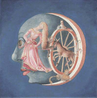 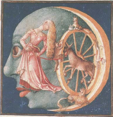
18 March 2008 On seeing that I was now devoting time to painting one of my contacts amused me with the remark that I seem to be the champion of lost causes, constantly swimming against the tide of current opinion. With my attempts to pursue alchemy as it really was, through looking at its original documents, rather than jumping on the esoteric bandwagon that is so popular nowadays. Also my interest in modern tarot as art, when the art world just sneers and ridicules this as junk and ephemera. Now he says, I have gone one better and am trying to interest people in art that died 500 years ago. He thought me completely misguided in trying to make facsimile copies of 15th century artworks, and even suggested that one can buy these from various Chinese factories for around $50, so why bother. I must say I found this a little bit insulting as this person has not seen the quality of my paintings nor compared them to the output of the Chinese sweatshops. I saw a documentary on these Chinese mass produced paintings recently. One artist was making a copies of the same painting by van Gogh working on a kind of assembly line, where he did 20 or so at at time, going from painting to painting working on the same area. It seems he was making hundreds of copies a day! I wonder how he would manage making a copy of the Rogier van der Weyden or an detailed alchemical work such as an image from the Splendor solis. Anything can look good when it is shown as a small image on the computer screen. As always I seem to be out on a limb, pursuing a vision that few seem to share. I am lucky to have a sense of humour and not take too seriously such criticisms. To have my work compared to the rubbish being churned out of China is depressing yet amusing at the same time. 15 March 2008 One of the difficulties I have is in finishing a painting. The sort of work I produce is so very detailed and when I am working on a painting there always arises a point when all the major forms are well established and the rewarding task of solving all the problems of construction and finding ways of creating particular effects and balancing the colours across the piece has been completed. One is then left with the task of finishing all the details. This requires quite a lot of will power. Other artists tend just to leave out the details and textures, merely suggesting them with some broader brushstrokes. It is perhaps my folly that I like to view paintings up close, and thus I want the detail to be there, even when it is viewed from a foot or so away. Usually when the painting looks complete to most people, I am not satisfied and feel I have to do at least as much work again on the details. Though it might look good when seen from 4 or 6 feet out, I feel I need to put in more detail so that it will look even better from that distance and will stand an even closer viewing. At the moment I have four paintings at this stage, so I must over the next few weeks use all my will power and determination to work on the details. I saw a documentary about the artist Whistler recently, and he was striving to create effects in his paintings that would be seen from a distance. Thus he had special long handled brushes made for him (seemingly about three feet long) so that he could stand some considerable distance from his canvas when painting. There are a number of Whistlers here in Glasgow in the Hunterian Art Gallery and I have looked at these a few times. I can see how his art works when seen from across the room, but I cannot really appreciate it up close as the texture of the brushstrokes seems to get in the way. 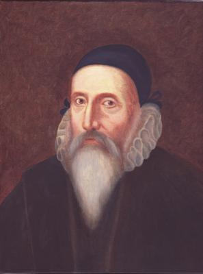 13 March 2008
I have almost completed my portrait of John Dee. I probably need another short session of a couple of hours just to tidy up a few areas and blend some elements together. Then I have to leave it to fully dry for some weeks before varnishing it. I will have to sort out a frame for it then hopefully I will offer it for sale, probably early in May. I expect this will sell rather quickly as I have already had a couple of enquiries. It is a small painting on board 11.25 by 8.75 inches (285 by 223 mm).  11 March 2008
Recently I was able to obtain high resolution scans of the Splendor solis manuscript which is now in the Germanisches Nationalmuseum in Nürnberg. Most people only know the Splendor solis as the version in the British Library and few realise that it is a copy made in 1582 from the Nürnberg version which was painted in 1545, some 37 years earlier. The Nürnberg version seems much more finely painted, particularly the illuminated border, but rarely reproduced in modern books on alchemy, as the British Library version is much more accessible. Some people have even suggested that the border and the central image were painted by different specialist artists. Unfortunately the Nürnberg manuscript images have sustained a little damage, at least some colour changes, possibly due to dampness, degeneration in the underlying vellum, earlier attempts at cleaning, or perhaps some surface varnish which has changed its translucency. It seems to me to be a surface phenomenon. When I have time I intend to make a facsimile painted copy which will attempt a restoration of these colours of the famous image of the man emerging from the swamp. 9 March 2008 I have decided that the next painting I will attempt is the miniature by Jean Perreal (c1460-1530) which prefaces an alchemical poem, La Complainte de Nature, in a manuscript in the Sainte-Genevieve library in Paris. The painting has been dated to 1516, (thus predating the Splendor solis). I did make a facsimile of this back in 2000 which I sold rather quickly, and, as I did in that painting, I will extend the image to the left of the plant form so as to include the bud. I always felt the image looked a bit cropped off. The vanishing point for the perspective in the original is outside the image, which can be unsatisfactory for the viewer. I will also reddraw and extend the image to the right of the alchemist's tower a small amount, as I find the incomplete door and window slightly unsatisfactory. I will also extend the painting upwards a little as one does not clearly see the light descending down onto the flask. I have just been reading an excellent article on this painting by the alchemical scholar Barbara Obrist. Scholars are so good at finding things and she tentatively associates the image of the large plant with a gigantic lily set up on the Bourgneuf Gate of the city of Lyons to celebrate the return of King Francis I in 1515. Perreal may have been involved in planning these celebratory decorations. Anyway I have made a provisional tracing for the painting enlarging it a little at the sides.  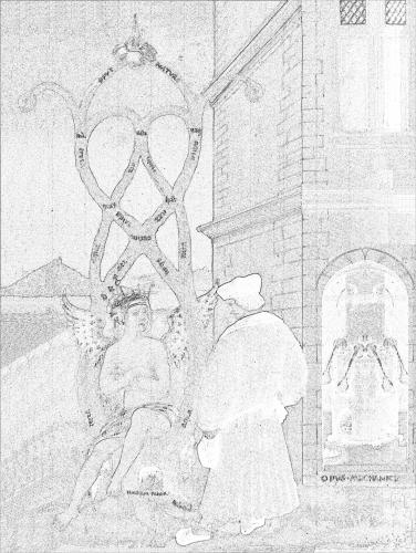
8 March 2008 I have decided now to allocate as much time as possible over the next year to producing more paintings. When working on my recent painting I found that the colour temperature of the light under which I was working was too low, too red. I use a dual quartz halogen floodlight some distance back from my easel and some daylight spotlamps close up to the painting to add more blue to the lighting. This is inadequate, so I have now installed a metal halide floodlight high up on the wall of my workshop. This is a much higher colour temperature light source but being basically an arc light it is rather harsh, so I have mounted it on the other side of the room from my painting work space and this just adds to the colour spectrum without dominating the illumination. The light thus shines from above over my shoulder, hopefully mimimising casting my shadow onto the area I am working on. I will try it out over the next few days in the hope that it solves a few problems. It is essential not to look direct at this light source as it is so bright. 7 March 2008 People sometimes say to me, "you should make some original paintings rather than copying these old works". To many people, art is all about originality, an artist is someone who creates something entirely new. Of course this does not apply to music, as so many people prefer to hear the works of long dead composers such as Telemann, Mozart, Beethoven, Debussy and all the others, and even avoid listening to music being composed nowadays. In an inverted way, my work is very different in that I am not interested in creating something original, but in restoring and reviving artworks of centuries ago, and especially those with allegorical, alchemical and emblematic import. The world is full of artists all doing completely different and original things, many of which seem very poor, apart from being entirely devoid of technique. The art world is full of such rubbish, all labelled as "original". Yesterday I came across one of those silly entirely media driven art stories. Helena Seget has a pet rat whom she calls 'Tony Blair'. Somehow she has managed to get some bits of wire, discarded food and nuts which have been chewed by this rat, exhibited in the Lime Studio Gallery in Newcastle and even mentioned on the prestigous Saatchi Gallery website. This rat even has a weblog. It is rather depressing to see such nonsense given public exposure - no doubt some sad individuals will buy these chewed up shreds, or she will get some publicity for her other work on the back of this. Here I am struggling with the nuances of the different earth tones, the wonderful transparency of raw and burnt Sienna, how the opacity of Naples Yellow is useful in flesh tones, and how a delightfully subtle greyish green arises from mixing Prussian Blue with burnt Sienna and Vandyke Brown. We admire technique in a concert pianist, a ballet dancer, an ice skater, or a jazz musician, but it seems that it is no longer much valued in art. 6 March 2008 A few years ago I found an interesting illustration in a modern French book on alchemy. This engraving clearly showed a figure carrying a shield with sun, moon stars and winged heart and I put it down as an alchemical emblem. This modern French book did not identify the book from which it was taken, except to say it was an illustration in a work of Louis Cadet de Gassicourt (a late 18th and early 19th century writer). I asked some colleagues what it could be and one suggested that it was most likely an emblem of St Jerome with no alchemical significance. I put it in my pile of images to colour and eventually forgot about it. A week or so ago it surfaced from a pile of images and I decided to hand colour it. A few days later I was in the University library looking at some art books, when suddenly I spotted a woodcut by Durer that was of the same image, the only difference being, that the engraving was a mirror image of the Durer. I realised how stupid I had been. The figure in the Durer woodcut is holding his staff in his right hand, while in the engraved version it was in his left. The engraving had obviously been copied from the Durer, as this printing process reverses the left and right sides of an image. I should have noticed that earlier. The Durer woodcut is quite delightful and I immediately began making a coloured version of this image also. The Durer woodcut was made in 1494 and was included in an Italian book Gerson nei panni del pellegrino ("Gerson in the clothes of a pilgrim"). Jean Gerson (1363- 1429) was French scholar, educator, reformer, theologian and poet. So this image is not alchemical but certainly allegorical and emblematic. I show the two images side by side (the Durer on the left and the later engraving on the right. 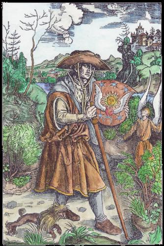 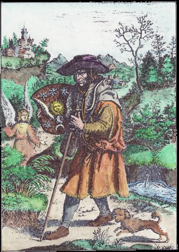
5 March 2008 In making my paintings I now use alkyd oil paints. These are prepared like conventional oil paints but using a special alkyd oil. This gives them exceptionally fast drying times. When I first started painting in oils I found the slow drying time frustrating, as I paint in very great detail and I often found that when working on the painting the next day, I could damage or smear an area I had previously worked on, merely by contacting it with my sleeve or the side of my hand. Alkyds dry so quickly, and as I use thin layers of paint, it meant I could begin working again on a painting without any fear of damaging it. Alkyd oil paints, at least in the product I use produced by Winsor and Newton, have other interesting properties. They seem very finely ground, and are not sticky or chalky as with some oil colours. Most of the pigments are transparent which makes them a delight to use for my particular painting style, which relies on many thin layers of paint. The method of painting using glazes, which was commonly used in the early paintings I like to copy, must have been very frustratiing for early artists as they had to wait some considerable time for a glaze layer to dry before applying a layer on top of that, probably weeks. If they painted on top too early they would loosen the underlayer and the pigments would puddle. With alkyd oils the underlayer can usually be over painted on the next day without the danger of loosening and puddling. So effectively I can mimic the use of glazes and finish a painting in days rather than weeks. The alkyds pigments I use are also wonderfully luminous and very suited to painting in thin layers. In general I don't use a medium, as the paints themselves have a good measure of alykd medium in them and I can paint with them neat, as it were, or with just a very little turpentine or even white spirit. This does produce slight differences of reflectiveness with areas of different pigments, especially those mixed with white, and so when I complete a painting I oil out the work with liquin alkyd medium, which gives it a wonderful glaze, like a deep varnish. I really enjoy that moment as all the little imperfections seem to become smoothed away and the colours glow even more luminous.  4 March 2008
I am continuing to work on my version of the right wing of Rogier van der Weyden's Braque Triptych. This small scale piece was made around 1450 for the oratory of a wealthy merchant, Jean Braque. The right wing shows Mary Magdalen. I was rather drawn to this work, not for its religious theme, but for the wonderfully melancholic figure of Mary, and her setting in an idealised Northern European landscape. As with many of these 15th century works the areas where the artist has used significant amounts of white mixed in his paints, such as the sky and the face, have badly cracked, so I like to make a copy which shows a little of how the painting would have looked in the the century immediately after it was painted. I also worked her blue cloak in a slightly different way, using continuous tones for the modelling, rather than the way in which Rogier painted the form of the cloak in a dark colour then modelled the folds using small strokes and filaments of slightly lighter blue paint. I worked the face in just two sessions and will not touch it any more, as the thin paint layer seems to look okay. One thing I really like about this painting is the idealised landscape. I will spend a great number of hours adding as much detail into this as I can see in the reproduction I have of Rogier's painting, as it really makes the painting. I have done it about the same size as Rogier's original. It is at the limits of my technical ability. I show the original opposite. When I get access to my digital camera I will photograph my version and put it up on this site. It will be an expensive painting as it will absorb many hours of my time. 3 March 2008 Over the last few months I have found myself especially drawn to 15th century Flemish paintings. One element often found in such paintings is a window which looks out onto a stylised landscape. We see this in Rogier van der Weyden's St Luke Drawing a Portrait of the Virgin c. 1450. St Luke was of course the patron saint of painters.  
Rogier was obviously echoing Jan van Eyck's Madonna with Chancellor Rolin, made a decade or so earlier in 1436 (which I show on the right). I really love the view though the window in van Eyck's painting out across the town set astride a river, and if I can ever get a sufficiently detailed image of this, I will attempt to make a facsimile painting in oils of this view through Jan van Eyck's window of an idealised townscape. 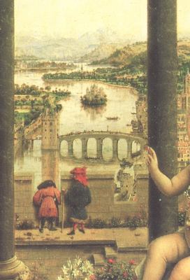
|