|
Ambriel
Member

|
Wow, I just check out the card already posted...they are all wonderful!!
|
|
|
debra
Member
| Joined: | Sun Sep 9th, 2007 |
| Location: | |
| Posts: | 1115 |
| Status: |
Offline
|
|
ALL CARDS SPOKEN FOR, YAY!
Heirophant....Demian
Strength.....Philebus
Emperor..... Ambriel has agreed to do the Emperor!
I'll update all the "specifications" here in a new posting, so people don't have to wade through 15 pages of conversation. Stay tuned.
Last edited on Tue Feb 12th, 2008 02:07 am by debra
|
|
|
debra
Member
| Joined: | Sun Sep 9th, 2007 |
| Location: | |
| Posts: | 1115 |
| Status: |
Offline
|
|
SPECIFICATIONS FOR THE CARDS
3" x 4.5" or any size at a ratio of 1: 1.5 that can be scanned at 300 DPI or higher
No use of material copyright to another
Do not put card name or number on the image itself
Borders (black or white?) to be determined later
OnePotato, our printer, has some ideas about card backs
THE LITTLE WHITE BOOK
We would like a statement from you about the card for the LWB. Card description Say a few words about how you made this card.
Card meaning Say a few words about what this card means to you.
Artist bioSay a few words about yourself
Post it here: http://www.tarotcollectors.com/view_topic.php?id=286&forum_id=3
THE PROCESS
1. We individually design cards. Who has what card is in the first post of this thread.
2. You may post your card, in progress or finished, in this thread, or in this folder: http://www.tarotcollectors.com/collaborative_deck/
To post in the folder, send a scan to Adam at adam@alchemywebsite.com
3. Participants write something for the LWB. It probably won't be more than a sheet or two of paper, but suggestions welcome. This can simply be a document you print yourself in with any b & w printer, or I can run some off and mail them, too. http://www.tarotcollectors.com/view_topic.php?id=286&forum_id=3
4. BlueToy consults with the group, adds titles and borders, and deals with any other layout issues.
5. BlueToy sends the card image files to OnePotato, who prints them.
6. Participants send OnePotato our mailing addresses and a bit of money to help offset his costs of printing and mailing the cards (or the sheets, for those who would prefer that the cards not be cut). OnePotato mails the goodies.
7. We are all delighted!
Last edited on Tue Feb 12th, 2008 03:32 am by debra
|
|
|
BlueToy
Member
|
i've updated the list on the first page too...
|
|
|
truelighth
Member

| Joined: | Tue Oct 9th, 2007 |
| Location: | |
| Posts: | 1069 |
| Status: |
Offline
|
|
I think I may have found the solution for the scanner. There is a shop in the city that can scan this format (and bigger) at 300 dpi. Now I need the time to go there.
And I think I will post both cards. One day I am more inclined to send one, the other day the other.
|
|
|
debra
Member
| Joined: | Sun Sep 9th, 2007 |
| Location: | |
| Posts: | 1115 |
| Status: |
Offline
|
|
That will be fun for us, truelight! I would love to see both versions and hear what you say about them!
MORWENNA! Temperance took my breath away!
|
|
|
mythos
Member

|
Nearly finished my Hanged Man (?). I "?" the Man because I went with the chimera theme. Sorta more that Hanged Chimera. It is not any known mythological chimera but a 'mythos' created one. It is rather awful still. I found that I was without one of it's arms ... fixing that helped. I am going to put some of those irritating symbols on it ... because they 'explain' it so some extent. Must add this information to the LWB bit. Must write the LWB bit ... Arrgggh!
mythos:)
|
|
|
truelighth
Member
| Joined: | Tue Oct 9th, 2007 |
| Location: | |
| Posts: | 1069 |
| Status: |
Offline
|
|
debra wrote: That will be fun for us, truelight! I would love to see both versions and hear what you say about them!
MORWENNA! Temperance took my breath away!
Well, they are not spectacular to be honest. It is the same design and drawing, but then executed twice. Anyway, hoping to get them scanned soon.
|
|
|
Demian Brennan-Gould
Member

| Joined: | Tue Oct 30th, 2007 |
| Location: | Illinois USA |
| Posts: | 294 |
| Status: |
Offline
|
|
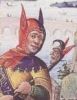
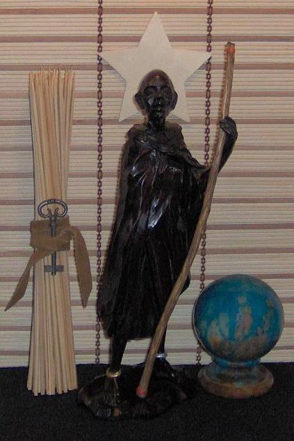
Thanks to Debra's guidance and help everything has been fairly straightforward, and I've sent the full-size scan of the image here below to Adam. Here is the image of my Hierophant at 65% to fit on screen. I'm still getting to know him! 
Attached Image (viewed 114 times):
|
|
|
debra
Member
| Joined: | Sun Sep 9th, 2007 |
| Location: | |
| Posts: | 1115 |
| Status: |
Offline
|
|
Oh nice!
|
|
|
gregory
Administrator

| Joined: | Wed Sep 12th, 2007 |
| Location: | United Kingdom |
| Posts: | 3281 |
| Status: |
Online
|
|
Holy bleep.
*Hides*
|
|
|
debra
Member
| Joined: | Sun Sep 9th, 2007 |
| Location: | |
| Posts: | 1115 |
| Status: |
Offline
|
|
I recognize those sticks...we have some too. Although...ours get more mundane usage

|
|
|
Demian Brennan-Gould
Member
| Joined: | Tue Oct 30th, 2007 |
| Location: | Illinois USA |
| Posts: | 294 |
| Status: |
Offline
|
|
debra wrote: I recognize those sticks...we have some too. Although...ours get more mundane usage
Every piece here has a story, a history. The bamboo sticks are actually a dedicated Yi Jing set, many years in service. The key was an inspired touch, reflecting both Letter 5 Heh of the ancient alphabets and it resembles the horns of Aries, the corresponding astrological sign for The Hierophant, a very sexy guy!
|
|
|
Ambriel
Member
|
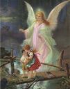
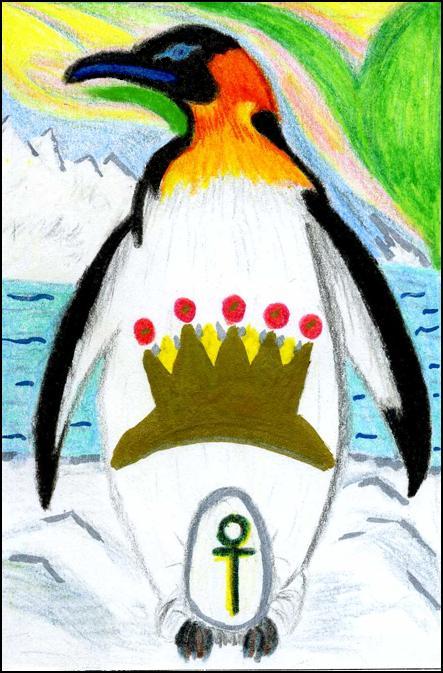
:) I finished my card and sent it to Adam for posting.
I hope it's the right size, etc. I had to ask a friend to scan if for me.
All the card are wonderful, really wonderful...and I hope my card meets the groups expectations. :)
Attached Image (viewed 97 times):
|
|
|
Mr. la-luna
Member

| Joined: | Sat Sep 8th, 2007 |
| Location: | Aalst, Belgium |
| Posts: | 525 |
| Status: |
Offline
|
|
Ambriel wrote: :) I finished my card and sent it to Adam for posting.
I hope it's the right size, etc. I had to ask a friend to scan if for me.
All the card are wonderful, really wonderful...and I hope my card meets the groups expectations. :)
For what's its worth I love it
|
|
|
debra
Member
| Joined: | Sun Sep 9th, 2007 |
| Location: | |
| Posts: | 1115 |
| Status: |
Offline
|
|
Oh I love that, Ambriel. What a surprise! A "good daddy" Emperor!
|
|
|
Morwenna
Member

| Joined: | Fri Sep 14th, 2007 |
| Location: | Germany |
| Posts: | 99 |
| Status: |
Offline
|
|
Penguins are my favourites! Love his royal posture, too!
|
|
|
truelighth
Member
| Joined: | Tue Oct 9th, 2007 |
| Location: | |
| Posts: | 1069 |
| Status: |
Offline
|
|
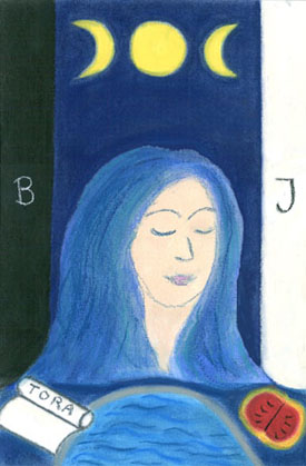
I finally made it to the copy shop today to scan my drawings. So here she is.. or rather, here she is twice: the High Priestess. I would love to hear which one you all prefer. I myself like the face of the left one and the colours of the right one. Attached Image (viewed 128 times):

|
|
|
gregory
Administrator
| Joined: | Wed Sep 12th, 2007 |
| Location: | United Kingdom |
| Posts: | 3281 |
| Status: |
Online
|
|
I agree with you
|
|
|
debra
Member
| Joined: | Sun Sep 9th, 2007 |
| Location: | |
| Posts: | 1115 |
| Status: |
Offline
|
|
Ah, I like the one on the right better in all respects. It looks better as a card, and I like her more simple face. Lovely.
|
|
|
truelighth
Member
| Joined: | Tue Oct 9th, 2007 |
| Location: | |
| Posts: | 1069 |
| Status: |
Offline
|
|
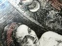
And then... there was a Third Option :shock:
Since I like the face of one and the colours and clean lines of the other, I decided to copy and paste. It took a bit of effort, but I think the result is very nice. At least, I hope it doesn't show that this was originally two pictures. Now I really don't know anymore!!!
Attached Image (viewed 117 times):
|
|
|
mythos
Member
|
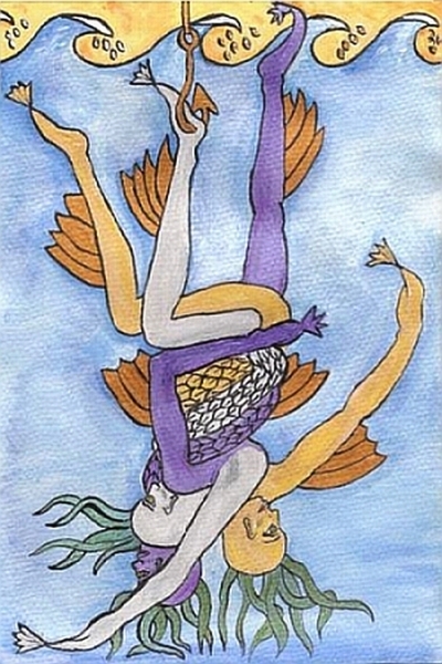
Ummmm ... embarrassment plus after seeing everyone else's .... forgive the chimeric mess. Ta Da! The Hanged Chimera Man.
mythos:)
Attached Image (viewed 115 times):
|
|
|
truelighth
Member
| Joined: | Tue Oct 9th, 2007 |
| Location: | |
| Posts: | 1069 |
| Status: |
Offline
|
|
Why embarrasment over your card? It is lovely! If anything, I still feel mine isn't good enough... lol!
And btw, the reason I didn't have any Chimeras in my card is.. I have no clue on how to draw them. So I really admire yours!
Last edited on Tue Feb 19th, 2008 11:45 pm by truelighth
|
|
|
skad1
Member

| Joined: | Thu Sep 20th, 2007 |
| Location: | Dallas, Texas USA |
| Posts: | 1255 |
| Status: |
Offline
|
|
mythos wrote: Ummmm ... embarrassment plus after seeing everyone else's .... forgive the chimeric mess. Ta Da! The Hanged Chimera Man.
mythos:)
I really, really like the "hanged Chimera man"!  :l it's so much better than what I imagined a chimera would be, and I like the fish hook in the foot. Original thinking! I just wasn't too sure about the chimera idea, but you've done an absolutely wonderful card. :l it's so much better than what I imagined a chimera would be, and I like the fish hook in the foot. Original thinking! I just wasn't too sure about the chimera idea, but you've done an absolutely wonderful card.
Well, I did my first sketch, and was actually fairly pleased. then...I came and looked at everyone else's, and my poor sketch looks yucky.:s:s
There is a great deal of original and very creative stuff happening on these cards.
As far as a name, how about the TCF 2008 Collaborative Deck. Can the back have a picture of a rabbit banging his head?
Last edited on Wed Feb 20th, 2008 01:15 am by skad1
|
|
|
debra
Member
| Joined: | Sun Sep 9th, 2007 |
| Location: | |
| Posts: | 1115 |
| Status: |
Offline
|
|
Mythos, what an inspiration. (Now I see why your son didn't want to pose for it!) I wonder if this is YOUR "hanged man" year, all tied up with family and head under water...definitely very evocative.
skad1 wrote:
Well, I did my first sketch, and was actually fairly pleased. then...I came and looked at everyone else's, and my poor sketch looks yucky.
As far as your "poor sketch looking yucky," skad--remember the "this is supposed to be fun" part of the deck.
Anyway, let us be the judge of that!

Last edited on Wed Feb 20th, 2008 03:44 am by debra
|
|
|
Mr. la-luna
Member
| Joined: | Sat Sep 8th, 2007 |
| Location: | Aalst, Belgium |
| Posts: | 525 |
| Status: |
Offline
|
|
I went to sleep and when i came back 2 new and great looking cards have appeared here.
Feeling more and more satisfied with my "creation" when i see all the others it seems bleak and weak and well....:pz sigh
|
|
|
debra
Member
| Joined: | Sun Sep 9th, 2007 |
| Location: | |
| Posts: | 1115 |
| Status: |
Offline
|
|
Luna, I like it, but if you want to change it, there's time.
Tomorrow is a full lunar eclipse! 
|
|
|
philebus
Member

| Joined: | Mon Oct 22nd, 2007 |
| Location: | United Kingdom |
| Posts: | 46 |
| Status: |
Offline
|
|
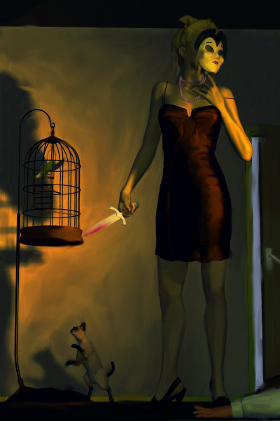
I'm sorry to say that I have found myself somewhat out of practice - I hope this isn't going to let the side down.
I've completed my design but am not sure that it is bright enough. My personal preference is for dark with lots of contrast. However, this is a smaller image than I would normally create a full scene for, so I'll let you folk choose between the dark and the lightened versions.
I have taken the two main elements from the traditional image but then tried to do my own thing with them. The result isn't very subtle though :(
Here is the original.
Attached Image (viewed 88 times):
|
|
|
philebus
Member
| Joined: | Mon Oct 22nd, 2007 |
| Location: | United Kingdom |
| Posts: | 46 |
| Status: |
Offline
|
|
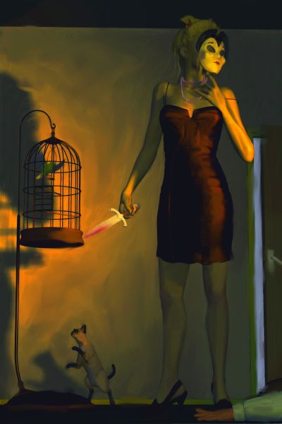
Here is the brighter version Attached Image (viewed 86 times):
|
|
|
philebus
Member
| Joined: | Mon Oct 22nd, 2007 |
| Location: | United Kingdom |
| Posts: | 46 |
| Status: |
Offline
|
|
truelighth,
I would go for the one on the right as well. I like bright colours and the face looks more serene to my eye.
|
|
|
debra
Member
| Joined: | Sun Sep 9th, 2007 |
| Location: | |
| Posts: | 1115 |
| Status: |
Offline
|
|
How interesting. My first reaction was to think "Devil" as I see strength in a positive light.
|
|
|
philebus
Member
| Joined: | Mon Oct 22nd, 2007 |
| Location: | United Kingdom |
| Posts: | 46 |
| Status: |
Offline
|
|
I hope it isn't too negative. The traditional image has a woman overcoming a lion, so I put the cat and the canary in the background to suggest a positive reading of her actions.
|
|
|
mythos
Member
|
debra wrote:
I wonder if this is YOUR "hanged man" year, all tied up with family and head under water...definitely very evocative.
'Tis indeed my Hanged Man year. My first thoughts on creating the image ... pre-suicide attempt, was a figure wrapped in barbed wired. This one is post suicide attempt. Oh illumination! I suddenly see ... but had only realised it now (total insight moment), is more indicative of all the people I am split into. However ... on the positive side, they are at least writhing together as a team ... not separately.
Philebus ... yours is a gem. To maintain strength one often needs to explore the dark places. To live with courage we need to be able to hold it aloft in the dark places. Good one.
mythos:)
|
|
|
skad1
Member
| Joined: | Thu Sep 20th, 2007 |
| Location: | Dallas, Texas USA |
| Posts: | 1255 |
| Status: |
Offline
|
|
philebus wrote: I've completed my design but am not sure that it is bright enough. My personal preference is for dark with lots of contrast. However, this is a smaller image than I would normally create a full scene for, so I'll let you folk choose between the dark and the lightened versions.
I like the lighter image, you can see the image better. (Oh my poor aging eyes!)
But I agree with Debra, I thought it was a Devil card too. A really, really neat one, but the devil none the less. There was a first indication of the Death, but then the hiding of the face behind a mask made me think Devil, plus the red dress...
But it's such an awesome card! :l
|
|
|
debra
Member
| Joined: | Sun Sep 9th, 2007 |
| Location: | |
| Posts: | 1115 |
| Status: |
Offline
|
|
Wow Mythos. Whew.
Philebus, for me it's the bloody dagger along with the hidden face that say "devil." The strongest people I know would use a knife only as a last resort, and demonstrate their strength as an element of their character (not hidden by a mask, I mean).
|
|
|
philebus
Member
| Joined: | Mon Oct 22nd, 2007 |
| Location: | United Kingdom |
| Posts: | 46 |
| Status: |
Offline
|
|
My thinking was that behind a mask we can often find a strength we don't have as ourselves. The cat tormenting the caged carary was to recall the lion of the traditional image, while she is the canary and the fallen man her tormentor. The open door behind was to suggest freedom.
Having chosen the story and the cat/canary elements, the rest was a tough arrangement. The bloodied dagger and the body all but out of picture allowed me to keep the cat and canary whilst still having a strong central figure. Other options just seemed to clutter the image and I ended up with an ever smaller figure. That was a problem because of my preference for lighting, so I had to keep it bold.
|
|
|
nicole
Member

|
After seeing all of your cards I am a wreck...have dedicated this weekend to getting my act together and producing.
I am counting on my magician to do some magic. :)
|
|
|
Mark E Merrill
Member

| Joined: | Fri Jan 18th, 2008 |
| Location: | |
| Posts: | 21 |
| Status: |
Offline
|
|
...that's why i'm not looking!
i'm so... curious to see what ya'll have done!
my third party to photograph arrived yesterday - will then begin final digital collage...
maybe by next week finished?
xoxo,
the fool!
|
|
|
Mr. la-luna
Member
| Joined: | Sat Sep 8th, 2007 |
| Location: | Aalst, Belgium |
| Posts: | 525 |
| Status: |
Offline
|
|
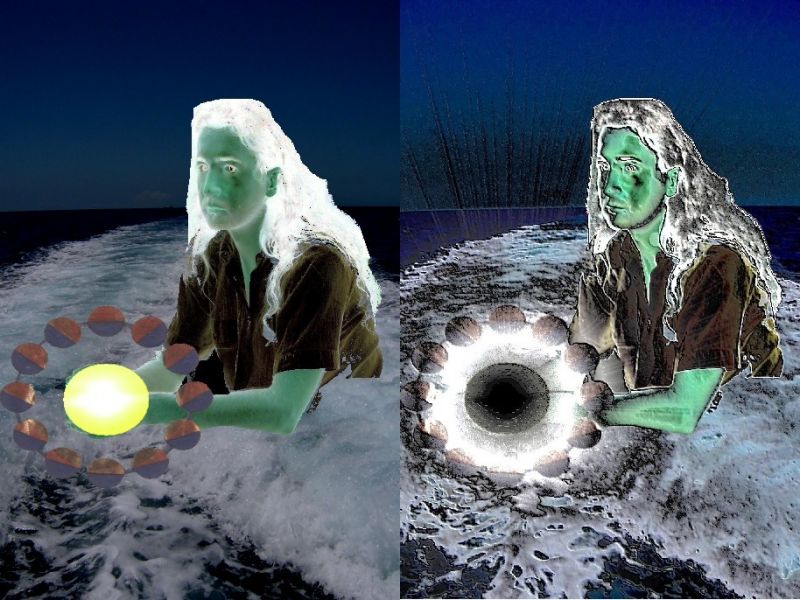
Since my last version I have played a bit around with my card and now I’m no longer sure what the one is I love the most. So I’ll let you see what you think about it left is the original one right the new version.
Attached Image (viewed 92 times):
|
|
|
gregory
Administrator
| Joined: | Wed Sep 12th, 2007 |
| Location: | United Kingdom |
| Posts: | 3281 |
| Status: |
Online
|
|
I like the first one better, if that carries any weight.
The other looks somehow a bit contrived; also, I don't like what the inverse change has done to the face.... it seems to have given it a plane that looks somehow - non facial.... and the background has got a bit grainy, too....
|
|
|
debra
Member
| Joined: | Sun Sep 9th, 2007 |
| Location: | |
| Posts: | 1115 |
| Status: |
Offline
|
|
The new moon itself seems more interesting to me than just the yellow ball.
Jackdaw has agreed to take THE LOVERS card.
|
|
|
Jackdaw
Guest
| Joined: | |
| Location: | |
| Posts: | |
| Status: |
Offline
|
|
Yes, I have :) Thanks to Debra and Gregory for putting me on to it ... I just hope I can live up to the work everyone else here has done!
|
|
|
Mark E Merrill
Member
| Joined: | Fri Jan 18th, 2008 |
| Location: | |
| Posts: | 21 |
| Status: |
Offline
|
|
la-luna! keep going! keep experimenting... you're on to something good! you'll be loving them even more!
|
|
|
gregory
Administrator
| Joined: | Wed Sep 12th, 2007 |
| Location: | United Kingdom |
| Posts: | 3281 |
| Status: |
Online
|
|
debra wrote: The new moon itself seems more interesting to me than just the yellow ball.
Good point. There I agree....
|
|
|
truelighth
Member
| Joined: | Tue Oct 9th, 2007 |
| Location: | |
| Posts: | 1069 |
| Status: |
Offline
|
|
Well, I must be the odd one out. I like the new version better. Somehow it has something spooky and eary and I think it fits the Moon. I most definately like the new moon better then the yellow ball.
|
|
|
|
|
|