|
| Posted: Wed Mar 24th, 2010 05:21 am |
|
1st Post |
papoon
Member

| Joined: | Mon Apr 7th, 2008 |
| Location: | California USA |
| Posts: | 499 |
| Status: |
Offline
|

|
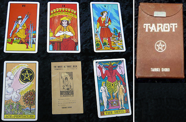
Back in December of last year, Adam featured the Japanese Waite J.K. Tarot on his weblog. He described it as being issued in 1989 with artwork by Seigan Nakajima from 1975 and coming with a book in what I assume to be one of the typical Japanese-style shelf boxes.
I received a copy of the deck last week, but it seems to be a different edition. As you can see in the photo, is comes is a small fiberboard snap-top box with a minimal LWB and has only a 1975 copyright notice on one of the cards. In addition, assuming that the colors in Adam's scan are accurate (which they virtually always are) the colors on my copy are very much more saturated than Adam's.
My suspicion is that there were (at least) two editions of this deck, and this one is an earlier one. Does anyone else have one or the other of these versions or any other info about it?Attached Image (viewed 215 times):
|
|
|
| Posted: Wed Mar 24th, 2010 10:29 am |
|
2nd Post |
AdamMcLean
Member

|
I took a look at the book and found that it had a double copyright date - 1975 and 1989. So it would appear that you have the first edition and I have a later reprinting with the extended book. Comparing with your images I don't think the cards were redrawn, but they have printed out with a slightly flatter contrast and saturation.
|
|
|
| Posted: Sat Apr 10th, 2010 02:14 pm |
|
3rd Post |
truelighth
Member

| Joined: | Tue Oct 9th, 2007 |
| Location: | |
| Posts: | 1069 |
| Status: |
Offline
|
|
I also have a Waite J.K. , but it is the same as the one from Adam as far as I can tell. The colours are the same and it did come in a cardboard box with a book. I got mine from Tarotgarden. The deck itself was in a creme coloured cardboard box, with says Tairiku Shobo on it. I never knew there was an earlier and later printing, I always went with the info from Tarotgarden on this one.
Last edited on Sat Apr 10th, 2010 02:16 pm by truelighth
|
|
|
| Posted: Mon Apr 12th, 2010 06:24 pm |
|
4th Post |
Mr. la-luna
Member

| Joined: | Sat Sep 8th, 2007 |
| Location: | Aalst, Belgium |
| Posts: | 525 |
| Status: |
Offline
|
|
I looked at my J K Tarot, the colors definately match those in papoon's scans - but further matcht truelights description (didn't find any date in the book ) only date i found is on one of the extra cards with the deck giving the date 1975. Last edited on Mon Apr 12th, 2010 06:26 pm by Mr. la-luna
|
|
|
| Posted: Thu Apr 15th, 2010 01:35 am |
|
5th Post |
lulukat
Member

|
I can't stop staring at this thread.
Oh man. These cards are just delicious!
|
|
|
| Posted: Thu Jun 3rd, 2010 10:07 am |
|
6th Post |
lulukat
Member
|
My JK Waite has arrived also and I am SOOO excited about this deck.
And if you haven't yet - it is well worth comparing each card side by side to the USG RWS .... I feel that this artist has really "improved" the RWS in an interesting way - or let's say, his take enhances details that would otherwise be overlooked.
I never noticed the snail on the ground in the 9 of Pents before - check it out.
The figures in these cards are facing more towards the viewer and overall all images appear to be "zoomed" in a bit to make use of the entire space of the card without overcrowding it. Like a photographer who moves one step to the left or right and shows the same scenario from a slightly different angle.
I've also noticed different horizontal lines in some cards, I could go on and on.
The Emperor for instance is shown sideways, not frontally. The body language is enhanced but not overwhelmingly so.
The differences are subtle overall but visible enough to give the entire deck a whole new perspective. Literally !
And those colors ... delicious.
I guess I lucked out because I received my copy (also the 1975 edition) in near mint condition.
Thanks for sharing this, papoon - I would have forgotten about this one if you wouldn't have posted about yours here.

|
|
|
| Posted: Sun Dec 6th, 2020 11:56 pm |
|
7th Post |
Res
Member
| Joined: | Wed Mar 12th, 2008 |
| Location: | |
| Posts: | 1 |
| Status: |
Offline
|
|
Actually my copy is slightly different with a dark purple back card with white star in center.
My edition also as the same brown snap box and with 1975 copyright card.
|
|
|
| Posted: Tue Dec 8th, 2020 08:15 pm |
|
8th Post |
papoon
Member
| Joined: | Mon Apr 7th, 2008 |
| Location: | California USA |
| Posts: | 499 |
| Status: |
Offline
|
|
Whoa! The resurrection of a zombie thread.
Looking at what's now in my collection (I think I bought and sold some in the intervening years), there seems to be at least 4 different editions (there may be more). In addition to the one originally posted:
- Shelf box with blue textured card stock folder holding the deck in a brown textured card snap box + a thick book. Red, finely checked card backs. Internal structure of folder is the same textured blue card stock as the cover.
-Shelf box with blue plastic folder with the deck in a brown snap box + thick book. Purple card backs with central star. Internal structure of the folder is blue plastic for the book pocket and white foam for the deck.
- Deck in a pale cream textured tuck box (no snap). Red, finely checked card backs. Minimal LWB.
|
|
|
Current time is 05:36 pm | |
|
|
|