 |
| Posted: Thu Jul 31st, 2014 06:39 pm |
|
1st Post |
spiralingcadaver
Member
| Joined: | Thu Jul 24th, 2014 |
| Location: | USA |
| Posts: | 17 |
| Status: |
Offline
|

|
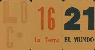
Hi, I've attached a deck that is right up my alley, but I have no info on it other than a blogger who rejected what I think is a great looking deck, and referencing "Tipografico Tarot," which didn't yield any useful info.
I'd appreciate any leads, since I think the deck has a great sensibility.Attached Image (viewed 104 times):
 Last edited on Fri Aug 1st, 2014 08:19 am by spiralingcadaver
|
|
|
| Posted: Fri Aug 1st, 2014 02:56 pm |
|
2nd Post |
| Posted: Fri Aug 1st, 2014 05:12 pm |
|
3rd Post |
spiralingcadaver
Member
| Joined: | Thu Jul 24th, 2014 |
| Location: | USA |
| Posts: | 17 |
| Status: |
Offline
|

|
Oh, yes, I didn't connect the name to this blog.
Unlike a lot of retro design which I think only pays lipservice to the more stylized elements without really connecting with what they're referencing, I think this nailed it perfectly- they look like a really great design piece.
Thanks for the tip- I'll probably check it out, down the way when I have some down time.
|
|
|
| Posted: Thu Aug 21st, 2014 09:34 pm |
|
4th Post |
AdamMcLean
Member


|
spiralingcadaver wrote:
.
Unlike a lot of retro design which I think only pays lipservice to the more stylized elements without really connecting with what they're referencing, I think this nailed it perfectly
Can you please explain to me how this simple printing
of the numbers and names of the tarot arcana connects
to what they are referencing ?
|
|
|
| Posted: Fri Aug 22nd, 2014 12:39 am |
|
5th Post |
debra
Member

| Joined: | Sun Sep 9th, 2007 |
| Location: | |
| Posts: | 1115 |
| Status: |
Offline
|

|
I can see it. The 21 is fat and stable; the tower numerals echo the shape of the Tower, and the Fool, el Loco, is disordered and irregular.
There's beauty in typography.
|
|
|
| Posted: Fri Aug 22nd, 2014 09:36 am |
|
6th Post |
AdamMcLean
Member


|
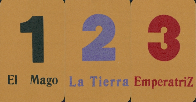
I am not sure that interpretation works.
Cards 1-9 all use the same bold sans serif font for the numbers.Attached Image (viewed 72 times):
|
|
|
| Posted: Fri Aug 22nd, 2014 08:07 pm |
|
7th Post |
debra
Member

| Joined: | Sun Sep 9th, 2007 |
| Location: | |
| Posts: | 1115 |
| Status: |
Offline
|

|
It's the overall concept--of typographic imagery. A visual echo of the traditional card imagery doesn't have to be present in all the cards to convey the concept--the idea is to accept, or maybe embrace, type. Last edited on Fri Aug 22nd, 2014 08:10 pm by debra
|
|
|
| Posted: Sat Aug 23rd, 2014 05:56 am |
|
8th Post |
debra
Member

| Joined: | Sun Sep 9th, 2007 |
| Location: | |
| Posts: | 1115 |
| Status: |
Offline
|

|
Oh rats. I was rude to interrupt here; sorry about that--I hope I haven't killed the discussion.
|
|
|
| Posted: Sat Aug 23rd, 2014 06:29 pm |
|
9th Post |
OnePotato
Member
| Joined: | Sun Sep 9th, 2007 |
| Location: | USA |
| Posts: | 325 |
| Status: |
Offline
|

|
AdamMcLean wrote:Can you please explain to me how this simple printing
of the numbers and names of the tarot arcana connects
to what they are referencing ?
I don't speak for spiralingcadaver, but as someone who has spent some time as a graphic designer.
This is clearly a minimalist work.
It is referencing the functional numbers on the cards.
For the fool, having no real number, is identified by the name, with a nod to the "o" as a zero.
Absolutely no effort is made to interpret, or even reference, the traditional tarot imagery.
In this sense, it could be viewed as sharing something with a tarock deck, yet I wouldn't literally call it a "tarock" either.
What it DOES do, as a piece of conceptual work, is present us with the results of the process of letterpress.
It isn't about the illustrative content of the image.
It looks like he's probably using traditional wood type, or vintage metal.
It has subtle qualities that simply do not exist in current digital type.
Some digital fonts may try to mimic some of these qualities, but they are not "real".
For instance, the letterpress process makes a subtle impression on the paper that occurs as a natural result of the process. I suppose it could be simulated, but it cannot be reproduced.
The letterforms themselves distort slightly, and evolve over time as they wear. Again, the appearance of this may be "faked" in digital type, but the actual history can't be.
These are just a couple of points, among many.
There is a certain beauty in letterpress, which goes beyond mere appearance.
If one is only interested in the image on the page, then, yes, there's not much to see here.
But the vast majority of decks out there don't pay any attention at all to what this one brings to the fore. It's born out of the love of, and respect for, the process. And I quite like that.
Last edited on Sat Aug 23rd, 2014 06:31 pm by OnePotato
|
|
|
| Posted: Sat Aug 23rd, 2014 10:31 pm |
|
10th Post |
| Posted: Sun Aug 24th, 2014 09:30 am |
|
11th Post |
AdamMcLean
Member


|
The Argentinian deck is a piece of conceptual art.
The essence of this lies in the concept of issuing
a tarot deck in which only the numbers and names of
the cards are used. The use of letterpress printing
seems only there to give the concept a certain gravitas.
We have to see this as a conceptual piece and not
convince ourselves that there is any other aesthetic
content or substance to the work.
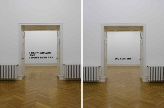
I attach two artworks by conceptual artist Stefan
Bruggemann that demonstrate the style.
I suspect I will be one of the very few people to
own a copy.Attached Image (viewed 53 times):
|
|
|
| Posted: Sun Aug 24th, 2014 10:21 pm |
|
12th Post |
OnePotato
Member

| Joined: | Sun Sep 9th, 2007 |
| Location: | USA |
| Posts: | 325 |
| Status: |
Offline
|

|
Appreciating this kind of work on any sort of significant level requires a different set of standards.
There is no single "essence of this deck".
I tried to explain my view of it very briefly above.
His "point" is not simply "...the concept of issuing a tarot deck in which only the numbers and names of the cards are used."
And the use of letterpress printing is not simply "...there to give the concept a certain gravitas." It is part of the substance of the work.
Obviously, faulting the imagery for not being what one expects it to be, and dismissing the qualities of letterpress printing, won't really add up to very much.
What we are talking about is a shift in perspective from the "appearance" as the thing, to the "experience" as the thing.
If this is "nothing" to you, or it sounds like a bunch of bullshit, that's ok.
Lots of people think soccer is a waste of time, too, and yet many others devote their lives to following it.
My initial understanding of conceptual art came as a revelation, back in school.
A very well known artist was going to have a retrospective show of his performance art in the school's gallery, and I was asked to silkscreen his poster.
I did it, and I got invited to the opening reception. I was pretty busy, and quite frankly thought it was ridiculous nonsense, but I went anyway, thinking I'd speed through it.
I walked in and found a room full of buzzing insanity. It did not "look" like art. I don't remember a lot of it, but I do remember a guy in his underwear, lying on his back, with a chicken in a cage at his feet, and rolling around the floor on a dolly.
The atmosphere of the room was utterly transformed, and it changed as you walked around in it.
As I stood there I came to realize that what I was feeling was not by random chance or accident, but by deliberate design of the artist.
Pictures didn't really capture it. That immediate feeling was his point. It was amazing.
Since that time, I've considered myself a conceptual artist, and it's served me quite well.
I imagine the Tarot Tipografico probably won't find much of an audience in the tarot collector world.
For many, that's a good thing.
|
|
|
| Posted: Tue Aug 26th, 2014 03:51 pm |
|
13th Post |
trzes
Member

| Joined: | Mon Mar 26th, 2012 |
| Location: | Germany |
| Posts: | 72 |
| Status: |
Offline
|

|
There have been many discussions over at ATF about how neutral and timeless a tarot deck should look in order not to distract the reader or to pre-define the reader's associations. The closest solution would be this (For the sake of it I’ll call it the “Courier Tarot”):
--------------------------------------------------------
| | | | | | | | | | | |
| 0 | 1 | 2 | 3 | 4 | 5 | 6 | 7 | 8 | 9 | 10 |
| | | | | | | | | | | |
--------------------------------------------------------
| | | | | | | | | | | |
| 11 | 12 | 13 | 14 | 15 | 16 | 17 | 18 | 19 | 20 | 21 |
| | | | | | | | | | | |
--------------------------------------------------------
Print out and cut along the horizontal and vertical lines to get a tarot deck that is as neutral as possible and perfect for fortune telling. But in fact even this wouldn't REALLY be neutral. The font is very "20th century", and the associations are probably like "formalistic nerd stuff". This "deck" would be artistically rather poor. It's only quality lies in the idea behind it. Still the idea may well appear like stating the obvious and you might miss the twist that it isn’t all that neutral after all.
In comparison to that the Tarot Tipografico looks quite rich and complex, with its different colours, font type variations, and vintage looking letterpress printing, refuting its own claim of emptiness in a quite enjoyable way while speaking on a more intuitive level.
All the differences between the “Courier Tarot” and the Tarot Tipografico make up for something you might call “aesthetic content”. Or call it "adding a certain gravitas" like Adam or a "shift in perspective from the 'appearance' as the thing, to the 'experience' as the thing" like OnePotato. In my book that's all the same thing. And what would be left of art if it wouldn’t contain "gravitas", although of course that’s rather subjective and will never work for everybody?
|
|
|
| Posted: Tue Aug 26th, 2014 10:34 pm |
|
14th Post |
OnePotato
Member

| Joined: | Sun Sep 9th, 2007 |
| Location: | USA |
| Posts: | 325 |
| Status: |
Offline
|

|
trzes wrote: ...In comparison to that the Tarot Tipografico looks quite rich and complex, with its different colours, font type variations, and vintage looking letterpress printing, refuting its own claim of emptiness in a quite enjoyable way while speaking on a more intuitive level.
All the differences between the “Courier Tarot” and the Tarot Tipografico make up for something you might call “aesthetic content”. Or call it "adding a certain gravitas" like Adam or a "shift in perspective from the 'appearance' as the thing, to the 'experience' as the thing" like OnePotato. In my book that's all the same thing. And what would be left of art if it wouldn’t contain "gravitas", although of course that’s rather subjective and will never work for everybody?
Well Mr Trzes, I don't think Tarot Tipografico ever claimed to be "empty", or even "intuitive", so I don't know that it's necessarily "refuting" anything.
You are projecting your comparison to your Courier Tarot onto it.
That's fine, but I don't know that it is terribly useful for evaluating Tipografico.
"Adding a certain gravitas" is most certainly NOT THE SAME AS "shift in perspective from the 'appearance' as the thing, to the 'experience' as the thing".
If you're lumping them together, you are missing my point, likely because it sounds to me that you're still presuming that the "art" lies in appearance & aesthetics.
My point in this discussion is that there is more to art than aesthetics and appearances.
And for many people, it's not "Aesthetics First, then Everything Else follows."
And it's also not simply "My Brand of Aesthetics First, because I Like what I Like." (The usual everything-is-subjective garbage truck.)
With this deck, the artist has made a visual statement about letterpress type and how he communicates his idea of a tarot.
I believe that if someone says it's silly nonsense, it's useful to hear why they think that, and look into what other interpretations may be offered.
I've offered mine, and of course, everyone is free to take it or leave it, or do what they will with it.
Last edited on Tue Aug 26th, 2014 10:36 pm by OnePotato
|
|
|
| Posted: Fri Sep 12th, 2014 01:46 pm |
|
15th Post |
trzes
Member

| Joined: | Mon Mar 26th, 2012 |
| Location: | Germany |
| Posts: | 72 |
| Status: |
Offline
|

|
OnePotato wrote:And it's also not simply "My Brand of Aesthetics First, because I Like what I Like." (The usual everything-is-subjective garbage truck.)
So what is the additional impact of using letterpress printing instead of strictly regular computer printouts then? In my case it reminds me of vintage books from before the computer age and it gives me a sort of natural feeling (like leaves that are almost but not entirely regular). But people with a different background may react entirely different. People from the early age of printing would probably prefer the computer prints because this kind of perfection was hard to achieve back then. People in later generations without knowledge of non-digital printing might just think their printer wasn’t working properly when looking at the letterpress printing.
You can call this a matter of aesthetics, a matter of experience, of personal feeling, of understanding genuine art or whatever. In any case it is the sum-up of people’s personal perception and feelings. And thus it is subjective. I don’t see any additional objective content or information coming with the letterpress printing design as such.
OnePotato wrote:"Adding a certain gravitas" is most certainly NOT THE SAME AS "shift in perspective from the 'appearance' as the thing, to the 'experience' as the thing".
If you're lumping them together, you are missing my point, likely because it sounds to me that you're still presuming that the "art" lies in appearance & aesthetics.
Someone making an (objective) empirical observation that many people (subjectively) feel attracted to letterpress printing will most likely use this technique exactly for that reason. Or artists simply use what they feel attracted to themselves. By using what attracts other people and/or the artists themselves, “gravitas” is added. On a subjective level it causes a certain emotional experience in the head of the viewer. In my book adding gravitas and a shift to “experience as the thing” therefore describe the same process indeed. Talking about experience describes a subjective perspective, Talking about “adding gravitas” describes an outside perspective. I intentionally ignored that Adam used the word “gravitas” in a somewhat dismissive tone.
We might have different understandings of the word “experience”. The only example for experience you gave is your personal impressions of an art performance though:
“As I stood there I came to realize that what I was feeling was not by random chance or accident, but by deliberate design of the artist. Pictures didn't really capture it. That immediate feeling was his point. It was amazing.“
This describes a strong personal (and subjective) experience. And the artist was obviously very good at adding gravitas by deliberate design.
It doesn’t look as if we would disagree too much about the idea that art mainly consists of gravitas, at least in the way I used the term. And I used it without any limitation to aesthetics or appearance, and also without negative connotation.
|
|
|

Current time is 05:52 pm | |
|
 |
|

