|
| Posted: Mon Jan 2nd, 2012 08:29 pm |
|
1st Post |
| Posted: Sat Oct 20th, 2012 06:32 am |
|
2nd Post |
OnePotato
Member
| Joined: | Sun Sep 9th, 2007 |
| Location: | USA |
| Posts: | 325 |
| Status: |
Offline
|

|
Given the response to my earlier post, I thought I would add another.
Here is the trailer for a movie I recently watched:
http://www.gerhardrichterpainting.com/#
It's a movie about a painter.
Although some may find it impenetrable, I think this film may indirectly offer some good insight into the differences between "art" and "illustration", and that this may perhaps be useful to people who are interested in recognizing these differences within the wide variety of tarot decks that they may encounter.
Or not.
|
|
|
| Posted: Sat Oct 20th, 2012 09:25 am |
|
3rd Post |
AdamMcLean
Member
|
I am sorry but I seem to have missed the point you were making by drawing our attention to the second video.
I have seen the squeegee artist before. There was a short documentary on UK television two or three years ago, and we saw him interminably drawing the squeegee across the surface, back and forwards. It is painting with a five foot wide brush! So what is your point? Sorry to have been unable to get it.
|
|
|
| Posted: Sat Oct 20th, 2012 12:14 pm |
|
4th Post |
trzes
Member

| Joined: | Mon Mar 26th, 2012 |
| Location: | Germany |
| Posts: | 72 |
| Status: |
Offline
|
|
OnePotato wrote: Given the response to my earlier post, I thought I would add another.
Here is the trailer for a movie I recently watched:
http://www.gerhardrichterpainting.com/#
It's a movie about a painter.
Although some may find it impenetrable, I think this film may indirectly offer some good insight into the differences between "art" and "illustration", and that this may perhaps be useful to people who are interested in recognizing these differences within the wide variety of tarot decks that they may encounter.
Or not.
[Placing this little passage on top of my post, because I just saw that I am cross-posting with Adam:] As far as I understood OnePotato (maybe just because that's how I see it  ) art is a lot about context. ) art is a lot about context.
Here is one by Richter that looks much more like "illustration": http://www.artnet.de/magazine/gerhard-richter-in-brasilien/images/7/ In a way this painting seems even more impenetrable than his abstract art because one might completely miss the fact that there also is a lot of context and thought behind it. In fact a publisher used this painting as a picture on a book cover, completely out of context, obviously mistaking it for an illustration instead of art.
And this one is how Lichtenstein and Warhol "demystify their pop art": http://www.openculture.com/2012/09/roy_lichtenstein_and_andy_warhol_demystify_their_pop_art_in_vintage_1966_film.html
Just watch Andy Warhol acting as if he was a retarded idiot! Is this part of his conceptual art or did he really have nothing to say? I still find it hard to judge Andy Warhol's work.
In general I find tarot art a fair bit easier. There always is a well defined "canonical" context I can use as a starting point to follow the artist in stretching and modifying the tradition. Even if it is not clear to me at all, I still expect some kind of system that would make sense to me once I found out more about it.
And even if a deck doesn't contain any (obvious) addition or modification to the tradition at all and only seems to illustrate the traditon nicely, it will least have a slightly different feel to the viewer, like the painting style as such would have an influence on our way of perceiving the images and focussing on different things. A lot of context would be involved here as well. Maybe I am stating the obvious, but this is the main reason why normally don't dare to call a deck illustration instead of art.
In my personal opinion the pictoral key tarot (http://www.aeclectic.net/tarot/cards/pictorial-key/) is pretty close to be pure illustration. But I know that it "speaks" to quite a lot of people, so who am I to judge?
|
|
|
| Posted: Sat Oct 20th, 2012 02:41 pm |
|
5th Post |
AdamMcLean
Member
|
Can one truly define the difference between 'art' and 'illustration' only by looking at the finished piece ?
There would seem to be no difference between 'art' and 'illustration' that is intrinsic to the piece.
What is different is the context in which it was created. In this sense one can define the difference between an illustrator and an artist from the context within which these two are working.
An illustrator is asked to create a work from some prexisting narrative or context. They are also sometimes asked to follow or mimic a particular style.
An artist creates the work out of their own concerns.
Thus an illustrator can sometimes create a work out of their own impulse thus becoming in that instance an artist, and vice versa for an artist taking up a commission to illustrate some artistic idea outside themselves.
One needs to know the context to decide whether something was created as an artwork or an illustration. The context is rarely visible in the work itself.
I cannot see there is anything intrinsic to the final work which marks it as essentially illustration or art.
|
|
|
| Posted: Sat Oct 20th, 2012 04:11 pm |
|
6th Post |
AdamMcLean
Member
|
Regarding Richter one might be amused by this analysis of his work by a thankfully anonymous Wikipedia contributor
Richter’s abstract work is remarkable for the illusion of space that develops, ironically, out of his incidental process: an accumulation of spontaneous, reactive gestures of adding, moving, and subtracting paint.
... stupidly I thought all painters added, moved and removed paint by spontaneous reactive gestures. I call that 'moving the paintbrush'.
|
|
|
| Posted: Sat Oct 20th, 2012 04:33 pm |
|
7th Post |
debra
Member
| Joined: | Sun Sep 9th, 2007 |
| Location: | |
| Posts: | 1115 |
| Status: |
Offline
|
|
In the brief clip I'm most interested in Richter's comments about starting with perfect freedom and stopping when it's obvious that nothing more is to be done. Adam, I don't think it's what all painters do. And to me it is different than a "scripted" project, to use the current term among tarot producers. In many decks these days, the artist/illustrator doesn't even get billing--the deck is "by" the person who writes the script, who thanks to the "talented illustrator" as someone they feel oh so lucky to work with.
This seems quite far from Richter's approach. Or Pollack's, another guy who starts with big blanks and knows when to stop.
I can't recall seeing a Richter painting in person so I don't know if it does accomplish this magic with space, but I don't doubt it. I was shocked at how different some of this stuff looks when it's the real deal, not the glossy little reproduction in the book or on screen. Pollack's rhythmic drips and Rothko's floating color planes are nothing in reproduction, and knockouts in reality.
Art made for reproduction, like cards, isn't this a different story? trzes, the thing about the Pictorial Key tarot is that--whether it's mere illustration or "real" art--it's ugly, and not in a good sense. It lacks just about everything that might make it worth looking at.
I'm thinking, in contrast, about a superb deck with variations due to reproduction technology and decisions, the Mary El. Big differences between the mass-market deck by Schiffer, and her earlier home-made laminated copies, and from what I saw on-line, her original paintings, some of which suffered damage and color distortion for various reasons and had to be overpainted and tweaked digitally.
Thanks for bringing this topic back to life, OnePotato. I mean, sometimes it seems like we get bogged down in the getting of decks, and forget about the deeper purposes of art. It's good to talk about it.
Last edited on Sat Oct 20th, 2012 04:35 pm by debra
|
|
|
| Posted: Sat Oct 20th, 2012 06:50 pm |
|
8th Post |
trzes
Member
| Joined: | Mon Mar 26th, 2012 |
| Location: | Germany |
| Posts: | 72 |
| Status: |
Offline
|
|
debra wrote: trzes, the thing about the Pictorial Key tarot is that--whether it's mere illustration or "real" art--it's ugly, and not in a good sense. It lacks just about everything that might make it worth looking at.
Yes indeed, it is just badly done but doesn’t contribute much to the question of art and illustration. The more I think of it the less helpful this distinction seems to me. Adam’s definition (as “scripted” versus non-“scripted” projects) looks to me like the only one that is precise enough. But in fact I don’t care too much if it’s the painter or the author of a deck who adds what I think is art. In the end author and painter create the deck together as one piece of art. And it hasn’t much influence on my appreciation of the deck (or any other kind of art) whether it is scripted or not.
But my appreciation of art will be influenced by other kinds of context information. Not only that it often makes a big difference to see artwork or its creation in real life, often there also is a concept, a whole set of ideas, references to other parts of culture or even a whole philosophy that isn’t accessible by just looking at a piece of art. So, despite my limited interest in divination, I started reading companion books and LWBs in the end, to learn more about the background and the ideas behind tarot decks.
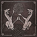
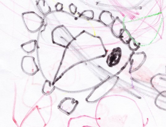
I attached a piece of original genuine and beautiful artwork. It’s called “Eisenbahn mit Türen” (train with doors). Never mind if you don’t see a train. It’s impenetrable without explanation by the artist herself. It’s by my three year old daughter who only just learned to draw circles. And it is a reflection on her recent journey on a subway train, showing the impression a train makes on a little kid when sitting inside of it. You don’t like it? Fair enough. I am not going to sell it anyway.

Attached Image (viewed 106 times):
|
|
|
| Posted: Sat Oct 20th, 2012 07:35 pm |
|
9th Post |
OnePotato
Member
| Joined: | Sun Sep 9th, 2007 |
| Location: | USA |
| Posts: | 325 |
| Status: |
Offline
|
|
The Richter trailer is a good follow-up to the earlier speech by the critic, Michael Kimmelman.
It offers a look at some work that (I think Mr Kimmelman might suggest) would require a bit more effort on the part of the audience in order to achieve some significant degree of appreciation.
The film is a full length expansion from the earlier short that Adam mentioned.
I don't think the difference between Fine Art and Illustration is as simple as evaluating the quantity or degree of "representational-ism" or "narrative content" in a work.
I do believe it is (far) more importantly a difference in the nature of the content that the artist puts into the work, which the audience then encounters.
In an early interview, Richter states:
"You can only express in words what words are capable of expressing, what language can communicate. Painting has nothing to do with that."
That is a very eloquent statement of a very complex concept.
In simplistic terms, for the sake of this post, my own views run along the lines of:
"Illustration" is linguistic, in which the artist translates a work of words into images.
"Fine Art" is non-linguistic, in which the artist communicates thoughts directly with images.
If one ignores this "non-linguistic" component of a work of art, or denies that it even exists, one will not register a significant portion of what some work has to offer, and will most certainly miss the point of those works by a very wide margin.
I think this is often a tragic missed opportunity, because it naturally leads to a diminished view of some of the finest works that are of the greatest complexity.
This is somewhat analogous to encountering a deaf-mute, and deciding that he has nothing to say, because one does not recognize the existence of sign language as a form of communication. (In fact, this is only partially relevant because "sign language" is a direct translation of verbal/word language, and is probably closer to illustration than fine art. But that's a different discussion.)
---
I am not suggesting, (and in fact reject the notion,) that there is a black-and-white, all-or-nothing difference between Fine Art and Illustration, or that one is inherently "better" than the other.
But this "non-linguistic component" mentioned above is a key factor in differentiating between the two approaches, and may help greatly in reaching a satisfying evaluation of any given work.
I would suggest that the point of difference is in the degree to which the "non-linguistic" component is employed.
Richter is a good example because in his abstract work he attempts to be as entirely devoted to that "non-linguistic component" as he can possibly be.
I found it quite fascinating to see how that same concern is vigorously applied to his representational portraits, though it may not be obvious to the casual observer.
Though these portraits may appear to be simply illustrational works, closer examination reveals that apart from that, there is something far more complex going on.
As an artist, he is very purposeful about what he does, as is abundantly demonstrated in the film.
Edited to add:
Sorry if all this sounds pretentious.
Last edited on Sat Oct 20th, 2012 07:41 pm by OnePotato
|
|
|
| Posted: Sat Oct 20th, 2012 11:14 pm |
|
10th Post |
trzes
Member
| Joined: | Mon Mar 26th, 2012 |
| Location: | Germany |
| Posts: | 72 |
| Status: |
Offline
|
|
Yes, I agree that the main point is not to miss the richness and complexity of art by ignoring or not knowing about the different layers of the artwork, the context of it etc. The distinction of “linguistic” and “non-linguistic” work seems a bit tricky to me although I do see the point of making such a distinction.
In terms of expressing myself and creating art: If I can completely describe the meaning, background and message of my art in words, then I could as well write an essay I suppose. But then, a well written essay or novel or poem surely isn’t an illustration, but it can be art. Still, a similar kind of distinction seems useful to distinguish written art that is well thought, clear and to the point but with nothing more behind it as opposed to written art that is mysterious, lyrical, depending on context information, and maybe is “hermetic”. My favorite example for the latter is Paul Celan:
LANDSCHAFT
Ihr hohen Pappeln - Menschen dieser Erde!
Ihr schwarzen Teiche Glücks - ihr spiegelt sie zu Tode!
Ich sah dich, Schwester, stehn in diesem Glanze.
LANDSCAPE
tall poplars -- human beings of this earth!
black pounds of happiness -- you mirror them to death!
I saw you, sister, stand in that effulgence.
To me it sounds much better in German I have to say. But anyway, the poem doesn’t give away a clear meaning, it evokes an image, it is multi-layered, much of its effect comes from a straight appeal to the unconscious, if you try to understand it by applying logic it is just paradox, although it feels right (to me at least). And context information is needed, like the fact that Celan’s sister was killed in the holocaust.
Thus, as another attempt to find simplifying words for a complex thing: For me there is “straight” art which is conscious, clear, with a well-defined purpose and a well-defined symbolic language or set of metaphors . And there is “mysterious” art which is less clear, maybe even hermetic, which is perceived on a more unconscious level and/or that requires more background information.
In Tarot that would be for example Visconti Sforza (straight) versus Mary El (mysterious) or less extreme Vacchettas Tarot of the Master (straight) versus good old Rider Waite Tarot (mysterious). I love Mary-El and RWS more, although I find neither of them particularly beautiful.
I hope all this makes any sense at all.
|
|
|
| Posted: Mon Oct 22nd, 2012 01:34 pm |
|
11th Post |
debra
Member
| Joined: | Sun Sep 9th, 2007 |
| Location: | |
| Posts: | 1115 |
| Status: |
Offline
|
|
Why is Mary El more mysterious than Visconti Sforza?
I'm a verbal person so what about an analogy? This poem is widely taught in American schools:
THE POOL PLAYERS.
SEVEN AT THE GOLDEN SHOVEL.
We real cool. We
Left school. We
Lurk late. We
Strike straight. We
Sing sin. We
Thin gin. We
Jazz June. We
Die soon.
It's by Gwendolyn Brooks. I saw her reading and was just shocked. Here's a link to an audio clip from 1983. She read much the same way when I saw her in the mid-90s. http://www.poets.org/viewmedia.php/prmMID/15433
It's a popular choice for high school English class projects--you tube has many versions. Judging by their projects, the kids are alright. :)
My point being that it started with her observation of the boys at the pool hall. The words themselves, the words as read or sung, the words as presented with images alongside--to me it's all different and yet somehow all the same because the poem has depth to begin with. I didn't "need" to hear Brooks read it, but it was great. Her voice changed the feeling of the message but not the message itself, if that makes sense.
OnePotato, I don't know about a thought being expressed directly with an image. I think in words, is the problem. I can see emotions expressed directly, but thoughts seem more, um, cognitive and therefore explicable with language.
Last edited on Tue Oct 23rd, 2012 12:35 am by debra
|
|
|
| Posted: Mon Oct 22nd, 2012 06:02 pm |
|
12th Post |
OnePotato
Member
| Joined: | Sun Sep 9th, 2007 |
| Location: | USA |
| Posts: | 325 |
| Status: |
Offline
|
|
In the trailer, Richter says:
"You can only express in words what words are capable of expressing, what language can communicate. Painting has nothing to do with that."
And in the full film, he goes on to say that "…..painting is another way of thinking."
Much of the rest of the movie is devoted to showing us what he means by that.
This is what I am applying to tarot art/illustration.
Think of "emotion" as a kind of non-linguistic thought.
Just as "words" may be used to communicate it, so can images.
As I said earlier, I am not suggesting, (and in fact reject the notion,) that there is a black-and-white, all-or-nothing difference between Fine Art and Illustration.
And here I should extend that to the differences between "linguistic" and "non-linguistic" thought.
An example:
If one wanted to express the experience of standing in an architectural space:
1. A writer could stand in the space, and write a description of the experience, then hand that written description to a painter (who had never been there) who could then make a picture based on the written description.
2. A photographer could shoot a photo of the space, and hand it to a painter to use as a reference for a painting.
3. A painter could stand in the space, and paint a picture based on what he sees and feels while standing there. (It doesn't have to "look" like the space.)
None of the finished paintings are the actual experience of standing in the space.
#1 is most linguistic, and most illustrative. (It also involves two steps of "translation"- Experience to words, then words to image.)
#3 is most non-linguistic, and most fine art. (It also involves one step of "translation"- Experience to image.)
#2 is most in between. (It also involves two steps of "translation"- Experience to image, then image to image.)
-------
Is all cognitive thinking verbal? (I don't know the finer points of the definition.)
I believe much of my own thinking involves the perception of space that constantly confronts me.
I constantly see planes and lines and intersections, and the relationships between them, everywhere.
I can't really describe this in words, as I believe that is part of what Richter is talking about.
I imagine it's part of the left-brain, right-brain thing, and that it probably varies in degree from person to person, and from time to time.
Perhaps illustration uses more of the left, and fine art more of the right.
I think the architectural space example can be applied to tarot production.
When one looks at the process of a "scripted deck", the illustration is one step more removed from the experience of an encounter with archetypal concept than it is in one that was created and executed directly by an artist, without a script, or with an internal "script" that will contain many non-verbal/non-linguistic elements.
In any case, there is good illustration, and bad illustration, just as there is good fine art and bad fine art.
(The word "good" that I use here is best explained by Mr Kimmelman in my first post.)
I think the distinctions I have called attention to here are pretty important in helping to better qualify those judgements when assessing work.
Last edited on Mon Oct 22nd, 2012 06:05 pm by OnePotato
|
|
|
| Posted: Mon Oct 22nd, 2012 10:09 pm |
|
13th Post |
trzes
Member
| Joined: | Mon Mar 26th, 2012 |
| Location: | Germany |
| Posts: | 72 |
| Status: |
Offline
|
|
Ok, I think I am now beginning to understand what you mean by „linguistic“. What I tried to come up with myself is different I guess, although the definitions seem to partly overlap.
I guess my problem has been in the first place that I normally can’t tell scripted decks apart from not scripted decks by just looking at them. And even if I could, say for example the Greenwood tarot (scripted as far as I remember) and the Bifrost tarot (genuine art by a single person), then it doesn’t always match the distinction of "illustration" and "art" you described. The Greenwood has as a lot of individual artistic style, the images have such a strong feeling, it is hard to imagine that this all comes from the “script”, to me it looks very much like genuine and individual artwork. The Bifrost tarot looks quite academic to me, even more than most other cabbalistic decks. The artistic style looks, well, “sober” and simplified, just like illustrations of the artist’s ideas about kabbalah (more driven by the left brain if you like). If you would also see the Greenwood more on the “art” side and the Bifrost Tarot more on the “illustration” side, then I think I am with you on your linguistic/non-linguistic distinction.
My understanding (as a non-linguist) of language (as in spoken or written language) tends to be pretty much that of conscious reasoning. So I would say that (conscious) cognitive thinking is verbal indeed (without knowing the cognitive psychologist’s correct definitions either). If I can’t put it in words, then it is more likely to be something un- or subconscious. The distinction I made before is more or less the distinction between conscious and subconscious perception of art. It looks a fair bit more personal and subjective to me now.
Debra, for me the Mary-El is more “mysterious” than the Visconti Sforza in a similar way as lyrics by Paul Celan are more mysterious than lyrics by Shakespeare. It is “easy” to understand Shakespeare on a conscious, rational level. It takes knowledge about the English language of the time. Knowledge about society and culture in England at the time will be helpful too. It is not that Shakespeare would be less complex or less challenging or less skillfully written than Celan (quite the opposite I suppose) but the path to a better understanding is clear at least, unlike trying to rationally understand Paul Celan’s poems.
Working with the Mary-El (not actually reading, more like meditating) had a very strong impact on me, when I got it. I kept dreaming the whole knight about the images and weird stories I had built around it in my fantasy. It spoke to me all the time (although it is one of the least “linguistic” decks I know, ), and I find the artwork utterly stunning. But when I tried to read the companion book and looked at the images with less intuition and more rationality nothing made sense any more. The artwork started looking inconsistent and almost ugly, flat and plump. It seems that I can only access the art of the Mary-El on an intuitive, sub-conscious level.
Maybe that isn’t too far away from OnePoteo’s non-linguistic approach. But anyway, I am crap at judging art. In the end I only know “appeals to me” and “doesn’t appeal to me”.
|
|
|
OnePotato
Member
| Joined: | Sun Sep 9th, 2007 |
| Location: | USA |
| Posts: | 325 |
| Status: |
Offline
|
|
Just to clarify, I did not intend to suggest that the only point of posting these videos was to illustrate the difference between "illustration" and "Fine Art" , or that that difference is determined simply by whether or not a "script" was used.
It's just one of many things that came to mind when I watched the movie.
Virtually all discussions about "Art" that I have seen within the tarot forum world begin and end with the notion that "art is subjective" and simply a matter of "personal taste".
I'm mostly interested in suggesting here that there may just be something more beyond that.
In the case of the Richter trailer, I think that given an opportunity to hear one of the most highly regarded artists of the past 50 years talk about what he does, and to actually watch him work, is well worth the effort, particularly for people who may be interested in art and where art comes from.
I think that the examples that Mr Trzes posted are interesting, but I really don't entirely agree with his position.
The idea of "mysterious" and "known" are certainly interesting and worthwhile distinctions, but I think they have more to do with the knowledge of the viewer than with any general questions about Fine Art vs Illustration.
Whether or not one can "guess" whether a script was used doesn't really change the conception of the work itself.
To address his examples, I think both Mary-El and Bifrost lean heavily toward fine art.
Mary-El is certainly more naturally representational, and more carefully controlled in execution, but Bifrost is also executed in a highly individual painterly style. And regardless of how refined or unrefined it is, how aesthetically appealing it is, or how "illustration-y that styles looks on the surface, the Bifrost still looks to me like an individual vision, rather than a mechanical, second-hand execution.
Edited to add:
(I forgot to address the Greenwood when I went off to write this. I'm not familiar enough with it to address it at length, but at a glance it looks like it leans heavily toward nicely done illustration.)
As I said earlier, I think Illustration is fundamentally tied to a verbal origin. (Among other factors.) and Fine Art is has more non-verbal roots. (Among other factors.)
I think this is what Richter is talking about when he says, "You can only express in words what words are capable of expressing, what language can communicate. Painting has nothing to do with that."
His reaction to the image that appears before him as he works is not determined by a set of instructions. (As opposed to how it would go if it were an illustration.)
It is difficult to quantify, describe, or communicate how his process is "done".
Even after watching the film, and seeing all of the technical details, one cannot really make a "Richter Painting."
By contrast, illustration work is far more pre-determined, far more quantifiable, and often relies heavily on known solutions that are conceived in reaction to pre-determined instructions, in order to achieve a predictable and specific result. In illustration, the "primary" work is the written work, which is then supported by visual images.
This suggests some questions about what a tarot deck actually is, and how important the role of the visual image is to whatever it "is".
Is a tarot card different from a painting? (I think the answer is, "Sometimes, and some of those are more different than others.")
Since the subject of "scripted" decks has come up, I'll ask the following:
Are there "Scripted" paintings? Do any artists work that way? Why not? Is it perhaps because their work does not originate as a written one? (Back to my claim that the difference between "art" and "Illustration" is in the language/non-language roots of the work.)
But rather than go on any further, I think my real point is that in the film, (or even within the brief trailer) Mr Richter demonstrates a whole lot about an artist's approach to making a visual image that may better equip people for looking at tarot cards, or judging any kind of art in general.

Last edited on Sun Nov 4th, 2012 11:24 pm by OnePotato
|
|
|
gregory
Administrator

| Joined: | Wed Sep 12th, 2007 |
| Location: | United Kingdom |
| Posts: | 3281 |
| Status: |
Online
|
|
I don't know how relevant some will see this as, but Fritz Hundertwasser was interesting on what makes any work of art GOOD:
I only have this in German, so if anyone thinks I have mistranslated, I will post the original, but my spellchecker makes German hell to type on line:
A picture should be like a flower or a tree. It should be just like nature. It should be such that it is missed when it's not there.
(that "such" is tricky...)
A painting you've done is only good when it can say more than the drawings done by your child; it is as beautiful as newly ploughed earth and as the boys and girls you meet, and almost as beautiful as the leaves of trees and grass, as flowers
He said loads more good stuff. (*has thing for Hundertwasser* !)
Last edited on Tue Nov 6th, 2012 04:30 pm by gregory
|
|
|
trzes
Member
| Joined: | Mon Mar 26th, 2012 |
| Location: | Germany |
| Posts: | 72 |
| Status: |
Offline
|
|
I don’t think that the Bifrost tarot only looks illustration-y on the surface. The main purpose of the deck is to illustrate cabbalistic principles. In a long discussion over at aeclectic tarot forum for example people complained about the wide open legs of the nudes in the deck. Many people found it offputting or even pornographic. Others explained that the open legs illustrate a certain cabbalistic meaning (I don’t remember what), like nudity as such often has a specific meaning in tarot. Also each color being used has a certain meaning that can be looked up in a textbook about kabbalah. Choosing a certain color consciously illustrates that certain meaning. It’s strictly semiotic (language based in a more general sense), thus it is pretty much illustration IMO.
But at the same time it is pretty much fine art too, I fully agree with OnePotato on the individual artistic style of the Bifrost, and that it is genuine art and not at all mechanical second hand execution. Bifrost simply is both. The only problem is that the illustrational part compromises the artistic part because it uses a counter-intuitive color scheme and a weird way of displaying nudity that seems to put off many people.
As a conclusion I would suggest not to see illustration and fine art as exclusive in the way that the more illustrationy an image is, the less fine-arty it is. More examples to illustrate this:
While randomly placing big splashes of color on a large piece of canvas may or may not be considered fine art, Richter’s interview surely makes it an illustration of the sort: “Look folks, that’s how an important artist like me creates genuine art.” There is no fundamental difference to Andy Warhol’s artificial staging of art to or to my little daughter’s ugly and clumsy scribbling that would be meaningless without the conscious verbal description of what it was intended to illustrate. Or consider an image of a guy in old-fashioned clothes sitting on a stone stool. So what? But put a roman four on top and print it on 4x2.5 inches laminated cardboard, and it becomes loaded with references to tarot archetypes and can be compared to other depictions of the emperor. It now illustrates a well-known archetype and it also becomes more interesting artistically because one can analyze how the canonical style and meaning has been altered or extended.
One might see a fundamental difference though in the creational process itself. I think that Richter, for example, mystifies his own creative process a lot by finding a long winded description for simply moving the paintbrush (thanks, Adam, for the laugh). I have no doubt that Richter is honest though, I am sure that creating art can be a mystical or even religious act indeed (which is another thing that Hundertwasser has said). But in any case it is a very personal thing for the artist. I don’t see how it would (in principle) have an impact on MY personal perception of art, unless it results in a different or somewhat “better” outcome.
Same thing with Hundertwasser. He described precisely what I like about his art. But he could have said more humbly: “What I think attracts people to my art is that it gives them a feeling of being attached to and reminded of nature” instead of making a claim that his own personal way of creating art is the only one. Like Richter’s remarks I see it as a promotional statement that provides some context for his art, enabling people to see what it is meant to illustrate, encouraging them to mystify his art a bit.
|
|
|
gregory
Administrator
| Joined: | Wed Sep 12th, 2007 |
| Location: | United Kingdom |
| Posts: | 3281 |
| Status: |
Online
|
|
I would have seen what Hundertwasser said as more general than commenting on his own work - then again, it was a quotation among many outside its original context... I felt he was defining what made "good" art (in general) more than - well, something I could do !!! (Trust me, I can't !)
|
|
|
trzes
Member
| Joined: | Mon Mar 26th, 2012 |
| Location: | Germany |
| Posts: | 72 |
| Status: |
Offline
|
|
gregory wrote: I would have seen what Hundertwasser said as more general than commenting on his own work - then again, it was a quotation among many outside its original context... I felt he was defining what made "good" art (in general) more than - well, something I could do !!! (Trust me, I can't !)
I couldn't become a Hunterwasser either of course, no matter how hard I would try. I really think he is a great artist. And yes, it's hard to tell whether he thought about good art in the first place and then tried to get as close as possible to this approach while doing his own work. Or if he did his own work first and then developed some thoughts about the quality of his art.
I really don’t know, but my suspicion remains that artists in general tend to talk more about their own stuff than about the rest of the world. Don’t we all tend to do that a bit? And I would guess that an artist needs an even bigger portion of egocentricity to be creative.
But if his thoughts should really have been first, then my point would be even more valid: that his work illustrates his ideas of art.
BTW while looking up more quotes online I must say he could put things in beautiful words indeed.
|
|
|
Current time is 05:47 pm | |
|
|
|