|
| Posted: Wed Sep 30th, 2009 05:03 pm |
|
1st Post |
| Posted: Thu Oct 1st, 2009 04:16 pm |
|
2nd Post |
| Posted: Thu Oct 1st, 2009 04:18 pm |
|
3rd Post |
Demian Brennan-Gould
Member

| Joined: | Tue Oct 30th, 2007 |
| Location: | Illinois USA |
| Posts: | 294 |
| Status: |
Offline
|

|
view from listing site: Attached Image (viewed 170 times):
|
|
|
| Posted: Tue Oct 13th, 2009 02:17 pm |
|
4th Post |
thorhammer
Member

| Joined: | Wed Sep 3rd, 2008 |
| Location: | Perth, Australia |
| Posts: | 13 |
| Status: |
Offline
|
|
I got mine in the mail today.
The stock is lovely and the grey colour an inspired choice. The box is sturdy but understated and I am very impressed by the concise yet comprehensive instruction sheet and original spread.
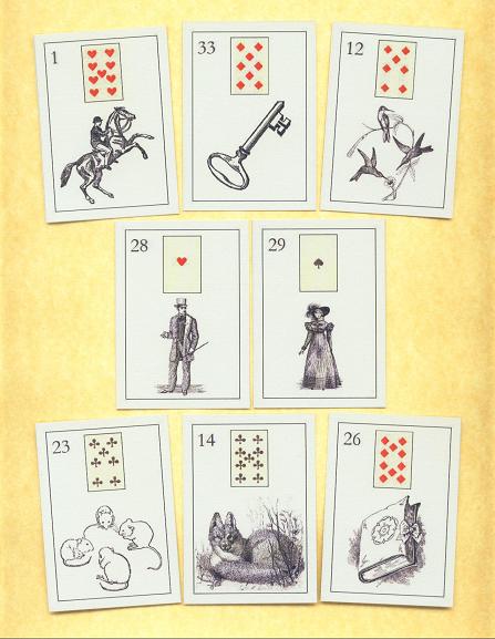
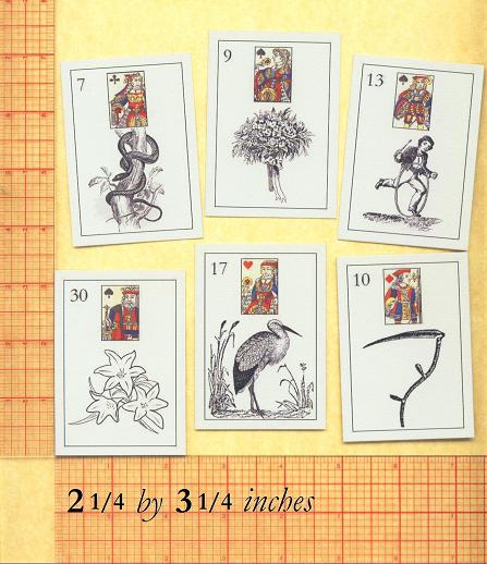
I'm not impressed, however, by the "professional" printing quality - the lines are often blurred across the image as though the printing heads needed cleaning. Also, the images are often pixelated, as in the Child card if you look at the hoop. This is not the case in all the cards; the quality is not consistent, nor is the style or complexity of the artwork.
All in all, a charming set which I am glad to have and I am enjoying reading with it, but not as pronounced an accomplishment as it could have been.
\m/ Kat
|
|
|
| Posted: Tue Oct 13th, 2009 06:19 pm |
|
5th Post |
Demian Brennan-Gould
Member
| Joined: | Tue Oct 30th, 2007 |
| Location: | Illinois USA |
| Posts: | 294 |
| Status: |
Offline
|
|
ARLO wrote: Hello Kat!
A generously fair analysis and kindly and thoughtful critique.
My rationale in every case was lucidity of image rather than
superiority of illustration. A good example is 25 RING where
the right Lenormand ring won out over the best artwork and
this was the consistent strategy, which led to inconsistencies
in imagery but was embraced as the best course of action...
As for the printing, the equipment costs more than I live on
year to year. The paper ~ well, I know my paper, and that
was never going to be less than "Yes!" ~Le Normand ARLO
is completed, and no turning back: the future is before us.
Many Thanks!
~Arlo
Additional notes:
Osgood's American First Reader for Schools and Families
Lucius Osgood (Pittsburgh, H. I. Gourley, 1870) [and: edited]

A cherished inspiration, to which homage is gratefully acknowledged...
here seen in the late 1880's to mid 1900's to current production forms:

|
|
|
| Posted: Sat Oct 17th, 2009 05:37 am |
|
6th Post |
thorhammer
Member
| Joined: | Wed Sep 3rd, 2008 |
| Location: | Perth, Australia |
| Posts: | 13 |
| Status: |
Offline
|
|
"Hello Kat!
A generously fair analysis and kindly and thoughtful critique.
My rationale in every case was lucidity of image rather than
superiority of illustration. A good example is 25 RING where
the right Lenormand ring won out over the best artwork and
this was the consistent strategy, which led to inconsistencies
in imagery but was embraced as the best course of action...
As for the printing, the equipment costs more than I live on
year to year. The paper ~ well, I know my paper, and that
was never going to be less than "Yes!" ~Le Normand ARLO
is completed, and no turning back: the future is before us.
Many Thanks!
~Arlo"
Fair point about the lucidity of image - I see totally what you were going for there now, and you did succeed. Knowing that story does help to understand the images better :)
I still love the paper :) I fall in love with it every time I touch it.
\m/ Kat
|
|
|
| Posted: Sun Sep 19th, 2010 08:43 am |
|
7th Post |
Demian Brennan-Gould
Member
| Joined: | Tue Oct 30th, 2007 |
| Location: | Illinois USA |
| Posts: | 294 |
| Status: |
Offline
|
|
Namaste
2011 looks promising too... free U.S. domestic shipping, discounts internationally.
|
|
|
| Posted: Fri Jun 28th, 2013 07:55 am |
|
8th Post |
| Posted: Sun Jun 30th, 2013 01:55 am |
|
9th Post |
Current time is 06:09 pm | |
|
|
|