|
NAMASTEINDIA
Member

| Joined: | Thu Aug 20th, 2009 |
| Location: | India |
| Posts: | 63 |
| Status: |
Offline
|

|
I was quite scared of the deadline and like a sincere student somehow managed to finish my tasks.
|
|
|
gregory
Administrator

| Joined: | Wed Sep 12th, 2007 |
| Location: | United Kingdom |
| Posts: | 3281 |
| Status: |
Online
|
|
NAMASTEINDIA wrote: I was quite scared of the deadline and like a sincere student somehow managed to finish my tasks.
Next time you will know  . .
|
|
|
Marcia959
Member
| Joined: | Tue Nov 18th, 2008 |
| Location: | California USA |
| Posts: | 394 |
| Status: |
Offline
|
|
I just didn't want to be the last one to submit my hi res copies like I was last year!
|
|
|
NAMASTEINDIA
Member
| Joined: | Thu Aug 20th, 2009 |
| Location: | India |
| Posts: | 63 |
| Status: |
Offline
|
|
gregory
Next time you will know .
you bet Last edited on Fri Jul 2nd, 2010 07:19 pm by NAMASTEINDIA
|
|
|
BlueToy
Member
|
Still in-progress. Something that hopefully ties-up with the blue line theme. Hopefully the very low-contrast pinstripes is still discernible.
Attached Image (viewed 332 times):
|
|
|
Marcia959
Member
| Joined: | Tue Nov 18th, 2008 |
| Location: | California USA |
| Posts: | 394 |
| Status: |
Offline
|
|
BlueToy wrote: Still in-progress. Something that hopefully ties-up with the blue line theme. Hopefully the very low-contrast pinstripes is still discernible.
ooo very cool
|
|
|
goldenweb
Member
|
They look wonderful, Ly!
Pen
|
|
|
debra
Member

| Joined: | Sun Sep 9th, 2007 |
| Location: | |
| Posts: | 1115 |
| Status: |
Offline
|
|
To be honest, Ly, I don't like the blue lines, the pinstripes and the curved interior space (rounding the edges of the images).
The exterior blue line expands the border at the expense of the image. It just takes up space. I'd rather see a larger image and less border. The pinstripes are good for some styles and deadening for others. It's "preppy"--Vanessa :) But are we all doing preppy cards? Definitely not.
I don't much want the corners of my picture rounded--I would have designed it differently had I known. You're cutting out part of Goldenweb's image, too. The interior blue line might look ok with some cards--and not so ok with others. (Like mine.)
Simplier is better, I think.

Last edited on Sun Jul 4th, 2010 07:50 am by debra
|
|
|
NAMASTEINDIA
Member
| Joined: | Thu Aug 20th, 2009 |
| Location: | India |
| Posts: | 63 |
| Status: |
Offline
|
|
BlueToy wrote:
Still in-progress. Something that hopefully ties-up with the blue line theme. Hopefully the very low-contrast pinstripes is still discernible.
wow very pretty. i loved the images and the artwork.
|
|
|
papoon
Member

| Joined: | Mon Apr 7th, 2008 |
| Location: | California USA |
| Posts: | 499 |
| Status: |
Offline
|
|
I've got to say that I'm with debra on the border, pinstripes and, especially, the rounded image corners. As it happens, I've spent the evening working on one of my cards (finally). If the corners of our images were to be rounded like the examples, I'd have to go back and rework some of my design, which I'd rather not have to do. And, of course, lots of people less prone to procrastination than I have already finished their cards with no expectation that the corners would be edited off.
So, whatever we decide about the border, I'd really vote against rounding the corners.
|
|
|
NAMASTEINDIA
Member
| Joined: | Thu Aug 20th, 2009 |
| Location: | India |
| Posts: | 63 |
| Status: |
Offline
|
|
papoon wrote:
I've got to say that I'm with debra on the border, pinstripes and, especially, the rounded image corners. As it happens, I've spent the evening working on one of my cards (finally). If the corners of our images were to be rounded like the examples, I'd have to go back and rework some of my design, which I'd rather not have to do. And, of course, lots of people less prone to procrastination than I have already finished their cards with no expectation that the corners would be edited off.
So, whatever we decide about the border, I'd really vote against rounding the corners.
someone would be doing this for all the cards or each one as to do the same format
well i wont be able to do...bcos i dont much knowledge about all this.
|
|
|
gregory
Administrator
| Joined: | Wed Sep 12th, 2007 |
| Location: | United Kingdom |
| Posts: | 3281 |
| Status: |
Online
|
|
I'm sorry- but I'm with debra and abrac.... I can actually live with the blue line - but not the rounding and the pinstripes... Like them - I would have done mine (well, one of them) differently if I'd thought it would be rounded.
Sorry - I LOVE you  but... but...
(Namaste - Ly takes all our images and makes the cards into a uniform deck - you don't have to worry ! You've done all you need to !)
Last edited on Sun Jul 4th, 2010 10:41 am by gregory
|
|
|
NAMASTEINDIA
Member
| Joined: | Thu Aug 20th, 2009 |
| Location: | India |
| Posts: | 63 |
| Status: |
Offline
|
|
gregory wrote:
(Namaste - Ly takes all our images and makes the cards into a uniform deck - you don't have to worry ! You've done all you need to !)
phew sounds good
|
|
|
Sumada
Member

|
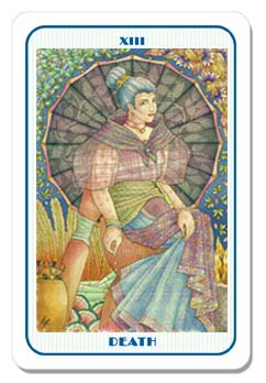
I'm not so sure about that border either... sorry Blue Toy, but your Death on the other hand, is really beautiful, (and I never thought I'd hear myself say that about any image for the thirteenth card.)
Like debra, I would rather see our designs as large as possible on the card, and although I'm not averse to rounded corners per se, I would have composed my image a little differently had I known the corners were going to be rounded.
Perhaps this is a lesson that the border, or at least a template for the exact shape, should be determined first; as is the case with the two window Museo dei Tarocchi deck and JMD's hexagonal Association of Tarot Studies deck.*
So, if it's not too much trouble Blue Toy, could you please offer us another border?
On another note, thanks so much Pen, Marcia, Nicole and Janet for the positive feedback on my Beachcomber/Hermit. It really means a lot to hear comments like that from other artists/designers that I also admire!
Cheers, Sumada
* BTW I think there is still one card going spare for the ATS deck.
|
|
|
gregory
Administrator
| Joined: | Wed Sep 12th, 2007 |
| Location: | United Kingdom |
| Posts: | 3281 |
| Status: |
Online
|
|
Oh - on a more positive not - LOVE the font !
|
|
|
BlueToy
Member
|
Ok thanks for the feedback guys. Like what I said, this is still in-progress. I can remove the rounded corners on the images. I can't make them too big, though, since they'wouldn't look proportionate to the actual card sizes (borders end up considerably thicker at the top and bottom) and we have a bleed of 1/8 inches on each side (there shouldn't be anything located at 1/8 corners per side. I dunno if the press can achieve something borderless. maybe we can try that next year  ). Skad and I were discussing that last year's deck border design's angular corners didn't go entirely well with the rounded corners. With the pinstriping, I was thinking of "blue line" again when I made that, but, well, that can be changed too. I guess I just wanted something really different from last year's, to establish that this is a different project we're doing. Will try working on a different border design next time I'm free. Not too many alternatives though - I noticed in the past that we get even more indecisive when we have a lot more stuff to choose from. ). Skad and I were discussing that last year's deck border design's angular corners didn't go entirely well with the rounded corners. With the pinstriping, I was thinking of "blue line" again when I made that, but, well, that can be changed too. I guess I just wanted something really different from last year's, to establish that this is a different project we're doing. Will try working on a different border design next time I'm free. Not too many alternatives though - I noticed in the past that we get even more indecisive when we have a lot more stuff to choose from.
Regarding cropping, nothing will end up cropped (well, since the images won't have rounded corners anymore) UNLESS you submit something that's not within the aspect ratio that was set at the beginning of the project. Can't do anything about that. I think with Goldenweb's image, I didn't resize the thing properly so some of the side details were lost, but she did submit in the correct proportions, so there won't be cropping with the actual final images.
I'd really appreciate if you guys could suggest some ideas/themes that go with the theme and with the artworks so far, that I could use as a springboard to develop the border design.
|
|
|
gregory
Administrator
| Joined: | Wed Sep 12th, 2007 |
| Location: | United Kingdom |
| Posts: | 3281 |
| Status: |
Online
|
|
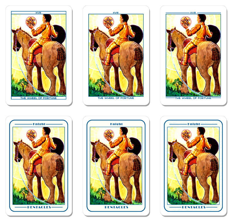
I'm OK with a blue line as part of the border.
Corners - NEXT YEAR - let's stipulate them in the design process ?
Meanwhile - you COULD perhaps try a rounded cornered blue line border OUTSIDE the images....
Actually for this CARD the pinstripes even work - don't know about all of them....
Attached Image (viewed 292 times):
|
|
|
debra
Member
| Joined: | Sun Sep 9th, 2007 |
| Location: | |
| Posts: | 1115 |
| Status: |
Offline
|
|
gregory wrote: I'm OK with a blue line as part of the border.
Corners - NEXT YEAR - let's stipulate them in the design process ?
Meanwhile - you COULD perhaps try a rounded cornered blue line border OUTSIDE the images....
Actually for this CARD the pinstripes even work - don't know about all of them....
gregory's version, without the pinstripes:
|
|
|
gregory
Administrator
| Joined: | Wed Sep 12th, 2007 |
| Location: | United Kingdom |
| Posts: | 3281 |
| Status: |
Online
|
|
Maybe with solid very pale blue inside the line ?
|
|
|
Sumada
Member
|
gregory wrote: Oh - on a more positive not - LOVE the font !
I forgot to say that I really like the font too! and that it's blue...
Best, Sumada
|
|
|
debra
Member
| Joined: | Sun Sep 9th, 2007 |
| Location: | |
| Posts: | 1115 |
| Status: |
Offline
|
|
gregory wrote: Maybe with solid very pale blue inside the line ?
Why? Let each image speak for itself, is my thought--if you "fancy it up" then some cards might look good and certainly some will look bad as a result...
Ly, if you run the width of each image as large as possible given the printer's specifications, and there's a wide top & bottom border, that means you could "fill" the awkward space with the titles and numbers, right? So you might consider putting the blue line at the top and bottom, not on the sides, so we can keep the image as large as possible.
I dunno, something like this
-------number-------
image here, big as
allowed by the
priner
---------Title---------
Last edited on Sun Jul 4th, 2010 07:45 pm by debra
|
|
|
gregory
Administrator
| Joined: | Wed Sep 12th, 2007 |
| Location: | United Kingdom |
| Posts: | 3281 |
| Status: |
Online
|
|
debra wrote: gregory wrote: Maybe with solid very pale blue inside the line ?
Why? Let each image speak for itself, is my thought--if you "fancy it up" then some cards might look good and certainly some will look bad as a result...
Ly, if you run the width of each image as large as possible given the printer's specifications, and there's a wide top & bottom border, that means you could "fill" the awkward space with the titles and numbers, right? So you might consider putting the blue line at the top and bottom, not on the sides, so we can keep the image as large as possible.
BEEEECOS I like Ly a lot and he went to a lot of trouble and I feel bad for him  . .
And because it adheres to the blue thing.
I'd prefer a box to two separate lines, myself. And I like the way it "prepares" for rounded corners on the cards, too.
|
|
|
debra
Member
| Joined: | Sun Sep 9th, 2007 |
| Location: | |
| Posts: | 1115 |
| Status: |
Offline
|
|
Well hell, I love Ly too :)
The less "personality" in the design, fonts, etc., the more the personalities of the individual cards will come through. If the look of any card is altered or subsumed by the design package around it, the design isn't doing its job--it should gently support rather than compete with the art.
It's a very simple graphic design problem. Whatever the solution, we all have to live with it.
|
|
|
gregory
Administrator
| Joined: | Wed Sep 12th, 2007 |
| Location: | United Kingdom |
| Posts: | 3281 |
| Status: |
Online
|
|
But before you thought my reworking of Ly's Death card was OK as long as there were no pinstripes - so maybe that with no blue either ???
|
|
|
nicole
Member
|
I love them - so there :P
|
|
|
BlueToy
Member
|
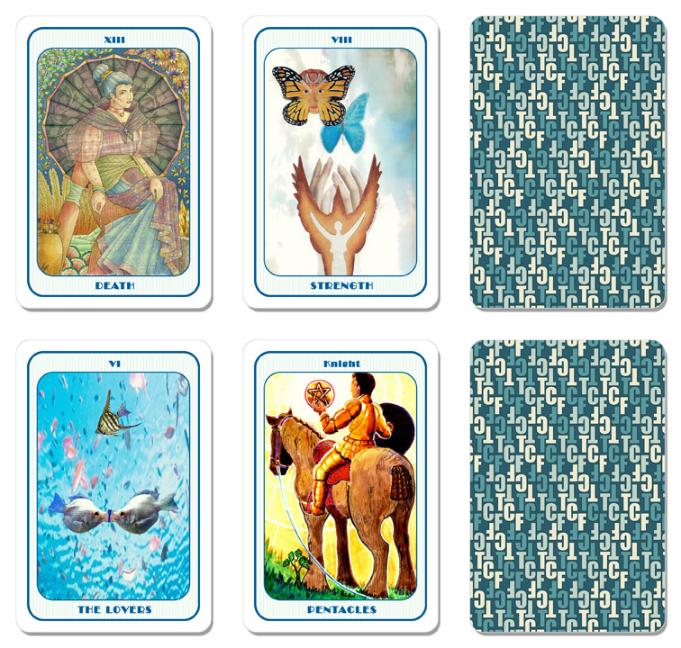
Some more restrained samples, factoring in your inputs. The top series is what happens when we maximize the possible size for the image. I was wrong with my estimate, though. the tops and bottoms don't end up looking too tall - they look too short. That's as much distance I can move the text away from the image. I had to change the font to something more readable as well since there's so little space left for the text.
The bottom series basically the old design... streamlined. I also made the "inside" border a bit off-white for aesthetic reasons. The last one has a very low-contrast leaf pattern just because I felt I had to include something to get a round (6) for the samples.
Attached Image (viewed 232 times):
|
|
|
Marcia959
Member
| Joined: | Tue Nov 18th, 2008 |
| Location: | California USA |
| Posts: | 394 |
| Status: |
Offline
|
|
BlueToy wrote: Some more restrained samples, factoring in your inputs. The top series is what happens when we maximize the possible size for the image. I was wrong with my estimate, though. the tops and bottoms don't end up looking too tall - they look too short. That's as much distance I can move the text away from the image. I had to change the font to something more readable as well since there's so little space left for the text.
The bottom series basically the old design... streamlined. I also made the "inside" border a bit off-white for aesthetic reasons. The last one has a very low-contrast leaf pattern just because I felt I had to include something to get a round (6) for the samples.
IMHO, if you number your samples
123
456
I like #2 the best, then #5. BTW I like your leaves because they go really well with your Death card, but I wouldn't want them to fight with the other designs.
Thanks for your hard work on this, Ly! You always have such interesting ideas.
|
|
|
goldenweb
Member
|
My choice would be the centre card on the bottom line. I think the image needs room to breathe, which it doesn't have in the top row due to the close proximity of the small type/font. Also the simplicity of the design leaves the image free from distraction. What's gained in the image size of the top row cards isn't worth the restricted feeling I get from having the text so small and close to the image.
I can't see the leaves in the lower bottom right card - they must be too low-contrast for my monitor, but less is more.
The largest image possible could be achieved with only the printers' designated border and the titles & numbers added to the images themselves, but I can see that causing a whole new set of concerns.
Ly, you're a star for taking this on again...
Pen
|
|
|
debra
Member
| Joined: | Sun Sep 9th, 2007 |
| Location: | |
| Posts: | 1115 |
| Status: |
Offline
|
|
In terms of visibility, there's quite a difference between the top row and the second row.
Ly, is it possible to maximize the images in the top row just a little less, to give the titles and numbers some breathing room? And maybe try a lighter, more neutral-feeling font?
|
|
|
BlueToy
Member
|
I can re-scale the images but they'll probably end up just very slightly bigger than those in the bottom row. I'm not sure about neutral fonts, though. That's pretty subjective. I mean, the one on the top's pretty neutral for me already. Maybe you guys could suggest other fonts to use?
In terms of personal preference, I'm for 4 and 5.
|
|
|
papoon
Member
| Joined: | Mon Apr 7th, 2008 |
| Location: | California USA |
| Posts: | 499 |
| Status: |
Offline
|
|
Isn't the image size of our art spec'd to be 2.5" x 3.75"? 750 x 1125 pixels at 300 DPI? My understanding is that that is a given and the border treatment will work around that.
Last year's adhered to that spec and there was plenty of room for a reasonable border with reasonably sized titles. I have faith that Ly can come up with a delightful design that will preserve the size of our art and provide attractive borders and titles.
|
|
|
gregory
Administrator
| Joined: | Wed Sep 12th, 2007 |
| Location: | United Kingdom |
| Posts: | 3281 |
| Status: |
Online
|
|
I like 5 best (middle bottom.)
As you'd expect as it was pretty much mine !!!! I could live with four. But I'd rather not; I think the lines clutter.
|
|
|
Mr. la-luna
Member

| Joined: | Sat Sep 8th, 2007 |
| Location: | Aalst, Belgium |
| Posts: | 525 |
| Status: |
Offline
|
|
I'm torn between 3 or 5 descicions decisions...
(happy it is not I who have to choose  ) )
|
|
|
jbthehp
Member

|
I like 5 best, too. And I love the typeface :-)
Very nice work, Ly!
Warmly,
Janet
|
|
|
Langustl
Member

| Joined: | Fri Jun 27th, 2008 |
| Location: | Konstanz, Germany |
| Posts: | 160 |
| Status: |
Offline
|
|
Hi ;-)
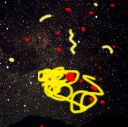
I finished the Five of Cups. I call it "Vergessen" what means to forget, let things go and these things. For me the meaning of the card is also being drunk. We lose consciousness, forget, don´t want to know anything.

and the full size image. Hope you like it ;-)
http://www.langustl.de/sonstigefotos/vergessen.jpg
p.s. I had to stretch the image a bit to get the right size. But I like the resulting effect :-)
Last edited on Wed Jul 7th, 2010 07:10 am by Langustl
|
|
|
nicole
Member
|
That is fantastic Stefan !
love the label on the wine too Last edited on Mon Jul 5th, 2010 08:24 pm by nicole
|
|
|
papoon
Member
| Joined: | Mon Apr 7th, 2008 |
| Location: | California USA |
| Posts: | 499 |
| Status: |
Offline
|
|
For got to mention, of Ly's six choices, I'd also vote for #5.
|
|
|
Langustl
Member
| Joined: | Fri Jun 27th, 2008 |
| Location: | Konstanz, Germany |
| Posts: | 160 |
| Status: |
Offline
|
|
Thanks a lot. Makes me very happy, that you like it ;-) !
|
|
|
acucent
Member
| Joined: | Sun Sep 30th, 2007 |
| Location: | Wisconsin USA |
| Posts: | 119 |
| Status: |
Offline
|
|
Langustl,I like your card too..... once again another great card!!!!
and back to the Ly's samples....I like 5!!!!
|
|
|
papoon
Member
| Joined: | Mon Apr 7th, 2008 |
| Location: | California USA |
| Posts: | 499 |
| Status: |
Offline
|
|
After giving it some more thought, I'd like to make a case for continuing our exploration of card designs. I'd also like to make it clear that this shouldn't be about whether or not one loves Ly. I know we all appreciate his efforts and, as I said in a previous post, I have no doubt that he'll come up with a great design. But multiple iterations based on client (that's us) feedback is a normal part of the design process. It doesn't in any way imply any disrespect for the talents of the designer.
Here are my concerns:
• The font in examples 4 - 6 has a lot of personality. Which is great if the deck is designed to communicate that personality. But in the case of a collaborative deck like ours, there is no consistent personality. Given the range of art styles already evident in the submitted cards, that font will look good on some cards, but completely inappropriate on others. It would seem that a clean, neutral font that won't clash with anything is the better choice for a collaborative deck. Here are some suggestions:
Futura
Univers
Stone
Baskerville
Caslon
Warnock Pro
• The blue outline takes up room unnecessarily. Imagine #5 trimmed just inside the blue outline (and then scaled up to full card size).
• Too much blue. I know the blue line is a feature of all the cards, but that doesn't necessarily mean that an overall blue color for the labels will work for all cards. Again, I'd recommend a neutral black or dark gray, as those are guaranteed to work with any color scheme.
So, here's a rough mockup of the sort of thing I have in mind. Sure, it's not as decorative, but I think it more effectively features the most important element of each card, our artwork.

|
|
|
BlueToy
Member
|
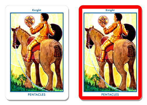
The font's position there isn't feasible. It goes beyond the 1/8 inch bleed border... thingie on all sides that the press has set. Nothing should go beyond that just in case there's slight shifting when the cards are cut. The one on the left is the closest I can do. I've pushed the text to the very edge that's possible. I also feel this is the largest I can make the image without it looking cramped with the text (or resorting to... stretching the images). Incidentally it's also about the same size as those in cards 1-3 (just slightly bigger).
Actually, the blue outline doesn't take up that much space from the images, the reason being proportions. In the image on the right, I've highlighted the bleed border... thingie with red so it's easier to see. We can't widen the image right to the very edge because any horizontal widening will also result in a proportionate vertical widening of the image - which would then make the text look too cramped. I just put the blue outer border there to fill in the space, and to add a bit more character to the cards.
I personally feel this current one's on the bare side (but still ok), but hey, we can have a consensus about this or something.
PS Wonderful new card Langustl! :)
Attached Image (viewed 117 times):
|
|
|
papoon
Member
| Joined: | Mon Apr 7th, 2008 |
| Location: | California USA |
| Posts: | 499 |
| Status: |
Offline
|
|
BlueToy wrote:
The font's position there isn't feasible. It goes beyond the 1/8 inch bleed border
My example was really more for style than to exact scale. If this year's deck will have the same size cards as last year's, and we assume no resizing of the artwork (and I'm doing the math properly), we've got 1/4 inch on the top and bottom to place the titles without encroaching on the bleed border. I don't think it would take much adjustment of the font size and spacing to make it work (and I just grabbed that font as one example).
|
|
|
gregory
Administrator
| Joined: | Wed Sep 12th, 2007 |
| Location: | United Kingdom |
| Posts: | 3281 |
| Status: |
Online
|
|
Still voting for 5. I think the consistency and "whole deck"-like feel it gives is good. And I think the font works - I am SICK of decks that use the most basic fonts. It always feels to me like the person who used them couldn't be bothered...
(And sure, it shouldn't be about whether or not we like LY - I said that as a bit of a joke after debra and I disagreed  ) )
|
|
|
|
|
|